


01
Brand Strategy & Messaging
We started by interviewing board members and key stakeholders, reviewing existing research, and combing through past publications to understand the Foundation’s evolution so we could strategize a potential path forward. From there, we collaborated with the Foundation’s communications team to clarify and refine the organization’s core messaging, including the tagline, mission, vision, promise, and values.


Creating Moments of Awe
Based on our research, we shifted the Foundation’s messaging strategy to be less academic and long form. We also crafted a new tagline “Inspiring Awe & Wonder” that focuses on connecting the big questions to daily life.
02
A Bold New Aesthetic
Once we established the brand strategy and messaging, our next step was to design a new logo and visual style for the Foundation. We created flexible versions of the primary mark to adapt to a wide variety of situations, both in print and on-screen. Then, we extended the logo design into a comprehensive brand with a full set of collateral, including business cards, letterhead, envelopes, memo pads, name tags, podium signs, presentations, wall signs and more.

Before and After
Our initial research revealed that the existing nautilus symbol had deep equity within the JTF community. While this ancient symbol has many interpretations, the inner spiral is a recognized symbol of creation, fluidity, and evolution. Our logo harnessed these associations while capturing the spirit of exploration that lives at the center of the Foundation.


03
A Sound Web Strategy
A thoughtful web strategy is essential. User profiles helped us determine the ideal site structure while messaging guidelines outlined a central content strategy.


Who Will Be Visiting the Site, and Why?
Detailed user profiles helped us document and understand typical website visitors. Based on these audiences, we simplified the navigation to highlight Funding Areas, Grants, and Partnerships.
Content Strategy Considerations
To inform the content creation process, we conducted an iterative workshop that resulted in practical messaging guidelines. From voice & tone to content heuristics and business goals, we helped the communications team rally around one central content strategy.

04
Web Design
We extended the brand system onto the web, where the new user interface design elements worked together to highlight the Foundation’s ideals of humility, open-mindedness, and curiosity.

Templeton Ideas
The Foundation’s new editorial home “Templeton Ideas” continues to grow in scope and reach. The Foundation recently launched a joint publication with Big Think and a new podcast. Templeton Ideas has also won awards from YouTube, the Davey Awards, and the dotCOMM Awards – among others.


05
Technology that Works
Our technical team connected the WordPress content management system to the client’s existing grant, calendar, and news databases. At a result, grant data can be searched or filtered by funding area, year, and geographic region.


A strong foundation
The new brand and web design garnered positive feedback from the board, academic community, media, and philanthropic partners around the world.
100%
Increase in Grant Database Visits
After the launch of the redesigned site, overall traffic to the Our Grants section of the site increased. In particular, the average time spent on the Grantmaking Process page increased by almost a minute as users engaged with the redesigned content.
17%
Reduction in Funding Area Page Bounce Rate
The new site introduced individual funding area landing pages. These new pages maintain strong traffic and represent over 15% of the site’s pageviews, attracting potential grantees and partners to the Foundation’s areas of focus.
60%
Qualified Grant Applications in 2022
In 2022 the Foundation received 2,934 grant submissions, a record for any single cycle in JTF’s history. Sixty percent of the submissions cleared the Foundation’s rigorous criteria for consideration.
Push10’s team helped us refine our brand, clarify and sharpen the messaging, and create a visually stunning and highly user-friendly site for our stakeholders. We could not be more pleased with our Push10 experience.
Templeton Foundation
Michael Murray, Senior Vice President
View WebsiteView Related Work
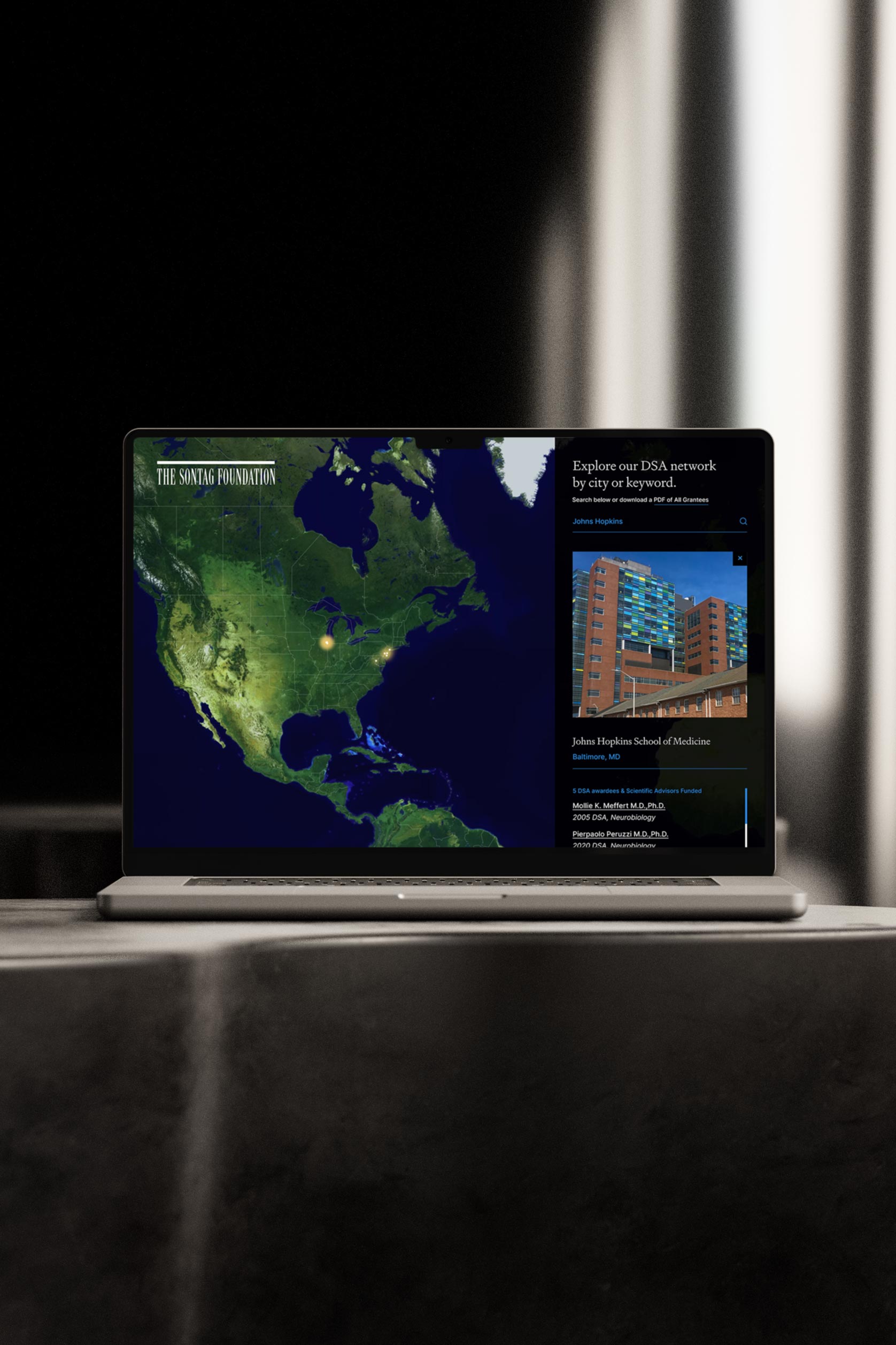
The Sontag Foundation
We partnered with the Sontag Foundation to redesign their website, integrating their personal story with a modern, user-friendly layout that highlights their research initiatives.

