Author
Chris Tremoglie
Minute
Read
Development
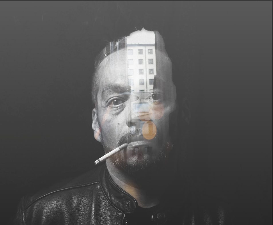
Creating a unique and animated double exposure effect through CSS is easier than you might think.
Based on the code by Cody Lindsay Gordon, this double exposure experiment utilizes triggers, animations and hover effects to create a double exposure trigger animation with the freedom to create and manipulate at will.
This code takes advantage of the CSS mix-blend-mode by targeting a specific mask and overlaying it on the original image. I have implemented simple CSS transitions as well as a gloss overlay to make the abstract elements move and distort using CSS keyframes. The overlay element can be set with a black gradient background to make the internal masked images stand out even more. Editing these elements can now create specific movement and hover effects that can be unique to each image or set as a constant throughout a project.
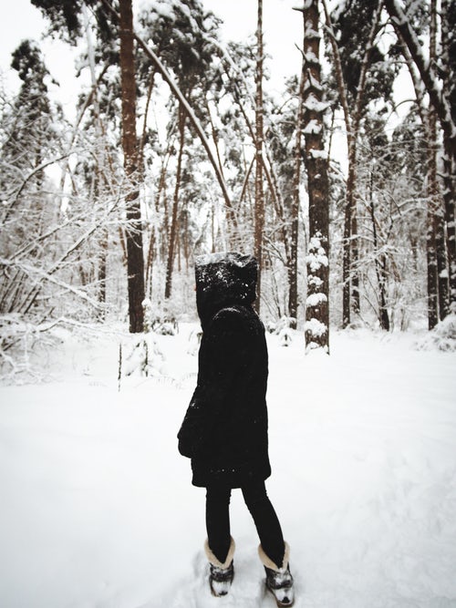
To get started, create the base image and the mask.
The base image is the main image of the element. For an example, let’s use this winter scene as our base.
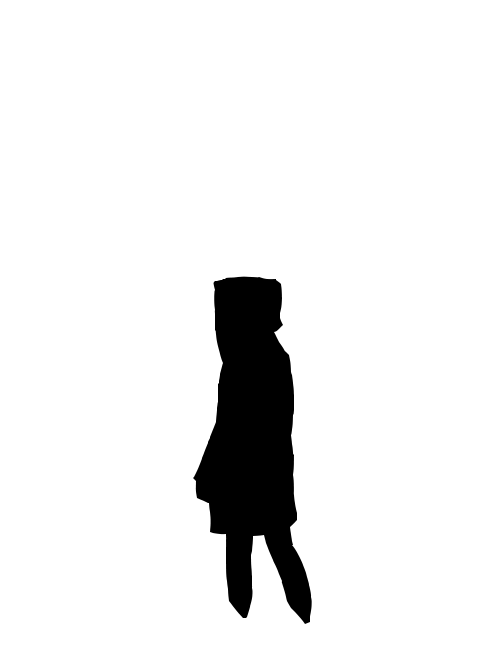
Next, you will need to create the masked image. The mask lies directly over the base image to define the area where you want the double exposure to occur, while the surrounding area remains transparent. You can also use opacity to get an even greater blended effect when you apply the abstract elements.
Now, let’s set up an element.
To do this, you will need a wrapper with image, figure, and overlay layers inside.
<div class="double-exposure-wrapper" style="transform: none;">

<img class="base" src="[base-image-path]">

<figure class="lava">

<img class="exposure" src="[abstract-overlay-path]" style="transform: none;">

</figure>

<div class="gloss lava-gloss"></div>

</div>
The “image” is the base image of the piece. The “figure” will house the abstract light, shape and smoke images we’ll be using for the effect, and the overlay (here in the example titled “gloss“) will be a gradient transition that will make the double exposure layer pop even more.
Refine it using simple CSS
You can control transition effects for all of the figure depths at different speeds and set the gloss layer to adjust how dark the overlay background should get when the transition is in effect. Doing so gives the double exposure more of a 3D feel to it.
.lava {

@include prefix(mask-image, url('[mask-image-path]'));

opacity: 0;

transition: all 0.75s ease-in-out;

img {

bottom: 0;

&:first-child { // target

animation: floatUp 25s infinite ease-out;

}

}

}

.gloss {

position: absolute;

z-index: 1;

top: 0;

left: 0;

width: 100%;

height: 100%;

background-image: linear-gradient(0deg, rgba($black, 0), rgba($black, 1));

transition: all 0.75s ease-in-out;

}
You can then easily trigger the effects on hover, hiding both the figure and overlay elements until the parent div is hovered upon.
This Double Exposure Effect borrows greatly from the hard and creative work of Cody Lindsay Gordon. When implemented effectively, using animation rather than mouse movement allows for easier and consistent use on projects as well as a very unique hover animation that will be sure to catch users’ attention.
Check out a few completed demos of the Double Exposure Effect and the source code below.