
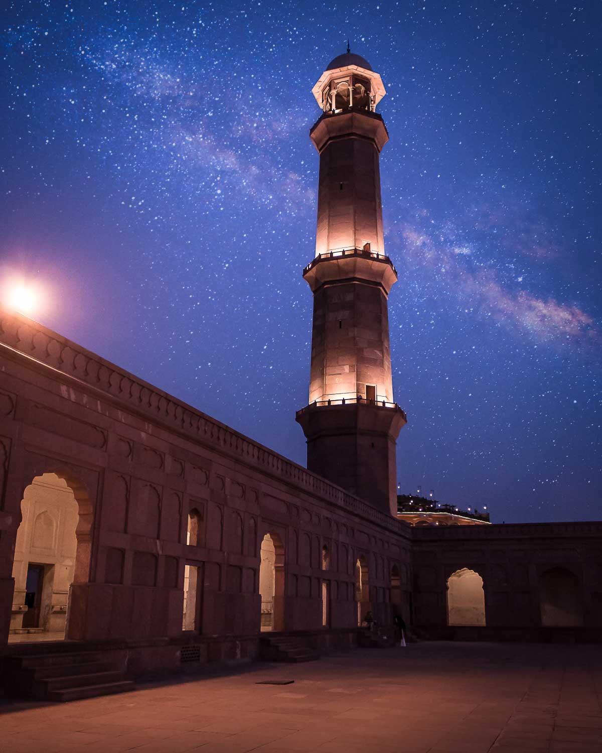
01
Shaping the Brand Strategy
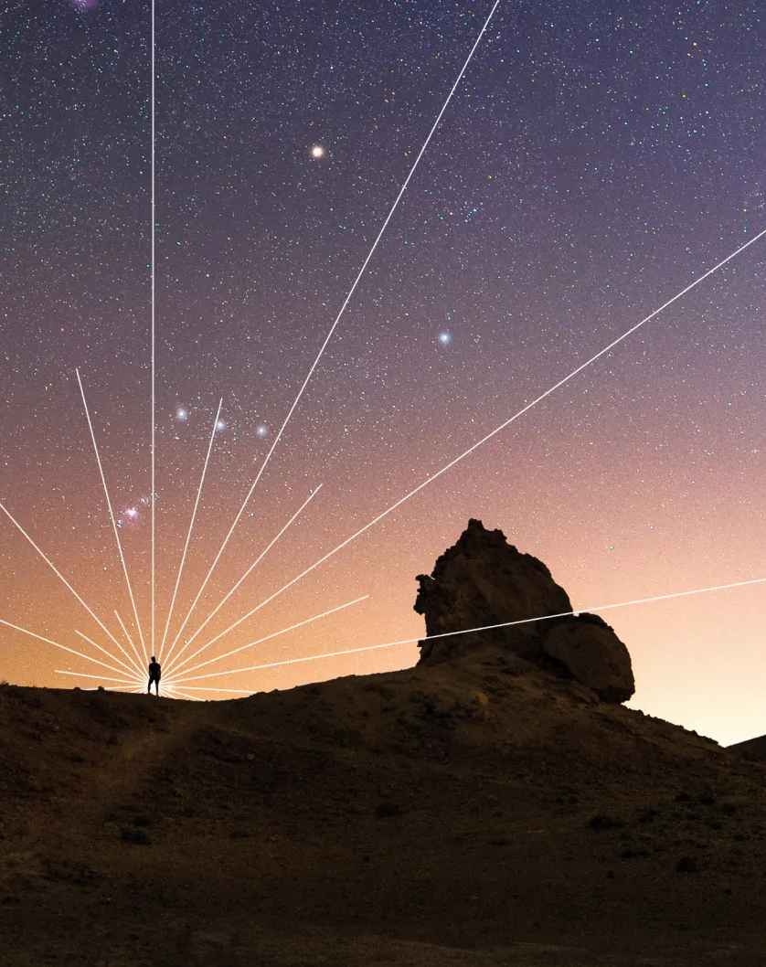
The Templeton Prize winners confront Big Questions that are not easy to address. We approached this rebrand with a big question of our own: Why was engagement waning?

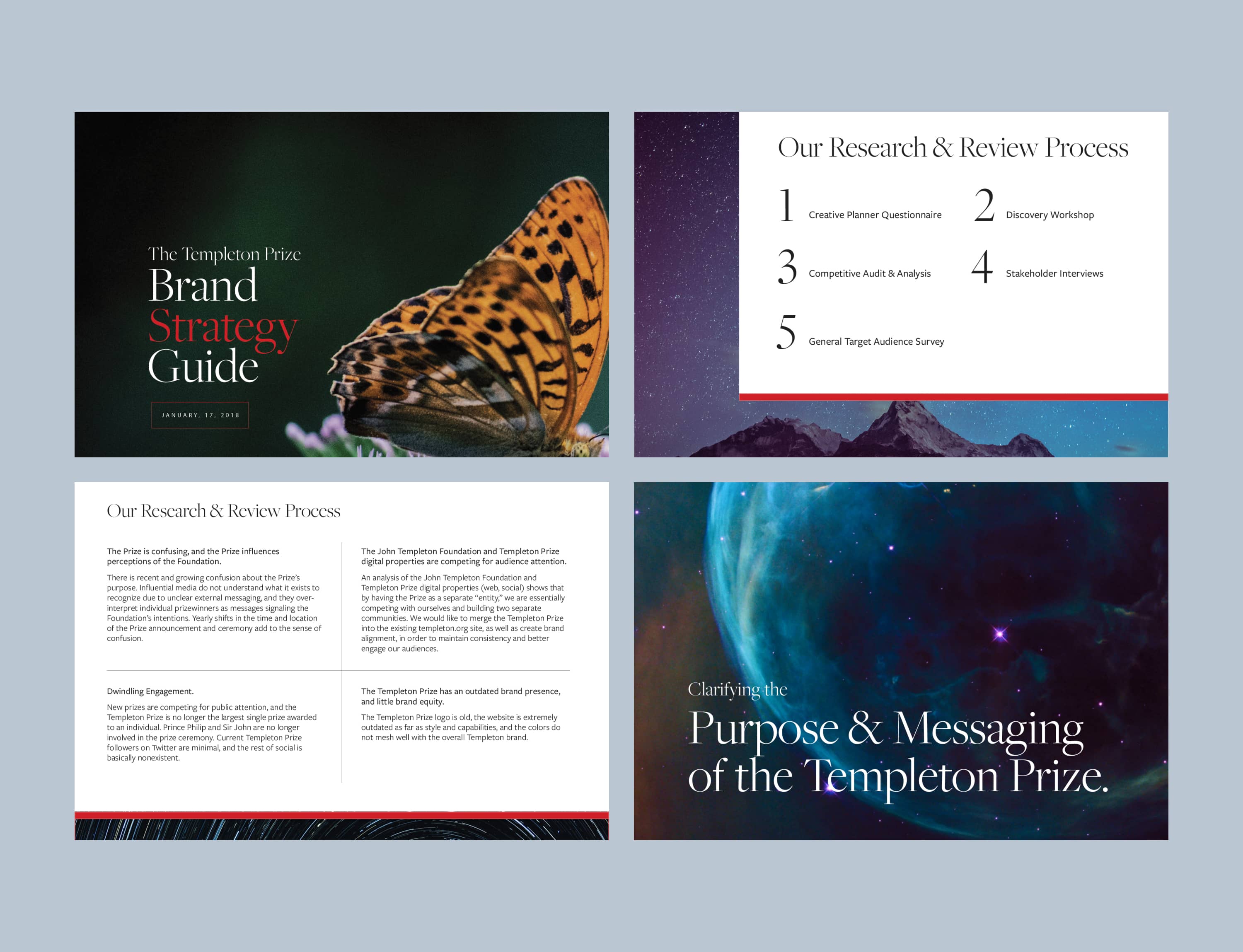
Challenge One: Lack of Brand Awareness
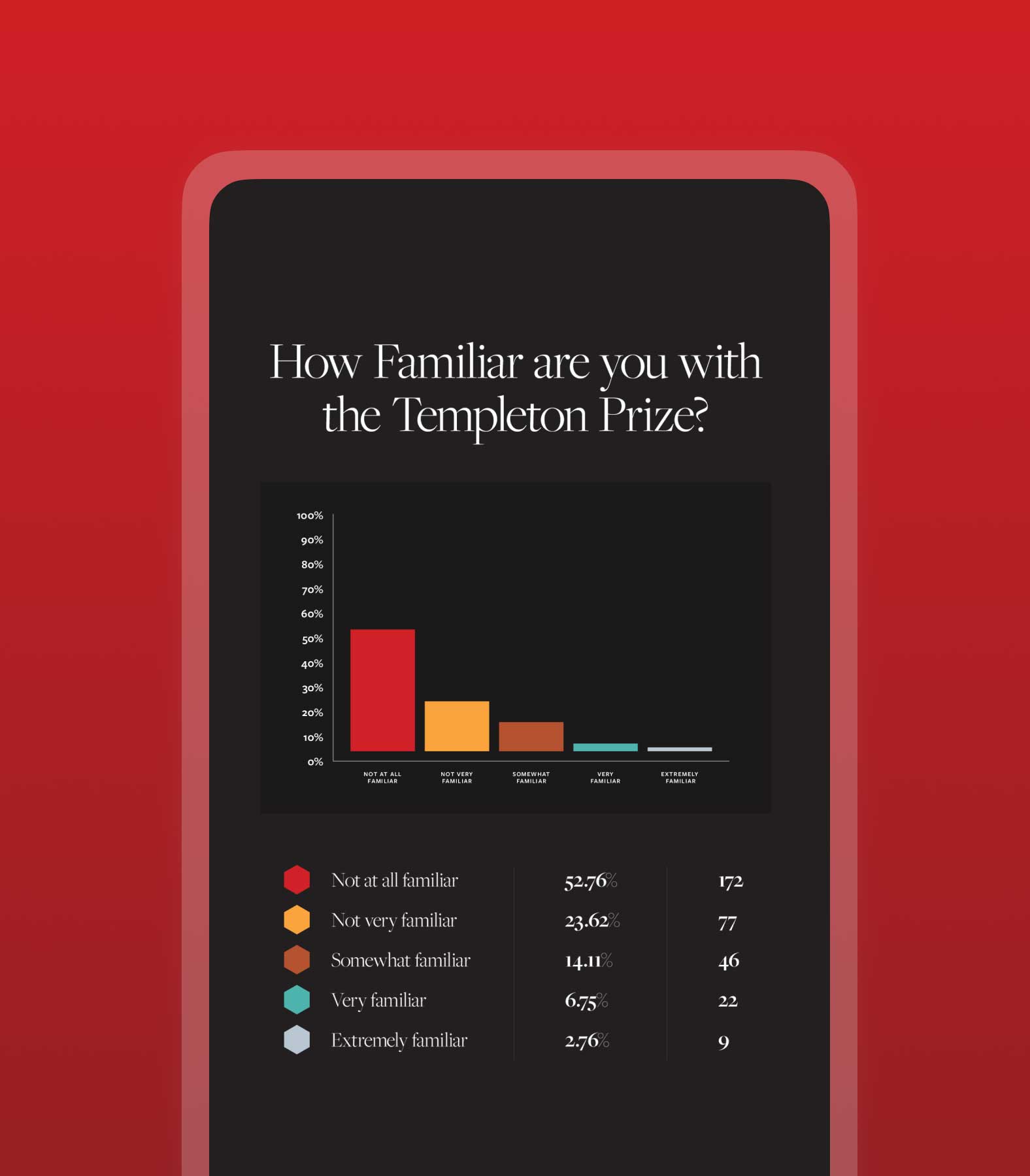
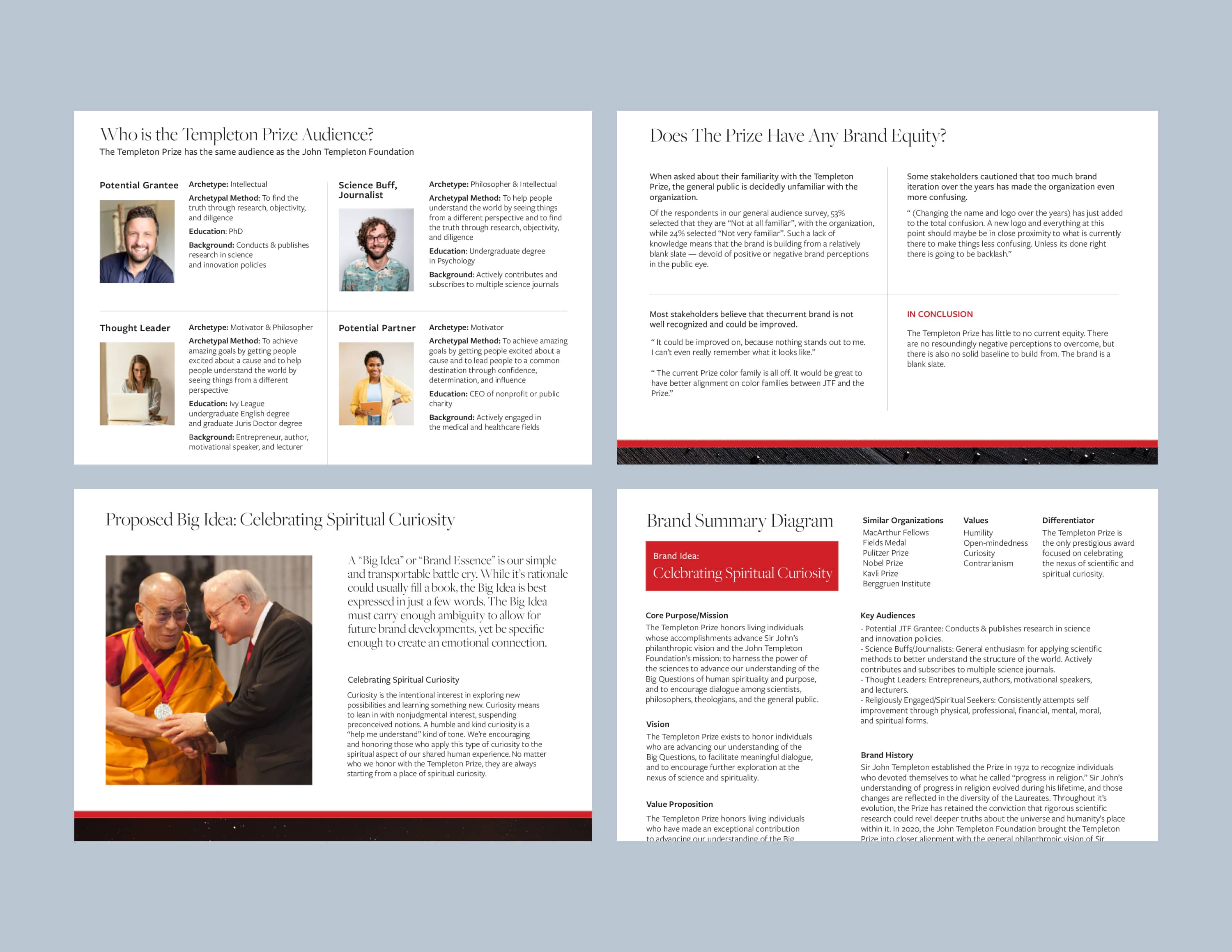
We embarked on a comprehensive discovery process that included surveys and interviews. We quickly found that over 50% of the public were “not at all familiar” with the Templeton Prize, while an additional 24% were “not very familiar.”

Challenge Two: Disappearing Enthusiasm
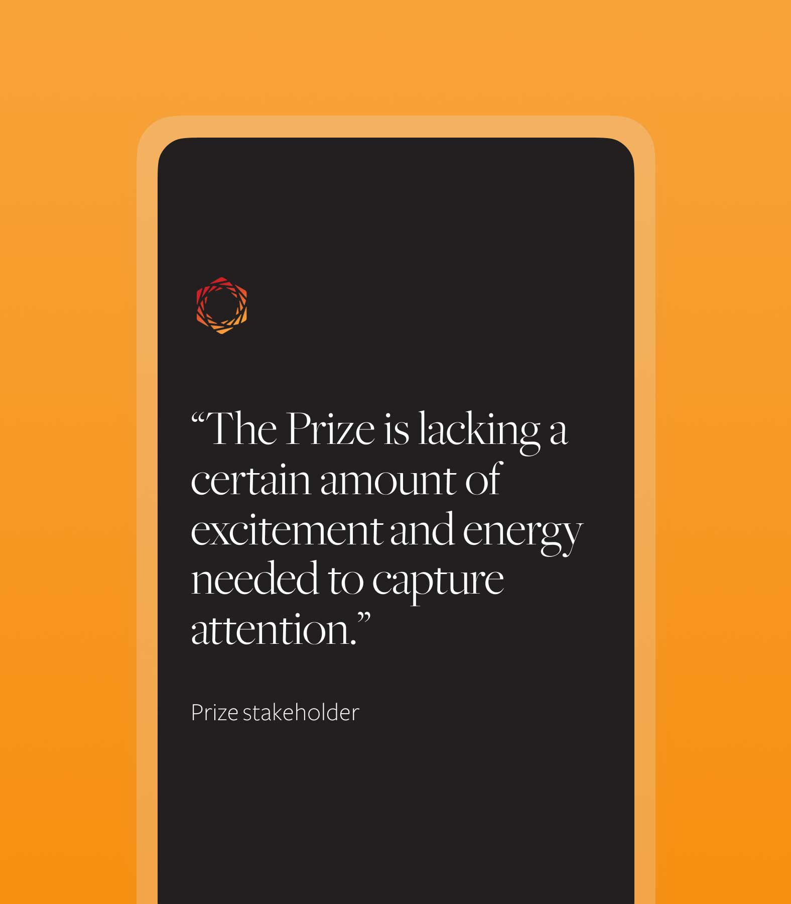
The Prize has a long, distinguished history, yet the brand has been losing equity and prestige over time, which is an indication of a larger public perception problem. To quote one Prize stakeholder: “The Prize is lacking a certain amount of excitement and energy needed to capture attention.”
Setting the Strategy
We reported back to the Prize team with a summary of our findings. We drafted a new "big idea," audience personas, and a messaging platform to lay a solid foundation for the future of the Prize.
02
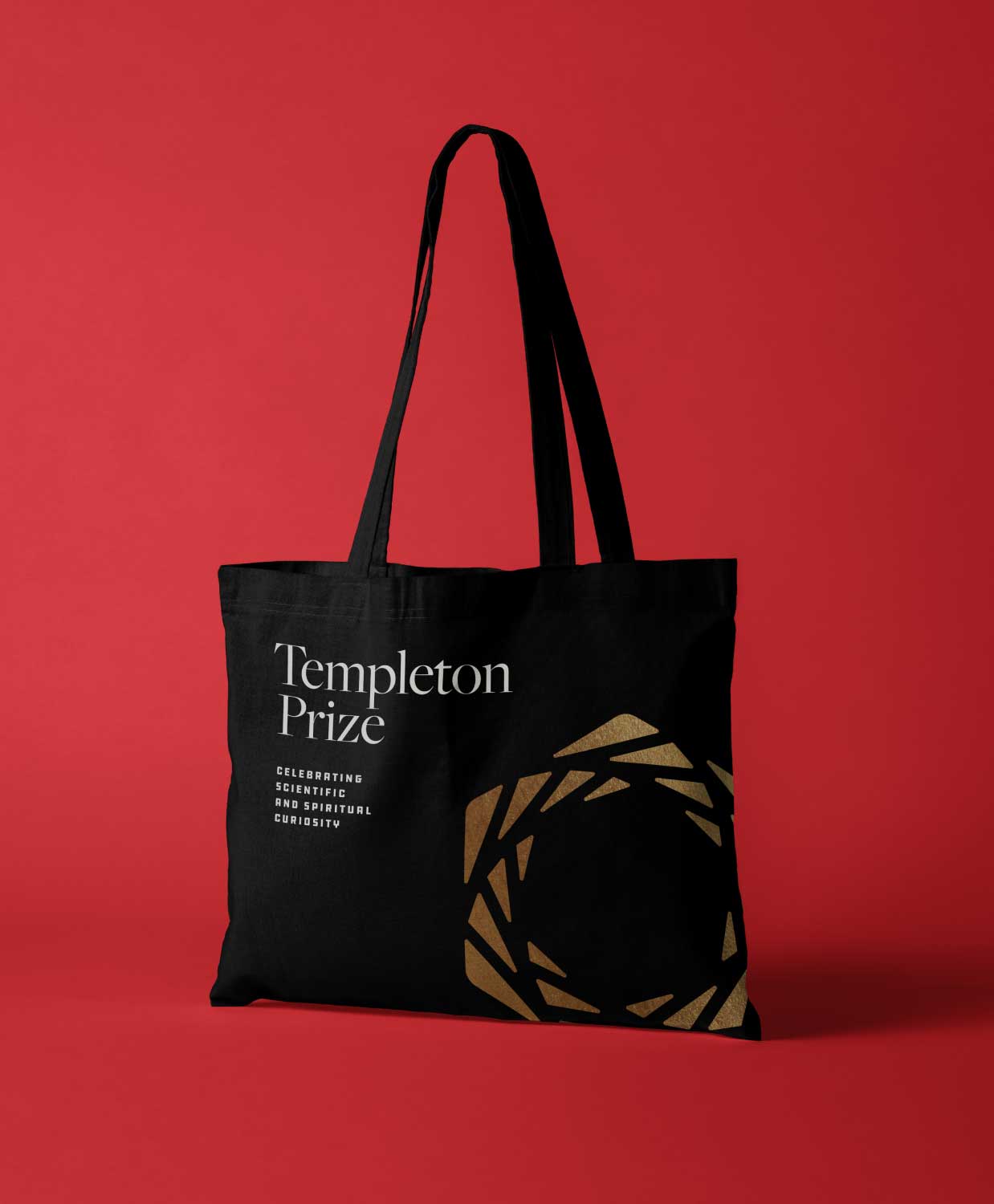
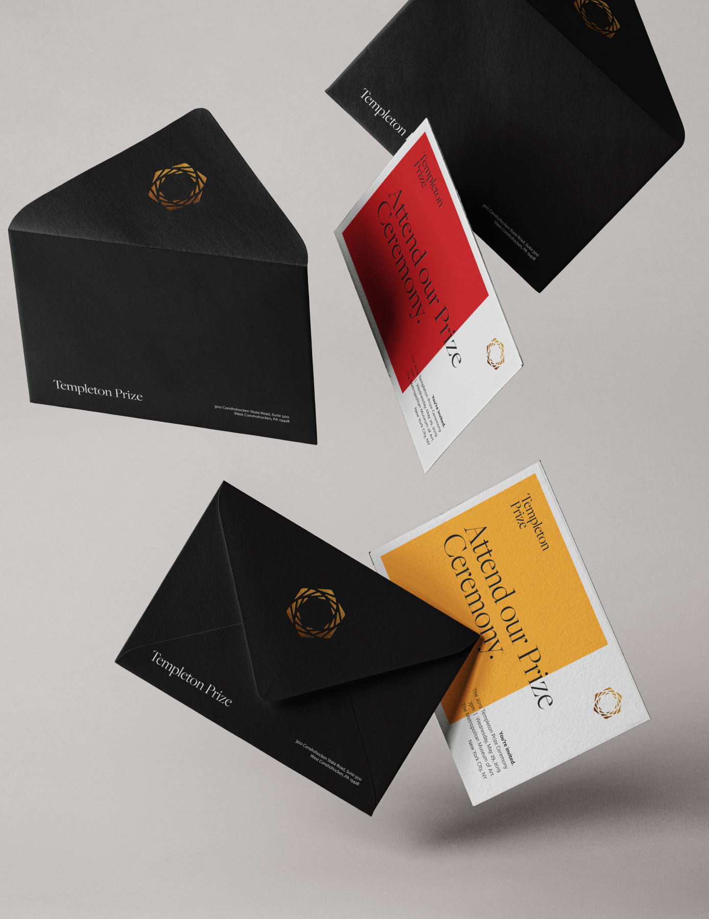
A Brand Identity, Reborn
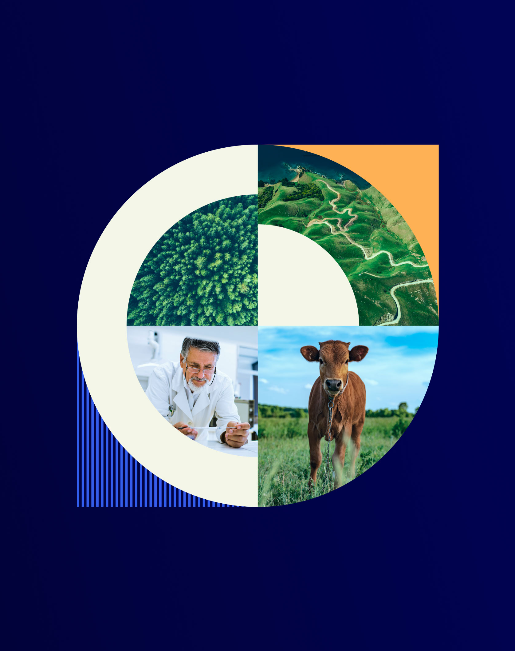
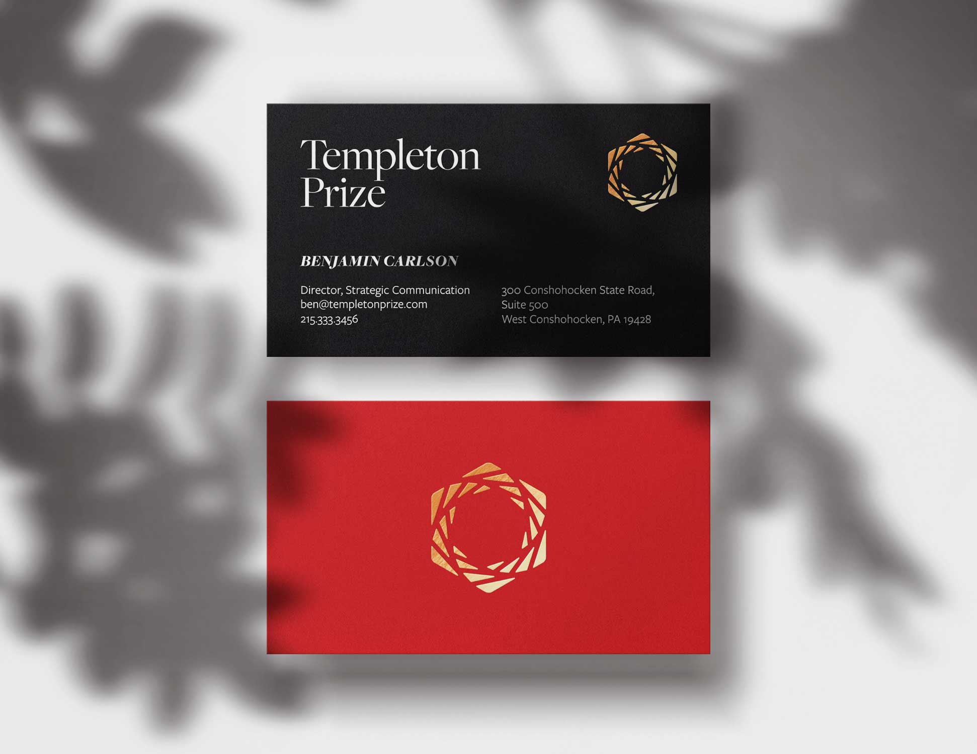
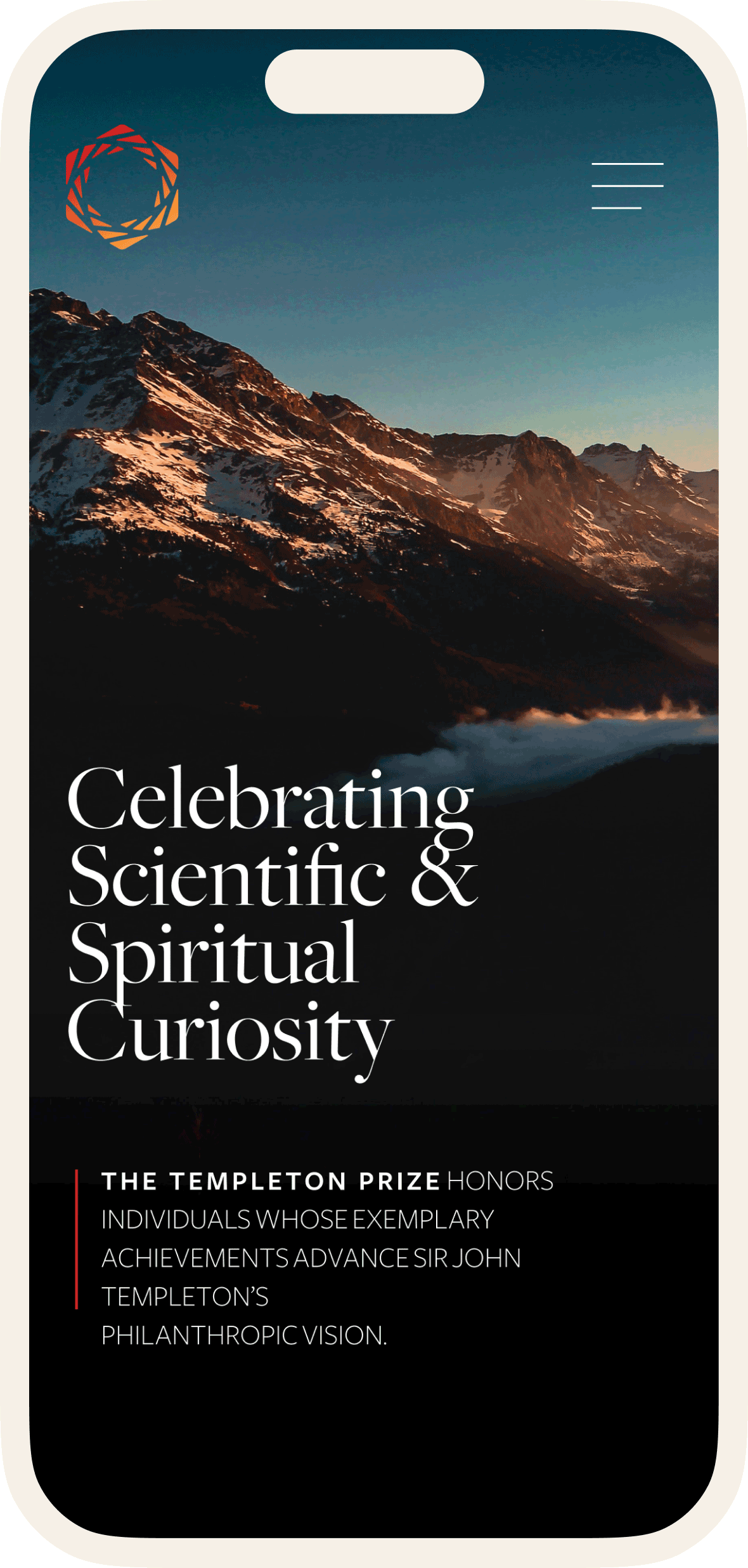
Equipped with a list of key findings from our discovery phase, we designed a new brand identity for the Templeton Prize that celebrates scientific and spiritual and curiosity.
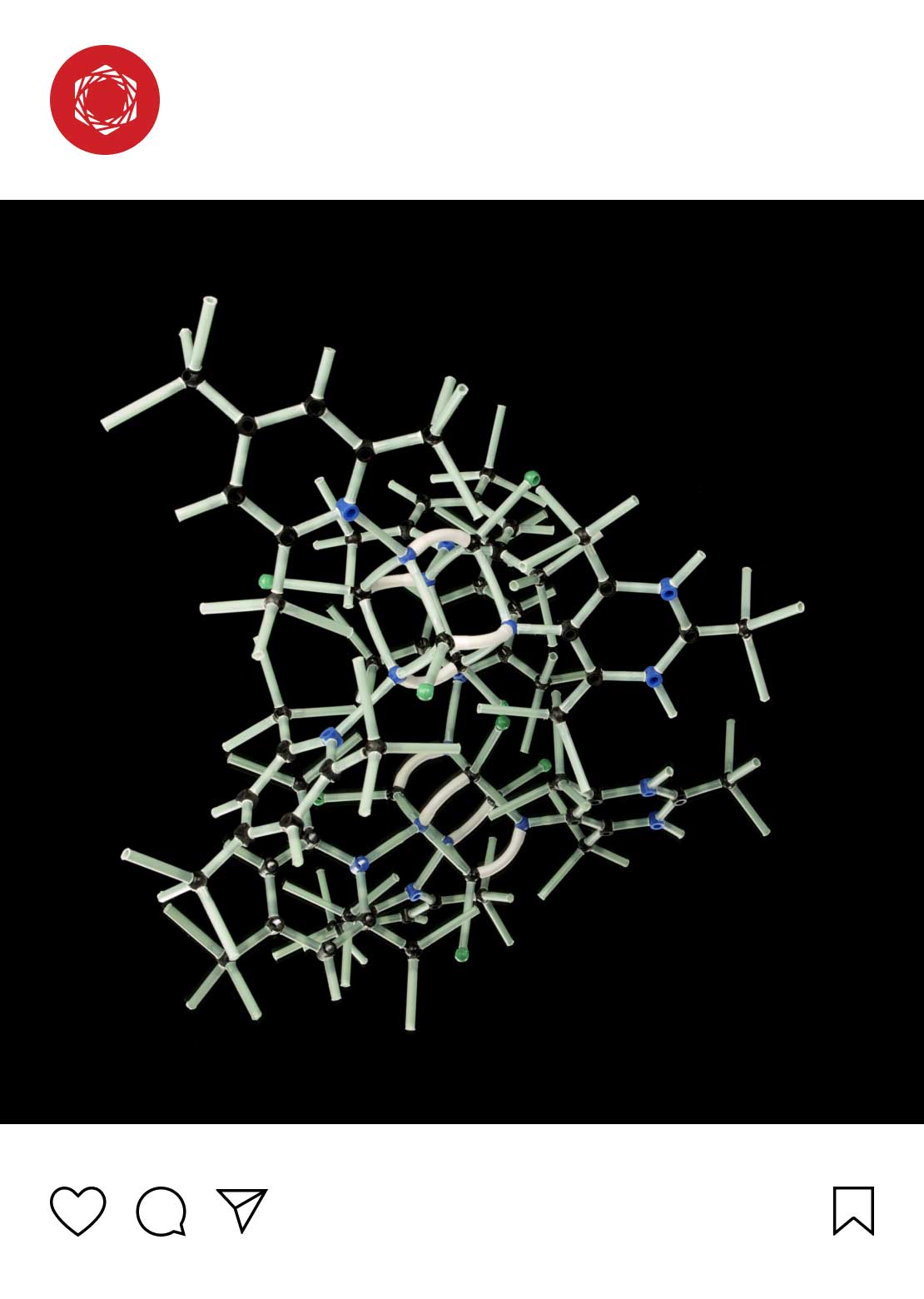
At the Nexus of Science and Spirituality
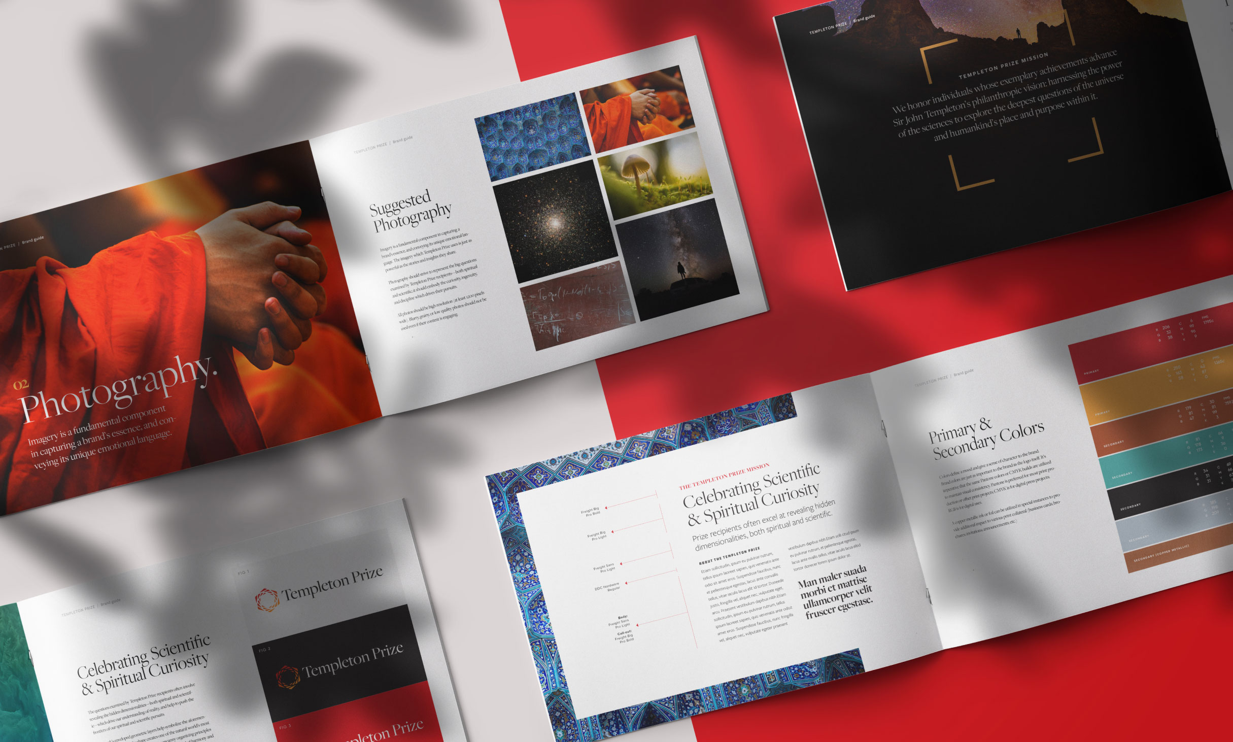
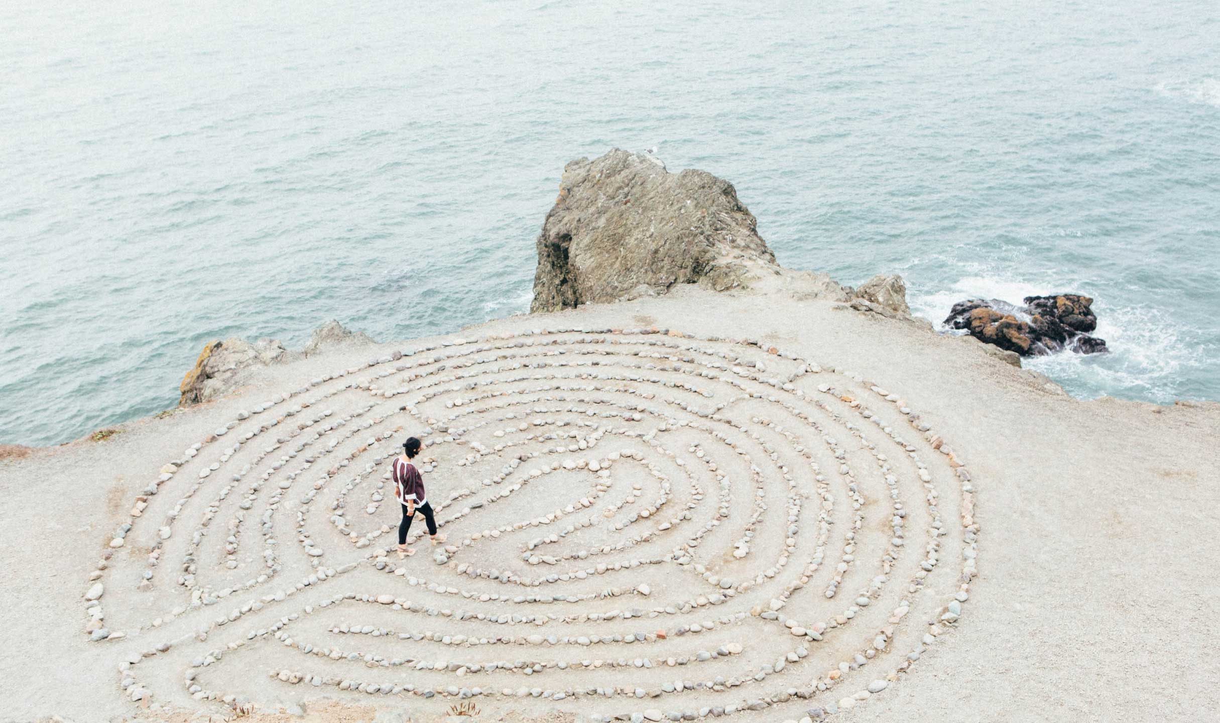
The final mark’s interwoven geometric layers symbolize the physical and metaphysical dimensions implicit in The Prize’s vision. Hexagons are classically revered for their strength, symmetry, and balance across scientific and spiritual disciplines, making it the ideal shape to define this brand’s bold and interdisciplinary mission.
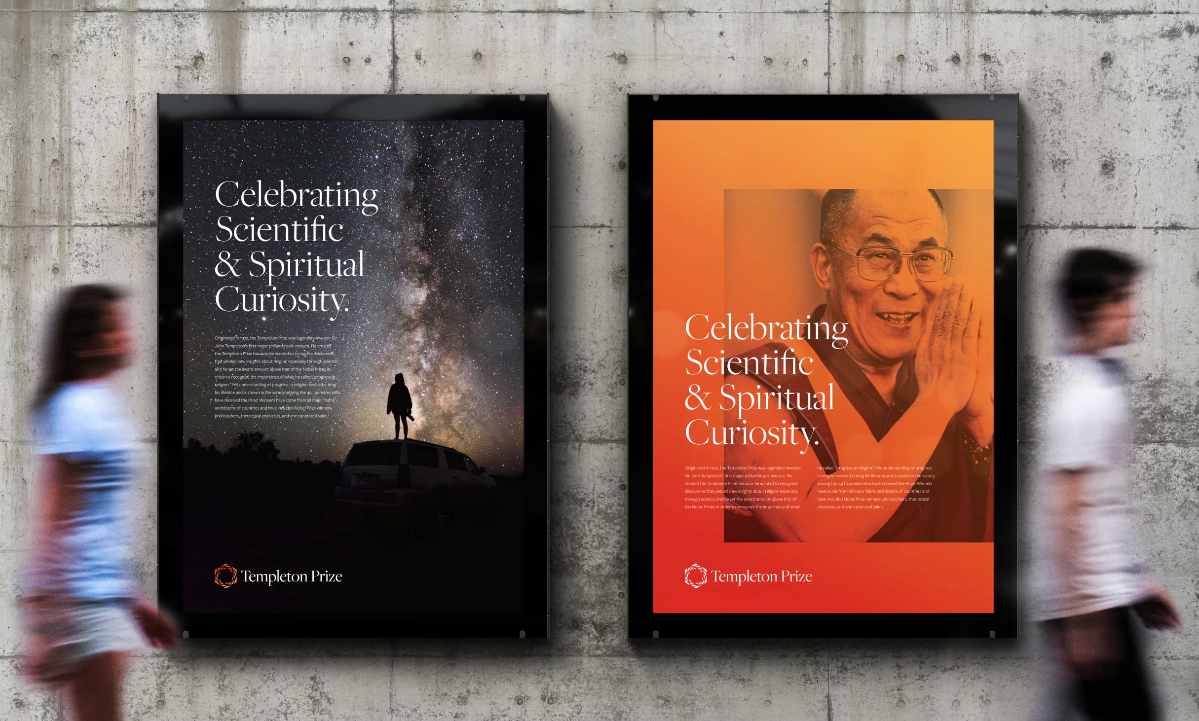


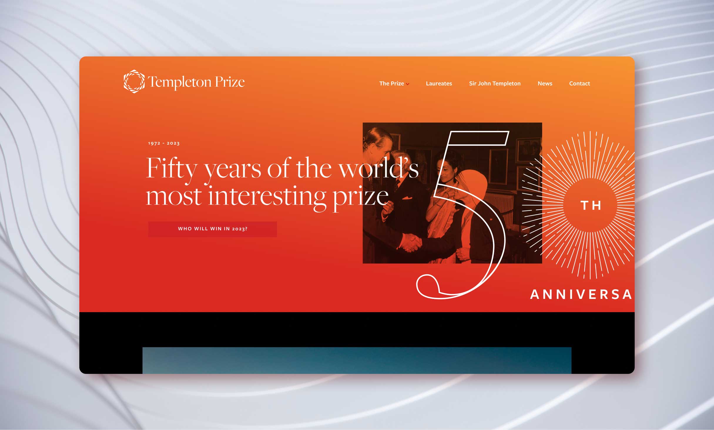
The World’s Most Interesting Prize
The brand toolkit is extensive, with clearly defied colors, fonts, photography, and graphic elements.
03
Building the Digital Strategy
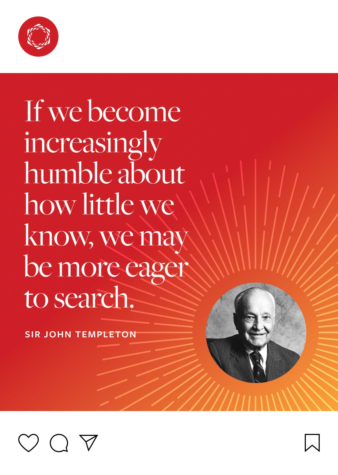
Our approach to designing the new Templeton Prize website could be boiled down to three words spoken by John Templeton himself: “enthusiasm for progress.” The Prize continues to recognize the world’s boldest thinkers, while promoting a sense of belonging and unity. The new web design reflects this noble mission—always bold, always modern, and never abandoning the needs of the audience.
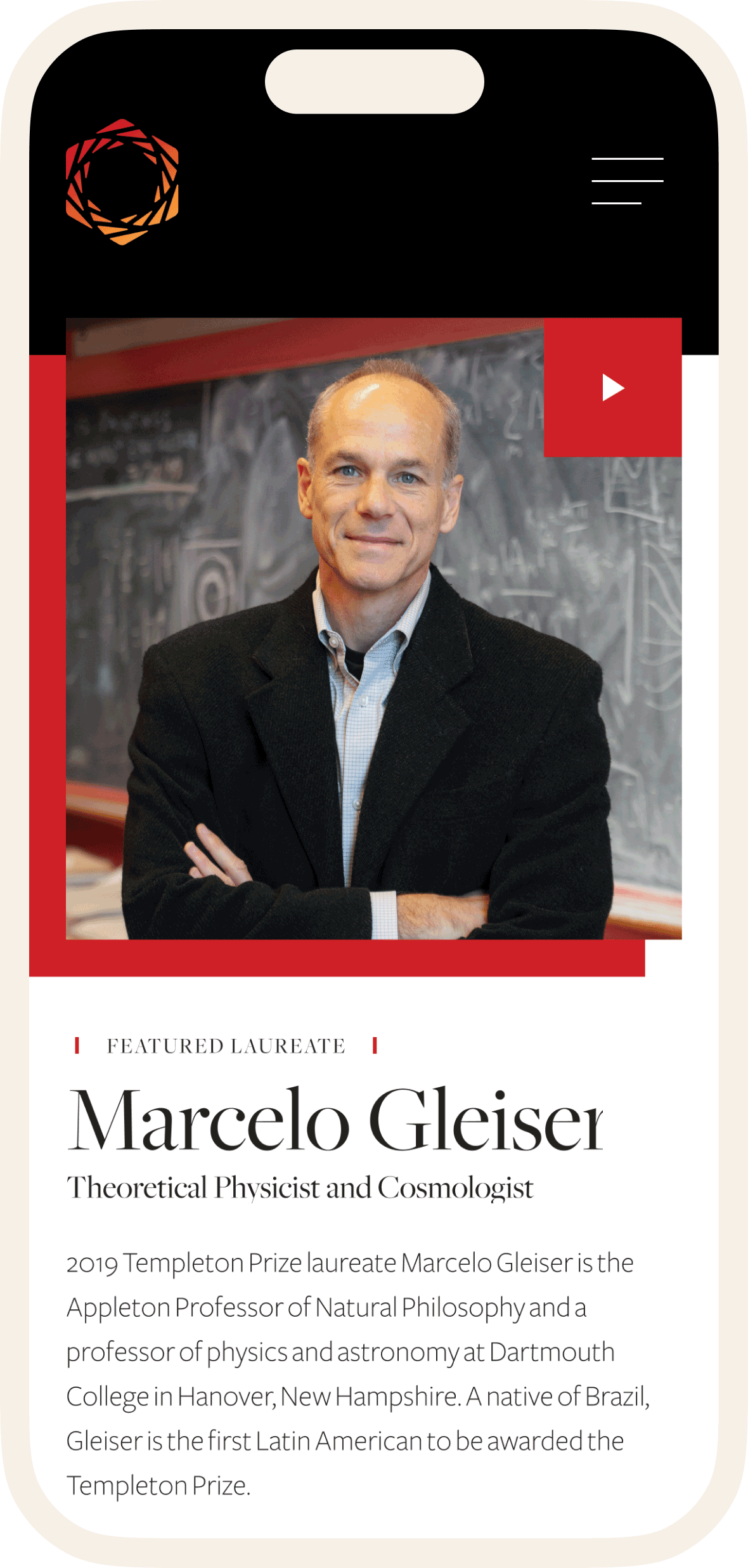
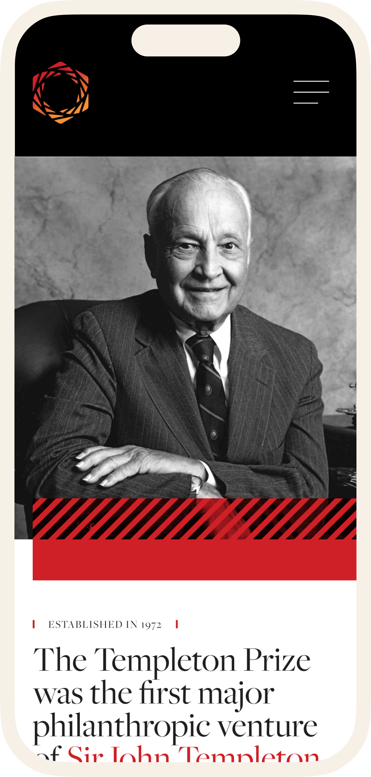
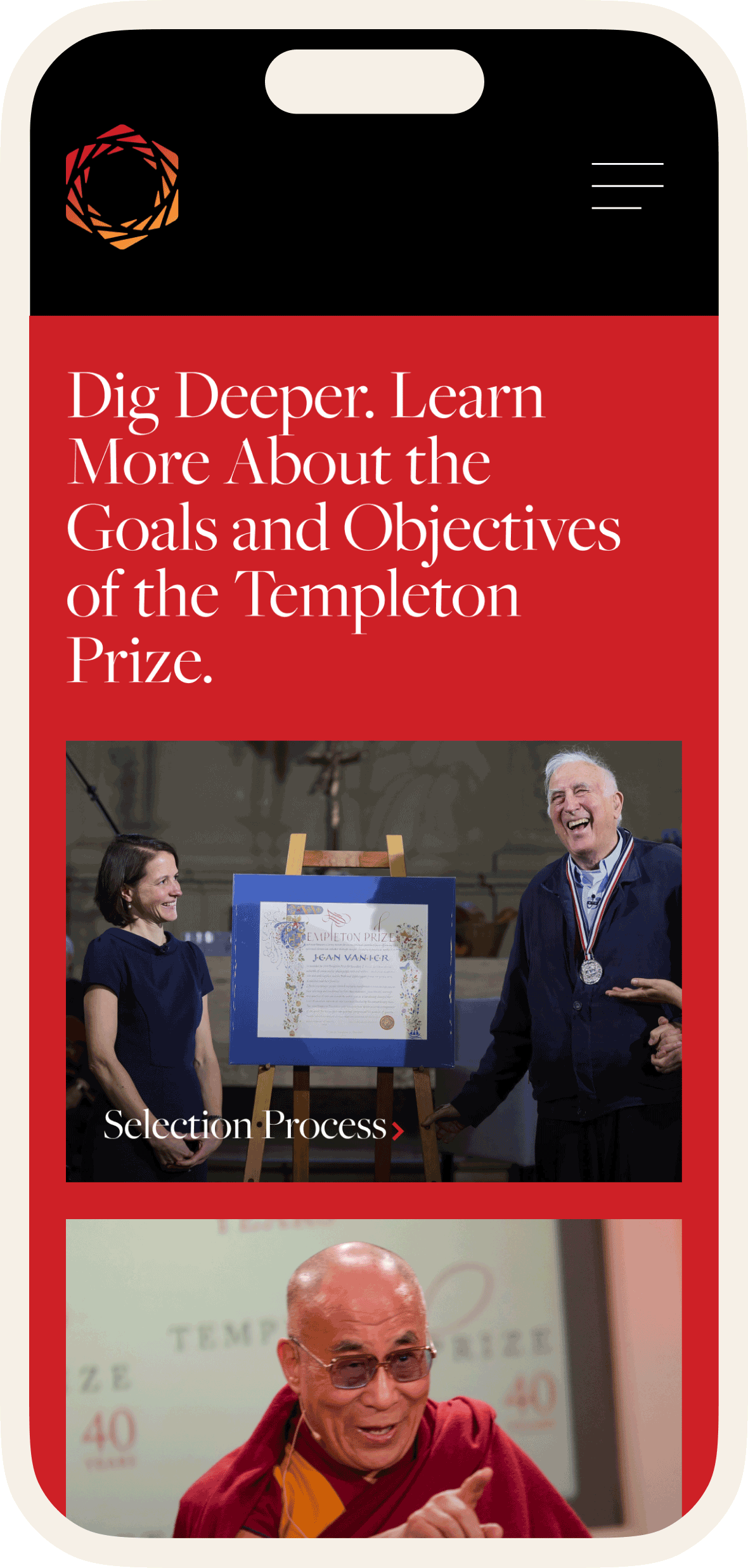
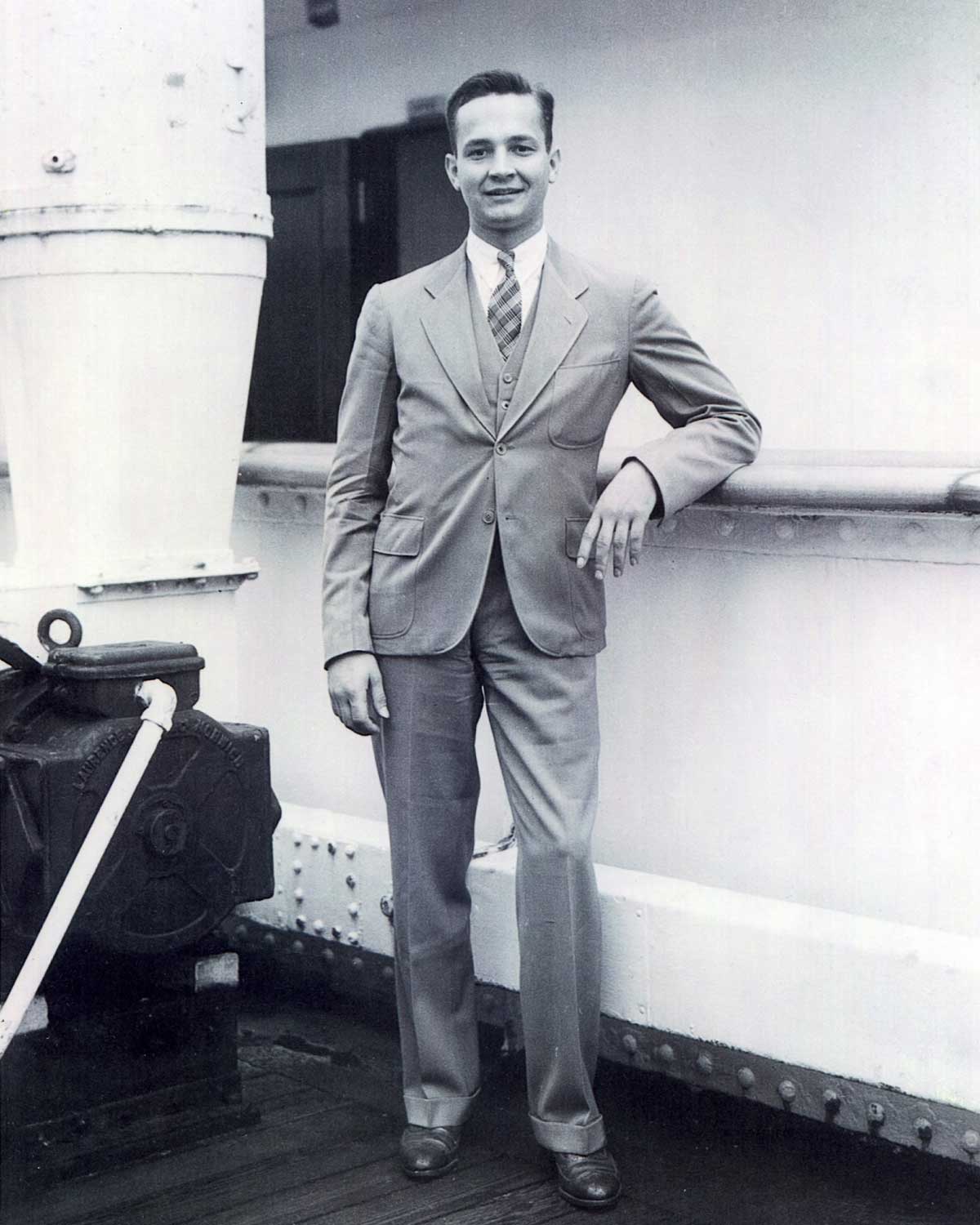
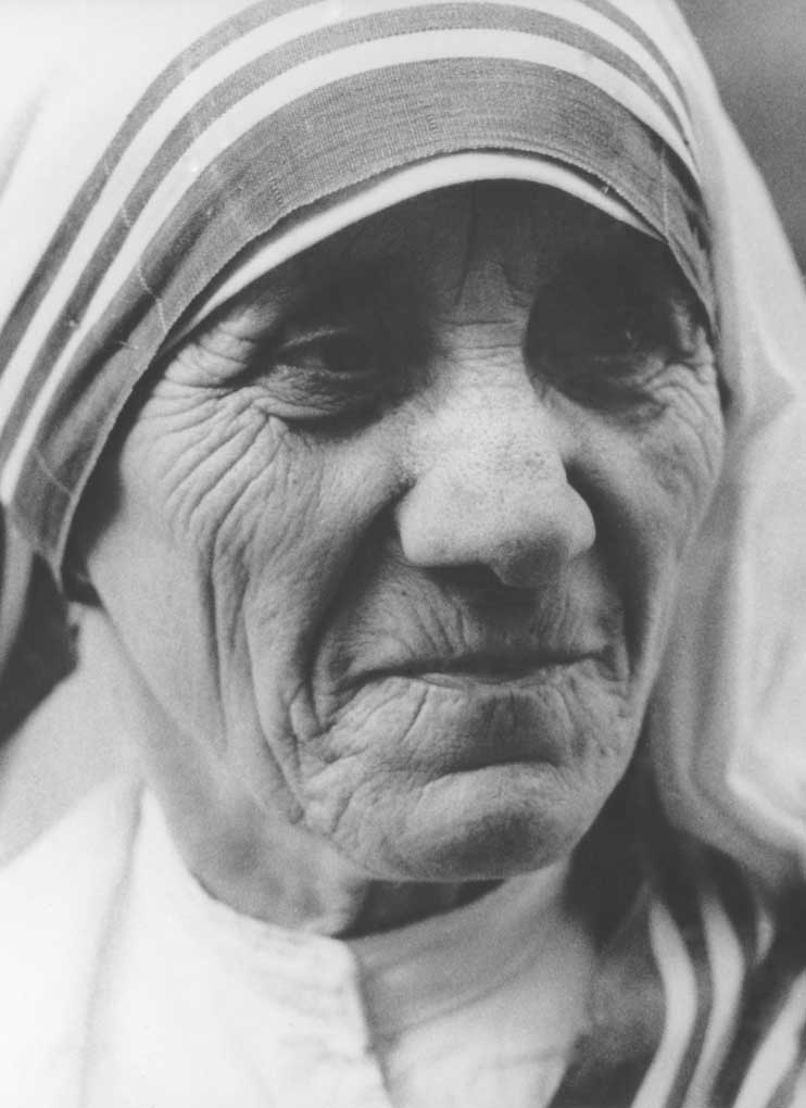
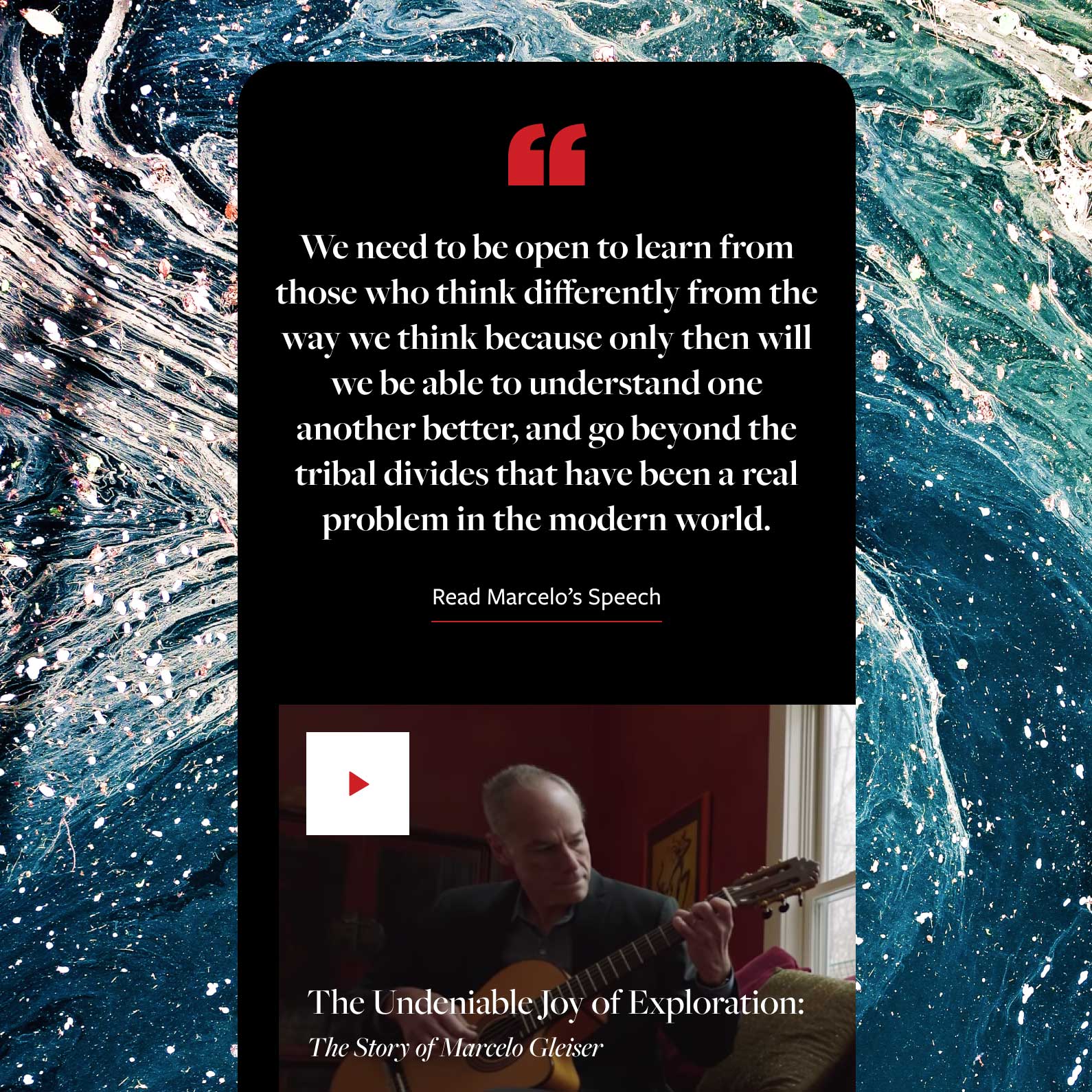
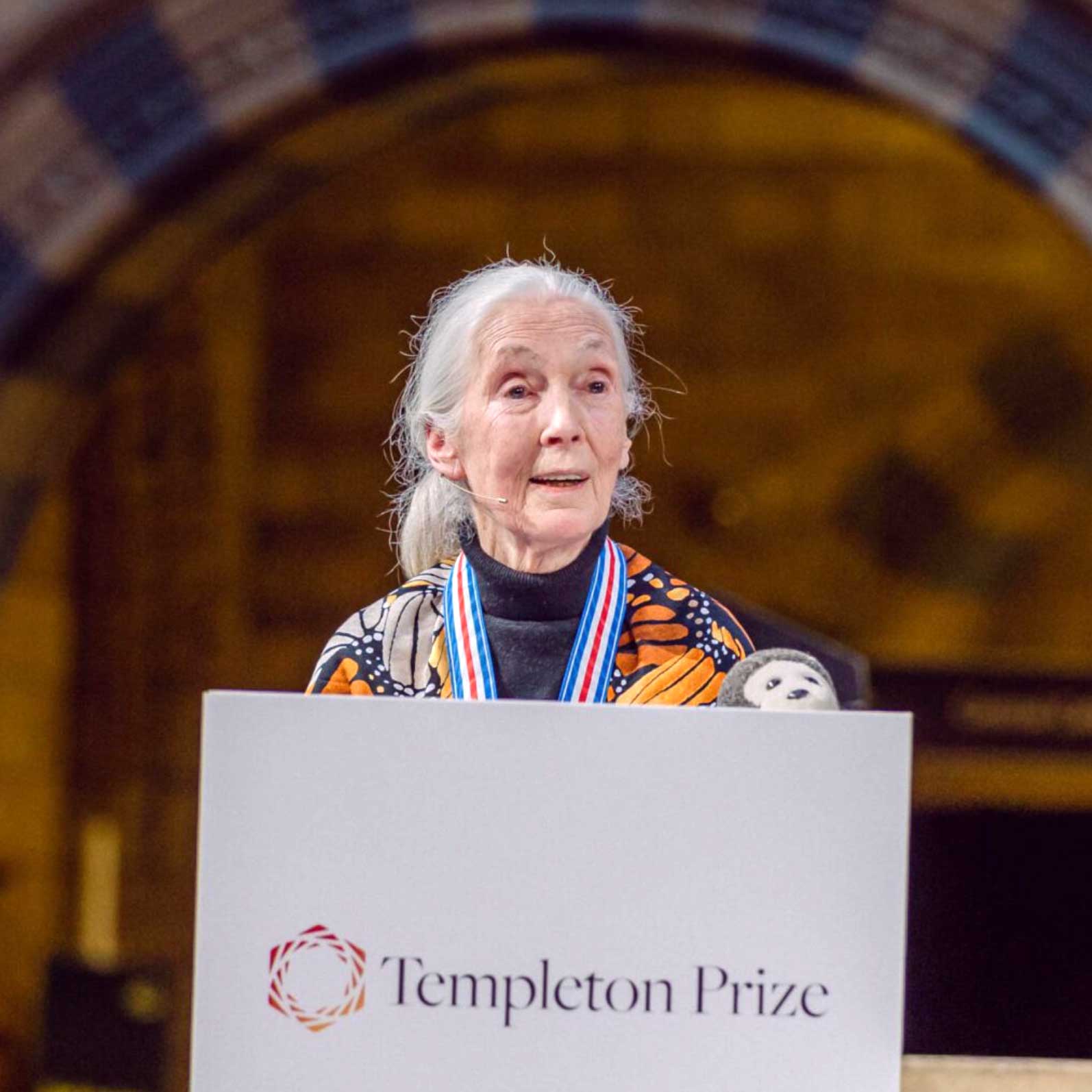
Celebrating Those That Confront Life’s Biggest Questions
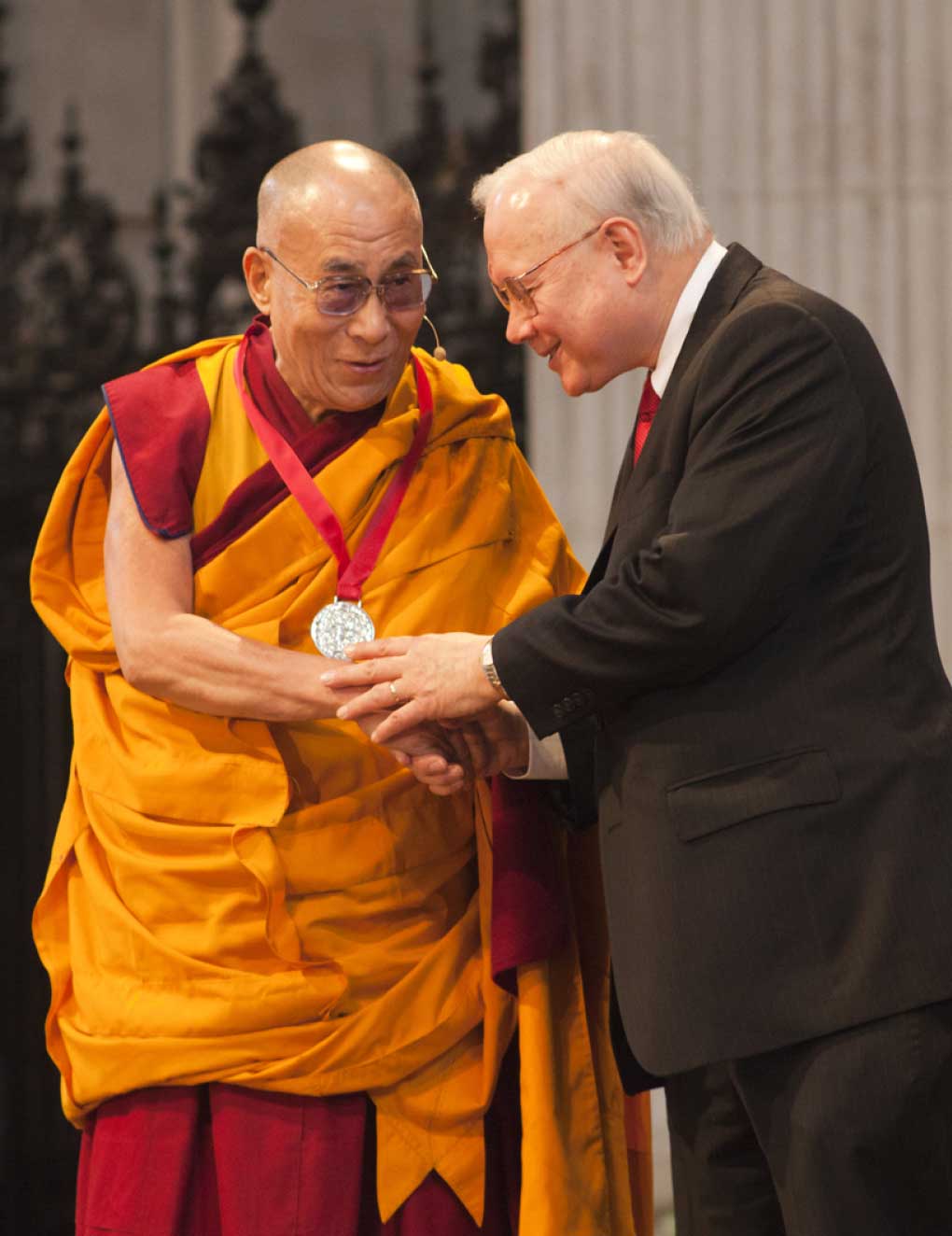
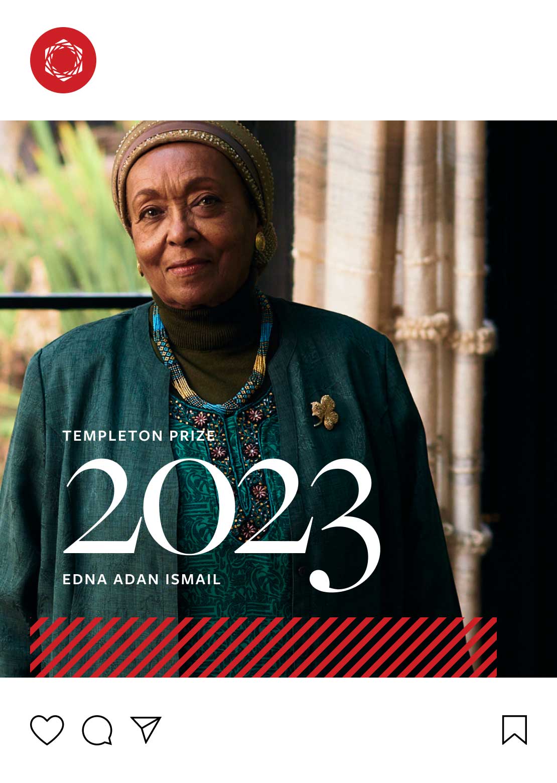
As we uncovered in our research, the distinguished laureates of the Prize carry an enormous amount of weight for the brand. To convey their importance, we designed bold pages to highlight each individual laureate and their notable achievements.

04
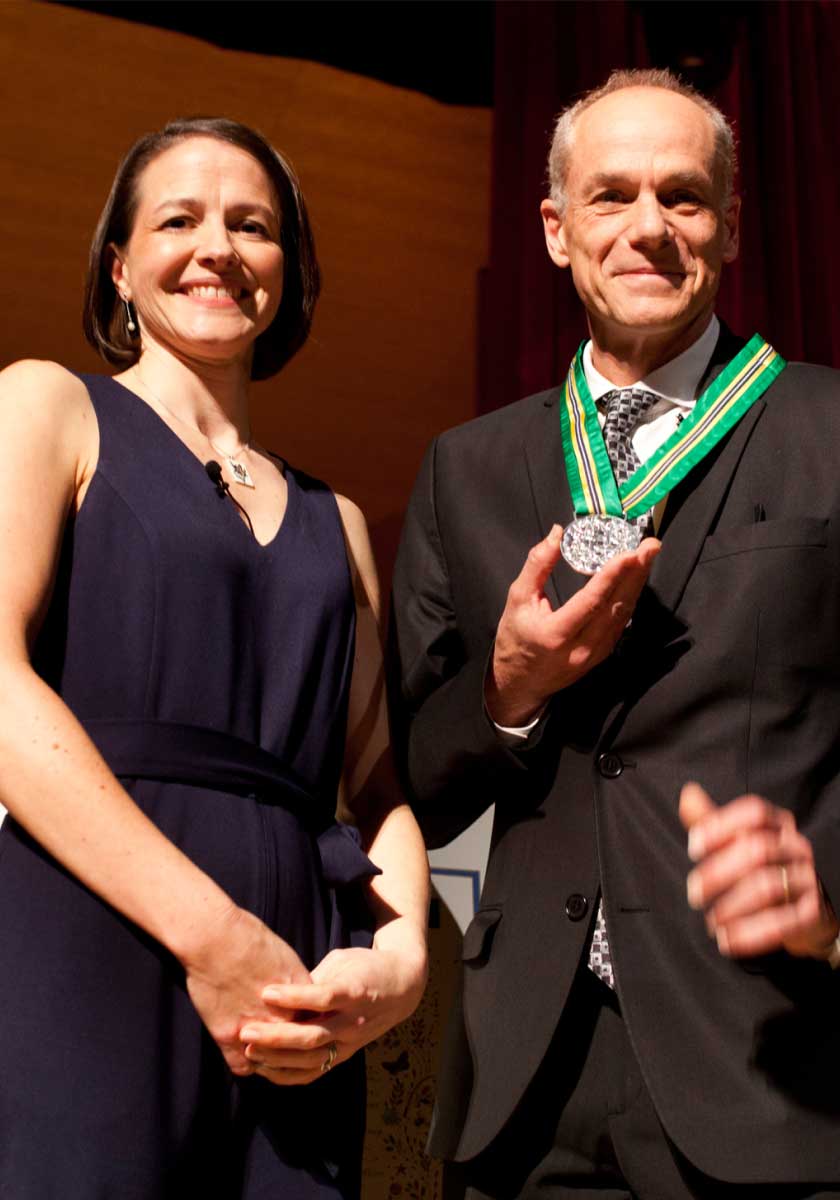
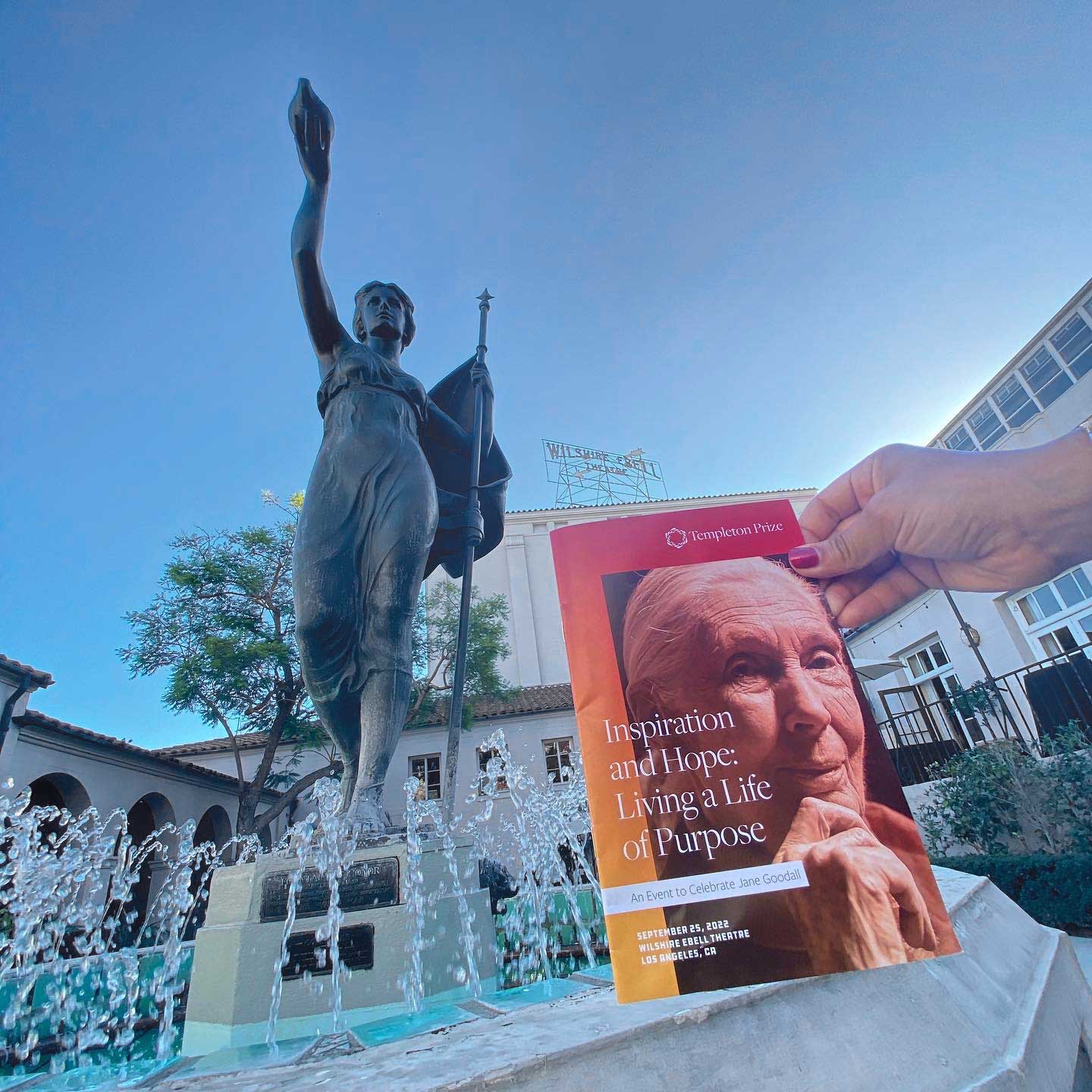
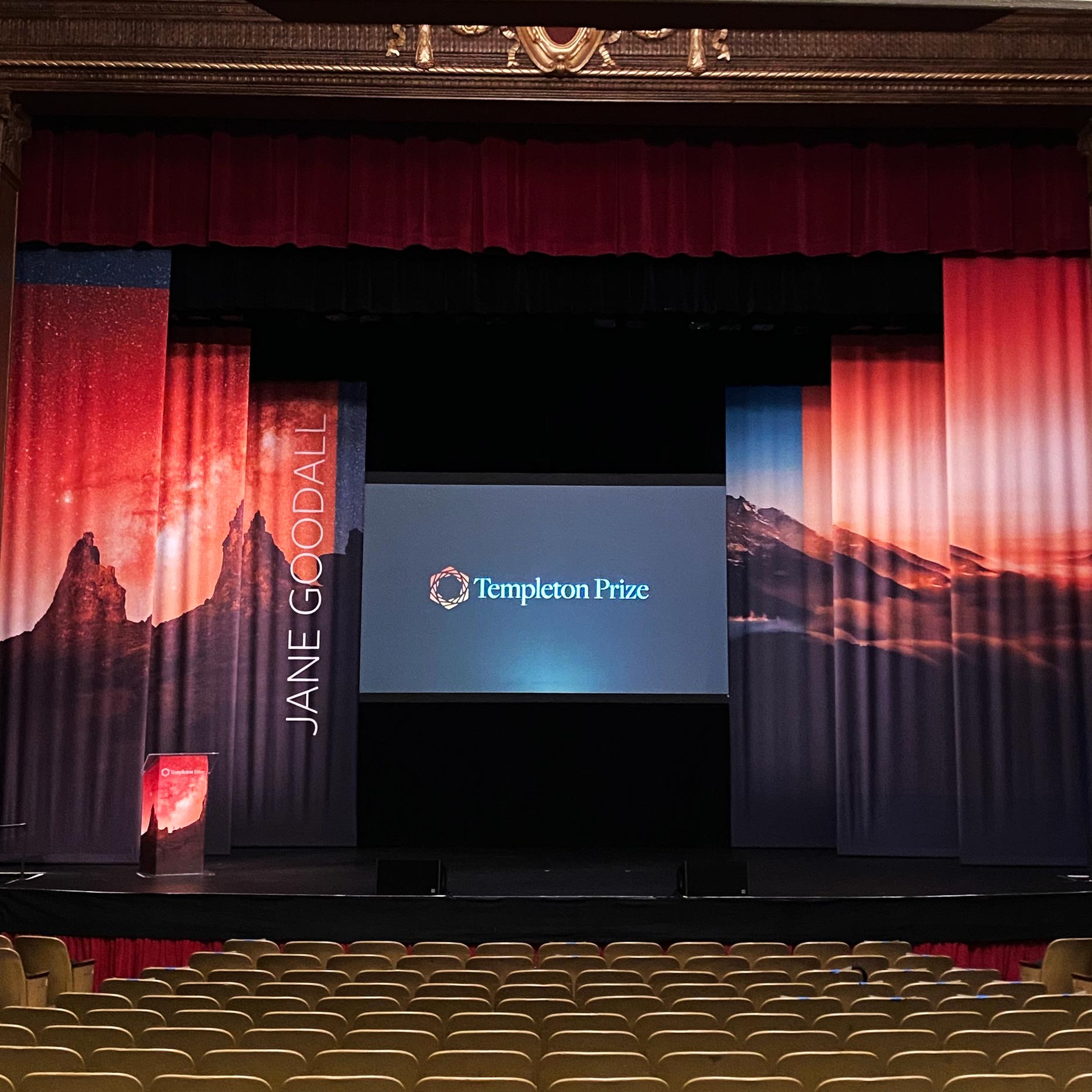
Ongoing Support
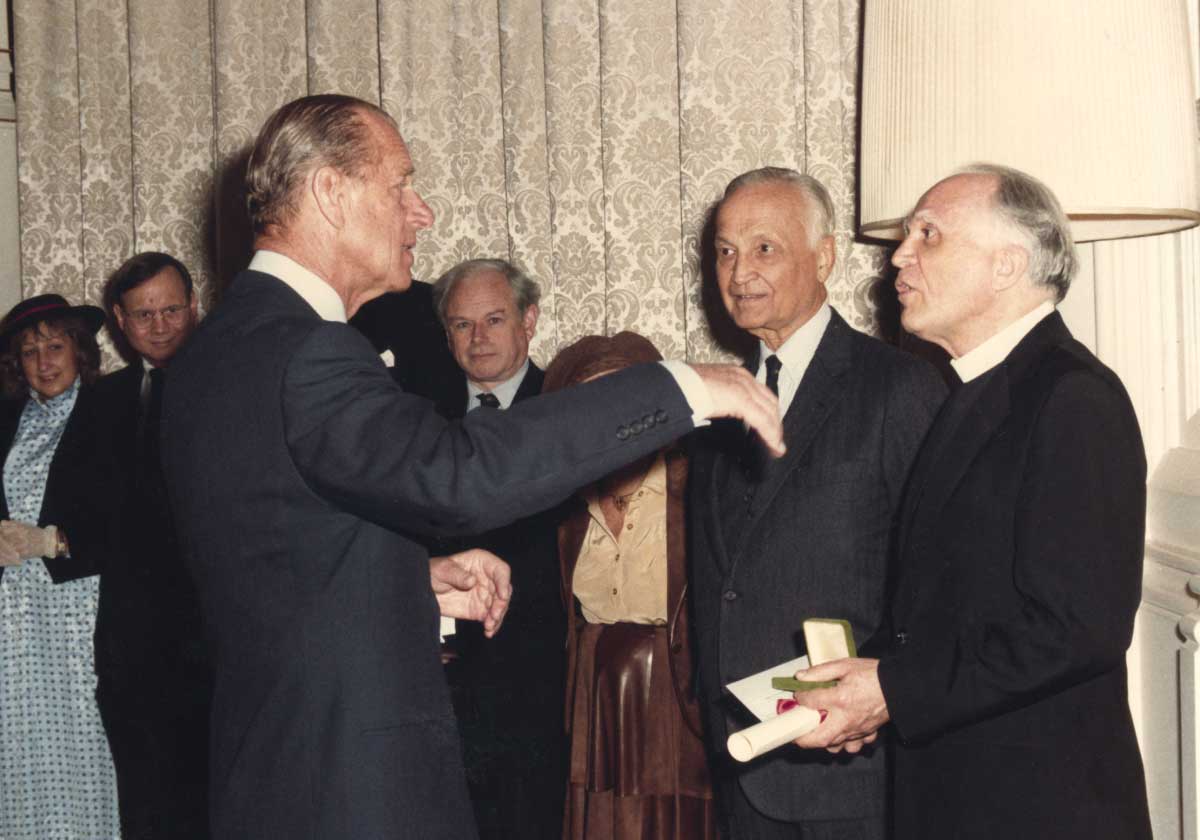
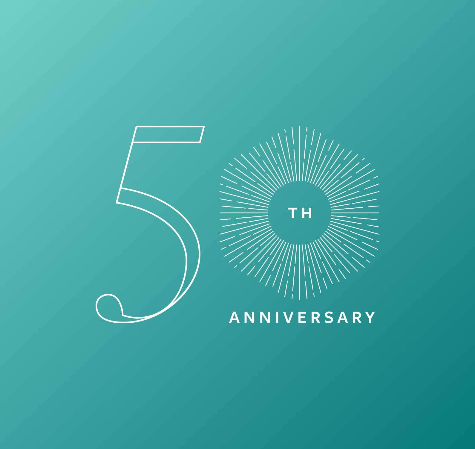
Push10 continues to support the Templeton Prize yearly award announcement. From digital and printed materials to a special 50th anniversary graphic, we continue to help create buzz and enthusiasm around the work of each new laureate.
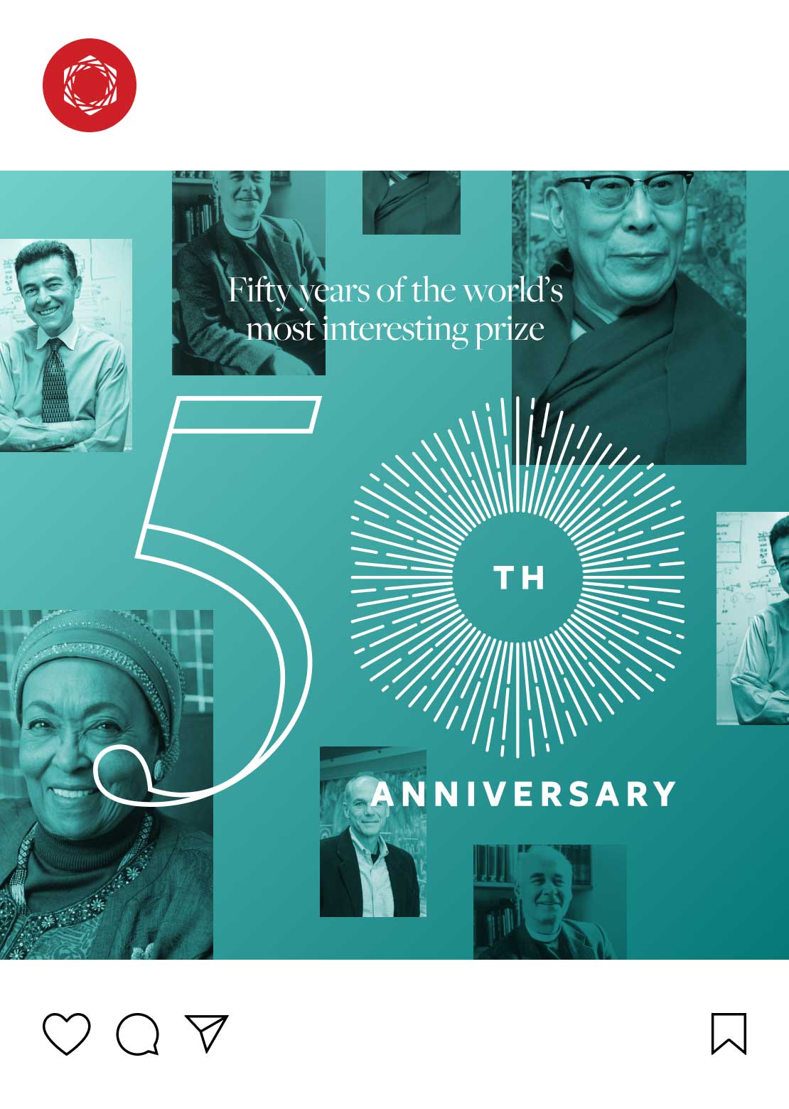
Giving shape to Templeton Prize’s brand and web design was a testament to how marketing can address bigger organizational challenges. I couldn’t be happier with the result, and neither could our fantastic clients.
Push10
Sabrina Pfautz, Partner + Creative Director
VISIT THE WEBSITEView Related Work

The Garrison Institute
Looking to expand their reach, the Garrison Institute approached Push10 to enhance and refresh their brand to help them build a more compassionate and resilient future.