BrightFarms

Ready. Set. Grow.

Web Design for Organic Food & Beverage Company

Quick Overview

The Background

BrightFarms is in the business of growth. That’s true for the pesticide-free greens they farm and for their own company goals, which is why they asked for our help to reimagine their website. With a fresh, new brand and healthy ambitions for this project, BrightFarms had a bold vision for their business. Thankfully, we had the tools to help them cultivate a beautiful new web design.

Push10 serves CPG clients via Aid&Abet, its specialized food and beverage branding agency. As part of an ongoing partnership, Aid&Abet is helping to refine and enhance the burgeoning family of brands, just like Bright Farms.

Reposition the Website

A shift in business focus from investors to customers means a shift in digital strategy to help the brand sell and scale.

Translate the New Brand

A new, interactive web design serves as a central home base to share an exciting new revitalized brand with the world.

Reimagine Local

A website that functions as a usable tool to find your favorite greens and connect to the local community of farmers that grow your food.

01

A Fresh Take on Digital Strategy

Like many companies, BrightFarms decided to rethink their web design because they reached an inflection point in their business. With funding secured and market traction rising every day, BrightFarms needed to reframe their site, focusing more on customers than investors. This goal was the focus of our digital strategy.

From a Sitemap

A shift in business strategy away from attracting investors toward appealing to customers required a fresh look at how BrightFarm’s website was structured. Considering multiple user journeys, we began on the bottom floor. We reinvisioned their sitemap to remain simple, but serve a drastically different audience profile.
Down to the Wireframes

Developing wireframes before launching straight into design lets us nail down the content strategy more efficiently and effectively. At this stage, we made sure the structure of BrightFarms’ brand story was effectively outlined in a website format.

Strategy Meets Empathy: The Busy, Health-Conscious Mom.

BrightFarms’ primary audience cares about value, responsibility, and quality – all while juggling her family’s busy lifestyle. This user was the foundation for our web strategy. By truly understanding what the primary user needs – what her goals are, what tasks she needs to complete, what she expects – we were able to craft a UX strategy to exceed expectations.

02

A Brighter Web Design

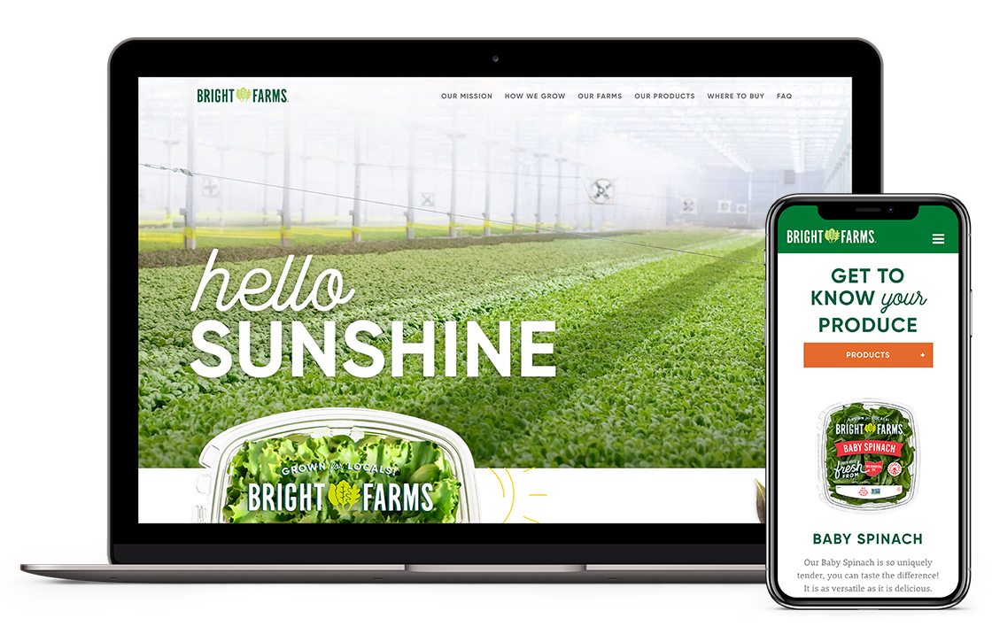
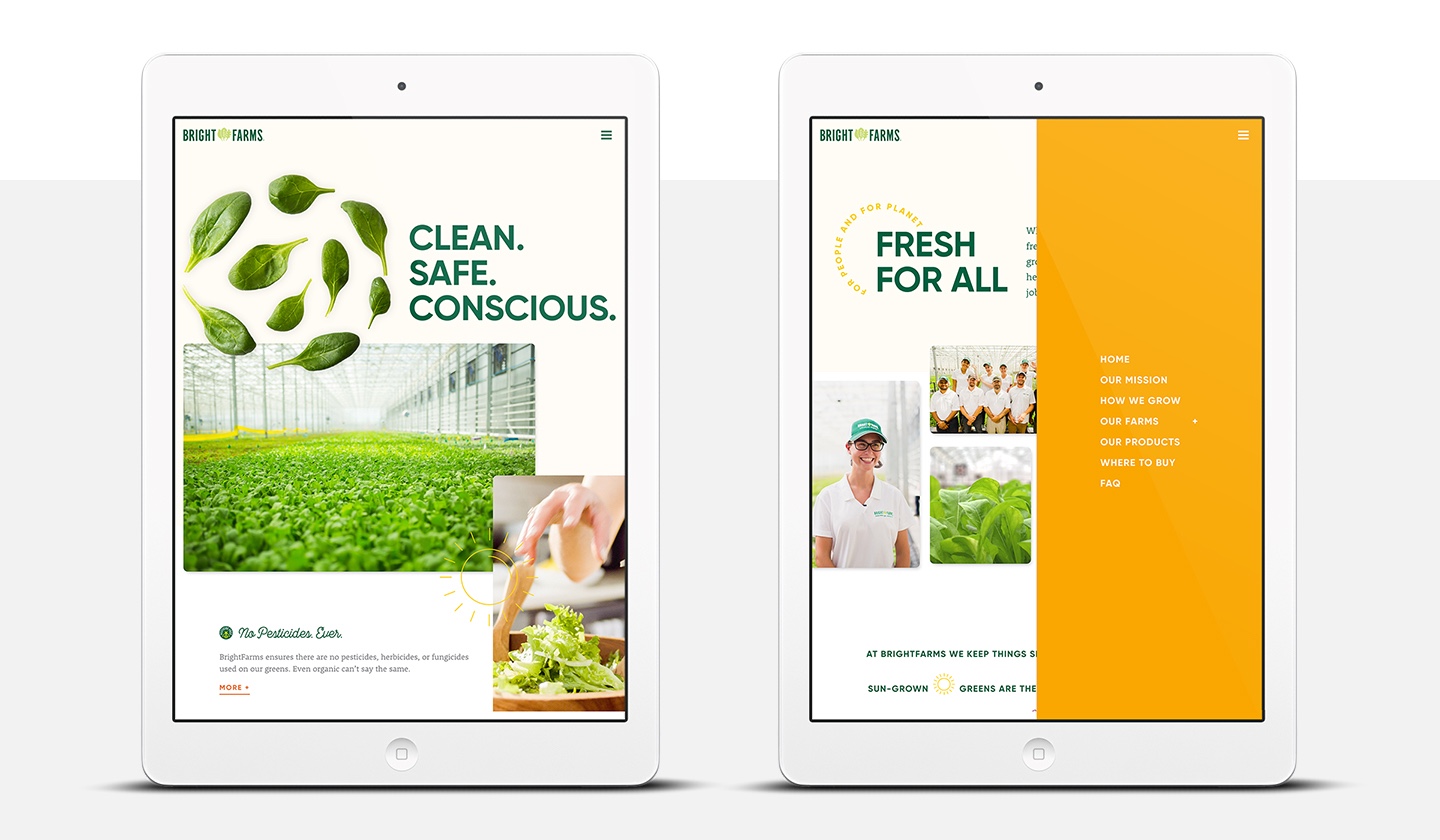
On the shelf, BrightFarms’ products win customers. And while their former website won investors, a shift in business strategy meant the new site had a different purpose. Translating package design to web design is not always a straightforward process. We accomplished this task by always returning to what makes BrightFarms so unique: their story. The final web design simply became a different vehicle to tell it.

Translating Brand Identity to Web

The visual brief we developed for this web project deconstructs the whimsy of BrightFarms’ packaging design and reimagines it for the digital space. It creates the cohesive brand experience customers have grown to expect on and offline.

Typography & Color

BrightFarms has a beautiful brand identity. Our task was to translate that brand into a stellar website that married smart UX strategy with pleasing UI design. The color palette and type pairings were square one for our design team.

Branded Color Palette for CPG Brand

Typography Design for CPG Brand

Used sparingly for high-impact, branded messaging.

Custom Typography Design for CPG Brand

The workhorse – used as a bold primary headline.

Typography Design for Organic Food & Beverage

A secondary typeface for paragraphs and long-form content.

Responsive Web Design for CPG Brands
03

Website Technology

Building the new BrightFarms.com was an exercise in making beautiful web strategy and design look effortless. It’s one thing to design stunning and functional desktop screens. It’s another to optimize them for all screen sizes, without losing the design’s integrity. This web design project successfully negotiated this and several other challenges through cutting-edge web development techniques.

Elegant Tech is Often Invisible

The art of building simple and functional websites requires a technical prowess that is often overlooked. For BrightFarms’ site, the effectiveness of its tech is in the details.

1
Smart opening load animation that doesn’t weigh the site speed down
2
Single-activation cookie policy for GDPR compliance
3
Forms seamlessly integrated with BrightFarms’ third-party CRM
4
Editable WordPress backend for easy content management

Greens Become Alive with Animation

Throughout the finished product, we developed SVG draw-in animations, micro-interactions, and other thoughtful animations to keep people engaged with the site. Functional? Yes. Undeniably delightful? Definitely. Animation allowed the whimsy of BrightFarms’ brand to come alive.

Helping the World
Find Fresh

We developed a custom “Store Finder” tool that brings customers even closer to BrightFarms’ delicious greens. Styled using official brand elements, the finder is an exercise of how tech and design can come together, resulting in a perfect solution for real-world business goals.

04

Greener Marketing Results

The new website launched to rave reviews, increased overall traffic, and a notable 10% gain in visitors who fit our “Busy Mom” demographic. Together, the site’s delightful animations, thoughtful user journey, engaging UI design, and memorable storytelling set a new standard for your local produce.

Food & Beverage Photography
Unique Pageview Increase
34k
Title
Together, the How We Grow and Our Mission pages now draw a large portion of the site’s traffic, showing that users are engaged with the BrightFarms story.
Mobile Traffic Increase
10%
The new site maintained a low bounce rate, and increased overall traffic to the Where to Buy interactive map.
Quote
Push10 did a fantastic job taking our vision and turning it into a reality. They immediately grasped the ‘soul’ of our brand and turned it into both a beautiful and engaging platform. It is an asset that I now feel proud to share!
– MARISSA ARGUELLES, SR. BRAND MANAGER, BRIGHTFARMS

More Like This

Brand Strategy // Package Design // Display Design

Push10 Arrow

UX Strategy // Web Design & Development // Illustration // Display Design // Photography

Push10 Arrow