01
A Bold & Inspiring Look
The website’s visual approach balances bold, action-oriented elements with soft, welcoming components to create depth and to invite Direct Support Professionals to engage with our site.


Dynamic Elements
We brought in circular shapes and arches that are derived from the curve of the star, as seen in Aurora’s logo. The arches, layered with the images of Direct Support Professionals, create a feeling of momentum and energy, and the arch symbolizes a dynamic “path” forward.

Personalized Iconography
We identified a library of icons that can be used to draw attention to key pieces of information. We’ve layered these icons with pops of color to tie them into the overall look and feel and to make them more substantial and eye catching.


02
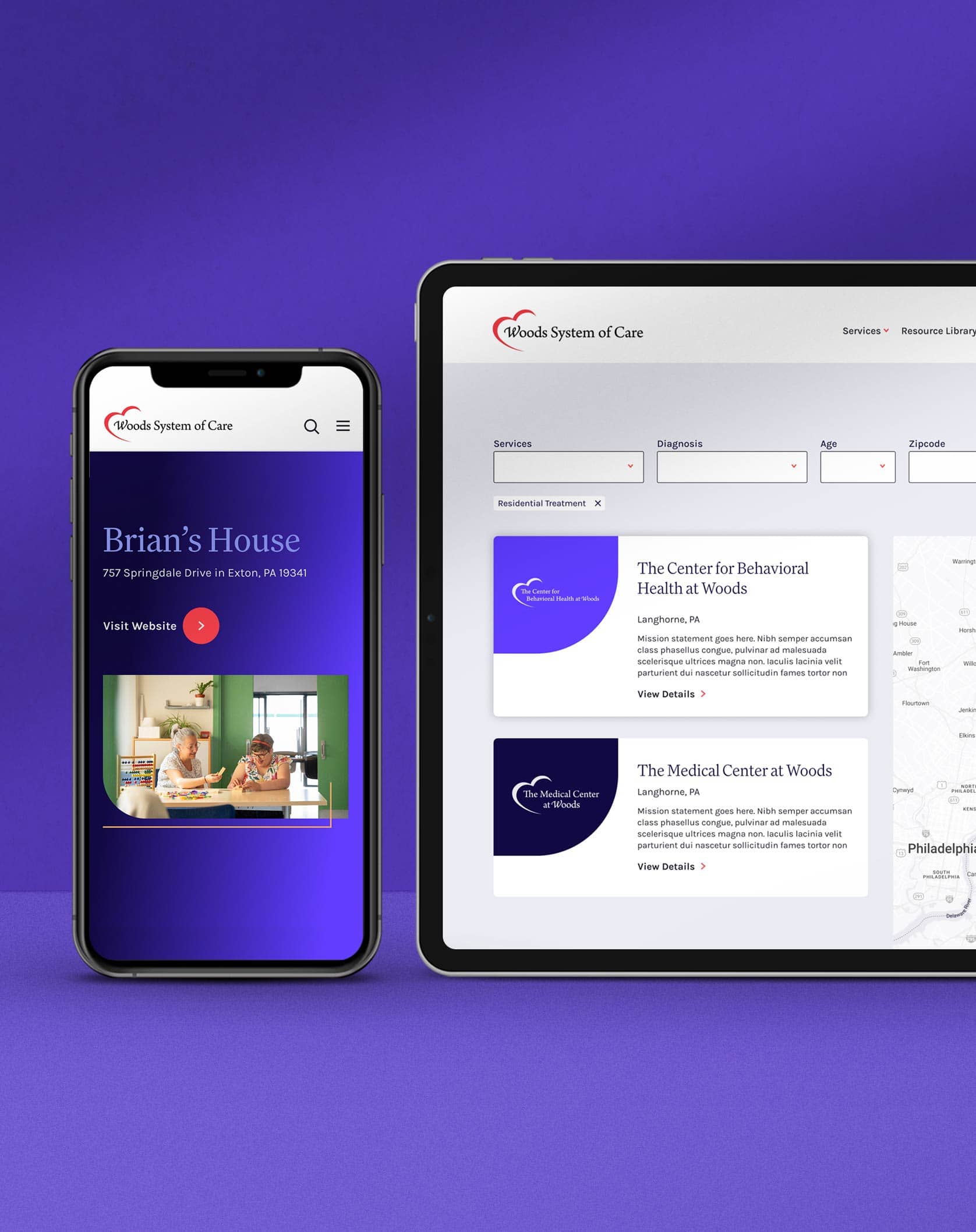
Designed for Professionals Committed to Quality Care
Overall, the website’s architecture, visual style, and content were designed to attract, engage, and inspire passionate and dedicated Direct Support Professionals to apply for positions within the Woods System of Care.


Push10 was a great team to work with – specifically Ashley, Sabrina and Ken. They did a very good job working with our team that often consisted of ‘too many cooks in the kitchen.’ Our favorite part of the journey was the people.
Aurora Staffing
Jared Levin, Vice President of Marketing
VISIT THE WEBSITEView Related Work
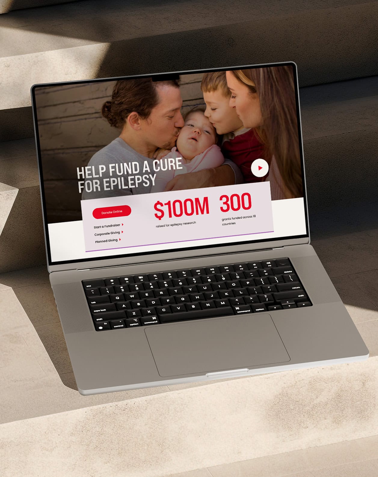
Nephcure
We collaborated with the NephCure team to create a comprehensive new brand strategy and visual identity to help reach more people with rare protein-spilling kidney disease