The Pros and Cons of Websites Designed with Full-Screen Hero Images
Whether you call them “hero” images or the more traditional “banner” images, the web design principles remain the same.
2
Jun

2
Jun
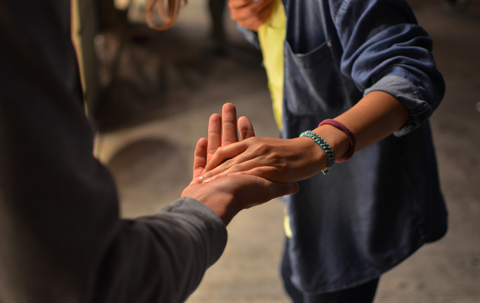
The Brand Balancing Act: 6 Common Challenges for Greek Organizations—And How to Solve Them
At the 2025 FCA Conference, Push10 & Kappa Delta shared real-world solutions to six major branding challenges facing Greek organizations today. From building generational trust to creating scalable chapter assets, here’s what every fraternity and sorority needs to know.
28
May
28
May
How EDOs Can Attract More Investment
Whether you’re working to bring in global businesses, support local entrepreneurship, or elevate your region’s visibility, your success as an economic development organization depends on one thing: your ability to inspire confidence and action.
20
May

20
May
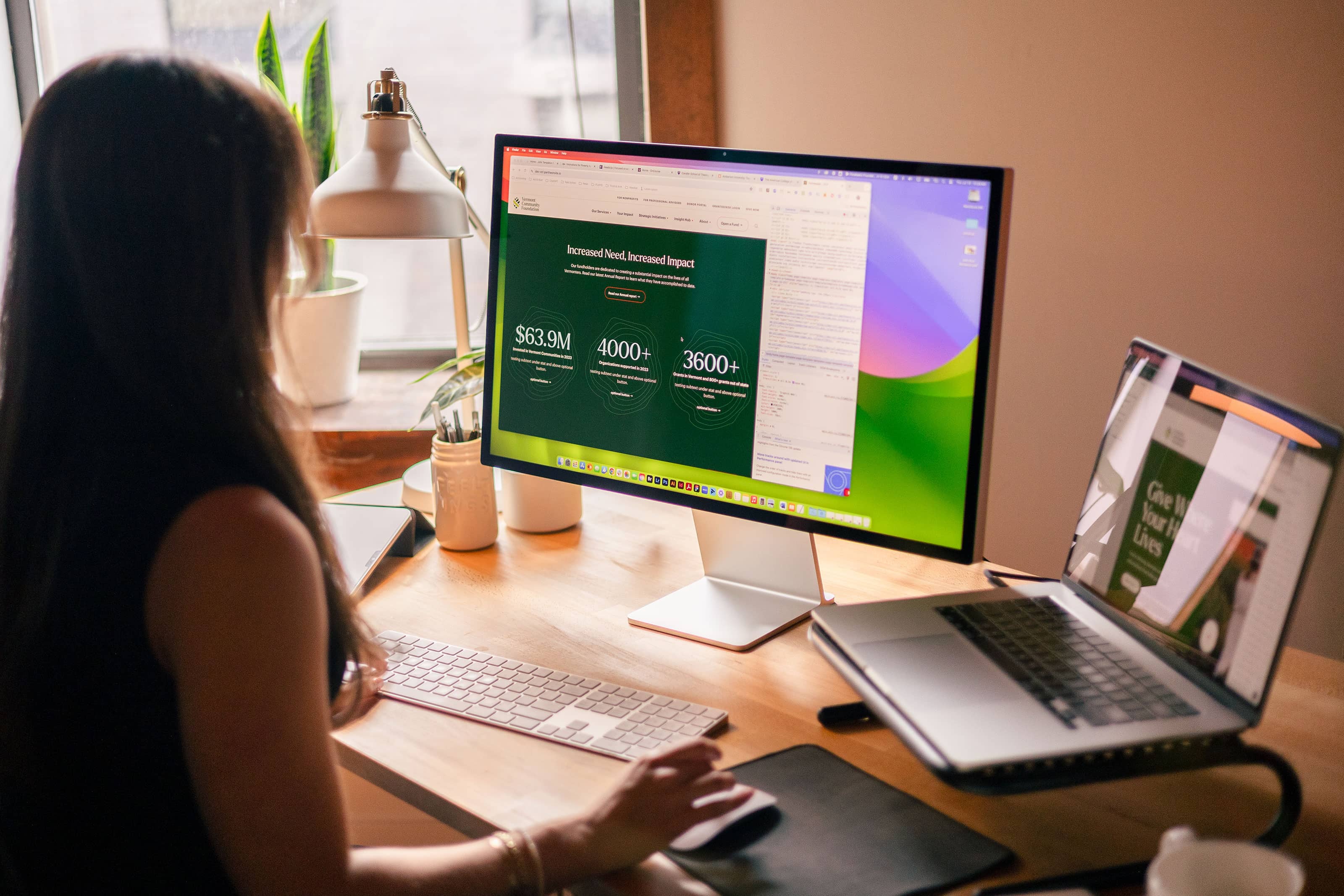
Tips for Building an Impactful Grant-Making Foundation Brand
A proper brand will illustrate your mission, values, and objectives, while making a meaningful, authentic connection with your target audience.
5
May
5
May
WordPress Website Maintenance for Nonprofits
Your nonprofit WordPress website will inevitably need maintenance. Engage a team of professionals to free up your organization to pursue its mission.
2
May
2
May
How Nonprofits Can Increase Private Donations During Uncertain Times
Discover how nonprofits can strengthen donor relationships, embrace innovation, and build trust to increase donations. See how Push10 helps nonprofits thrive in challenging times.
23
Apr

23
Apr
How Your BID Can Wow Assessment Payers with Tangible Impact
Proving your BID's value to assessment payers starts with showing tangible impact. From interactive dashboards to compelling before-and-after visuals, discover how your website can tell the story of progress and build lasting trust.
14
Apr

14
Apr
How BIDs Can Use Branding and Web Design to Attract Businesses and Investors
A strong brand and a powerful website are key to attracting businesses and investors to your BID. Learn how to showcase your district's strengths, tell compelling stories, and make it easy for businesses to say yes.
3
Apr
3
Apr
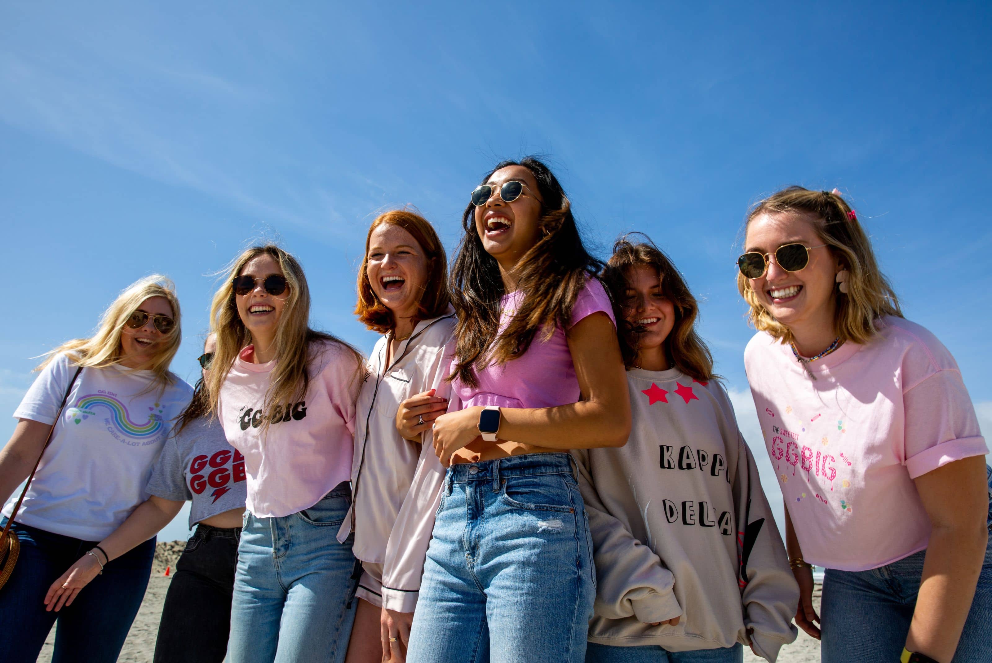
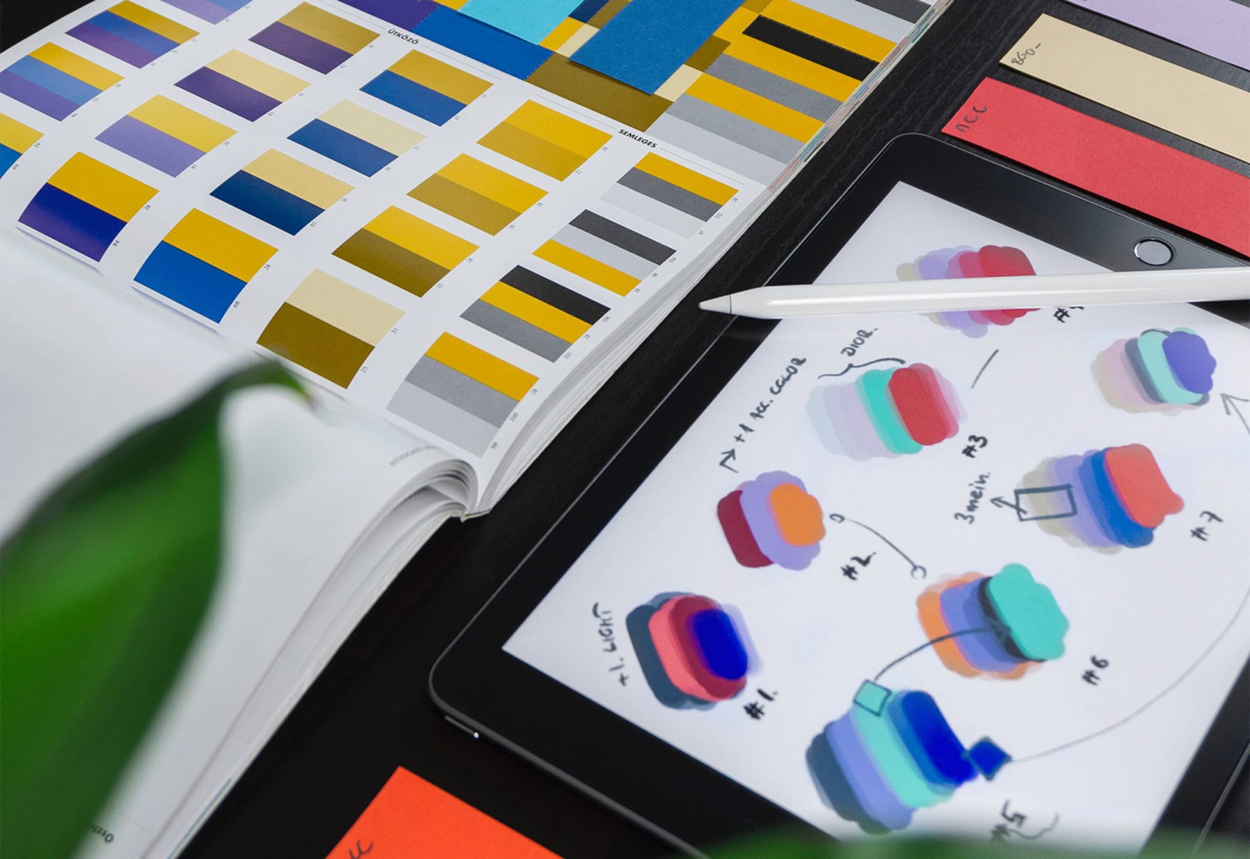
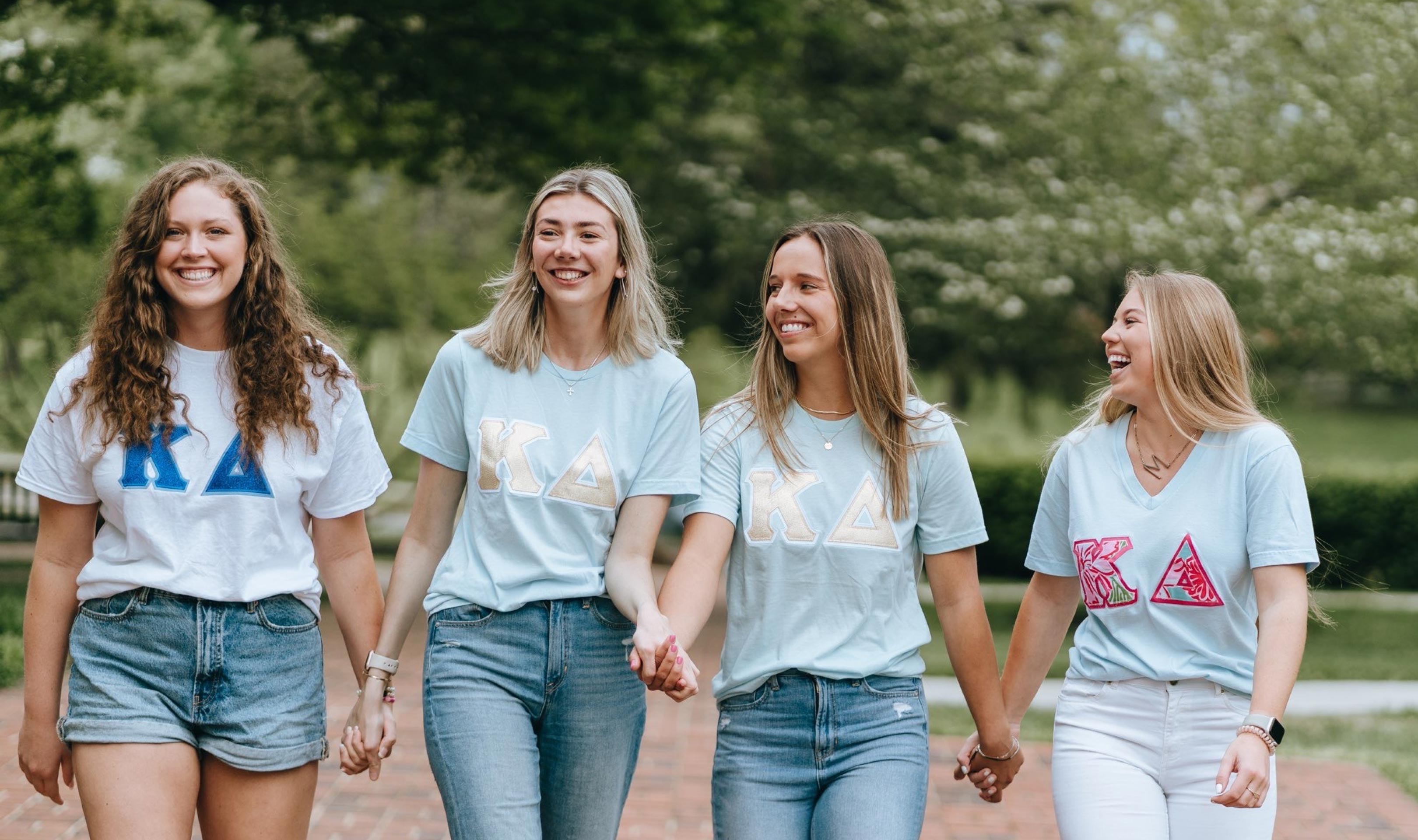
Your Sorority’s Brand Needs More Than a Crest
In today's digital-first world, a sorority’s visual identity is more than just a crest and color scheme—it's how your organization is perceived, remembered, and embraced by PNMs. If your visuals feel outdated, exclusive, or generic, it could be keeping your organization from attracting new members who are seeking authenticity and connection.
31
Mar
31
Mar