NephCure Branding & Web Strategy
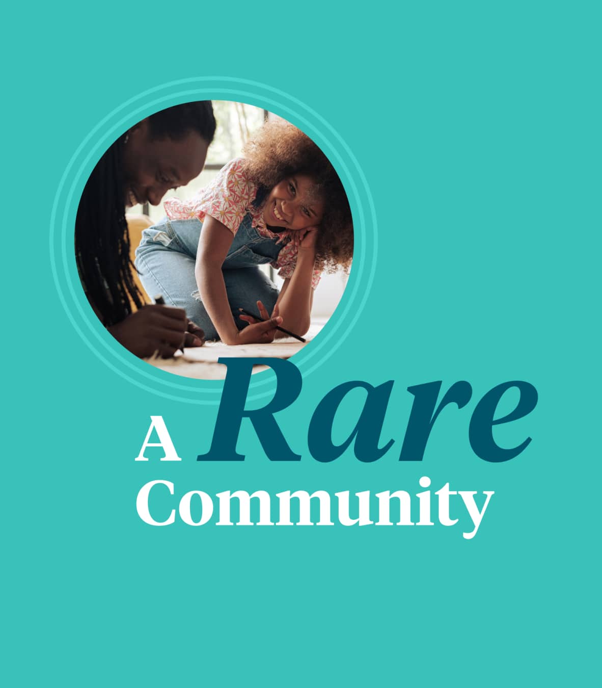
Building A Rare Community
NephCure is a nonprofit that empowers people with rare protein-spilling kidney disease to take charge of their health, while also leading the revolution in research, new treatments, and care.
01
Research & Audit
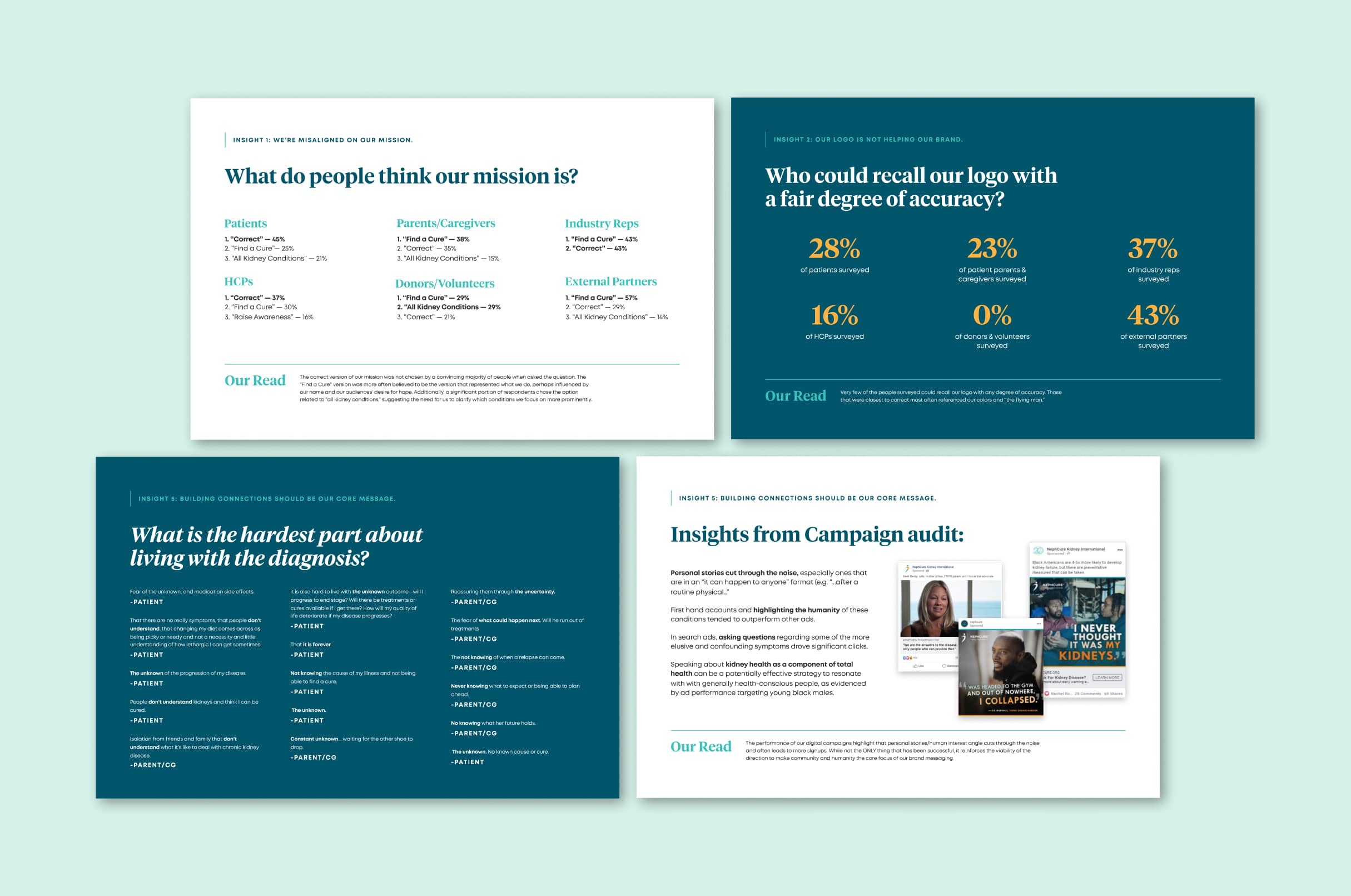
We started by auditing NephCure’s existing brand, surveying their audiences, and reviewing their competitive landscape. We identified a number of key insights, including misalignment around the mission statement and a lack of meaningful equity in the logo.

Community Matters
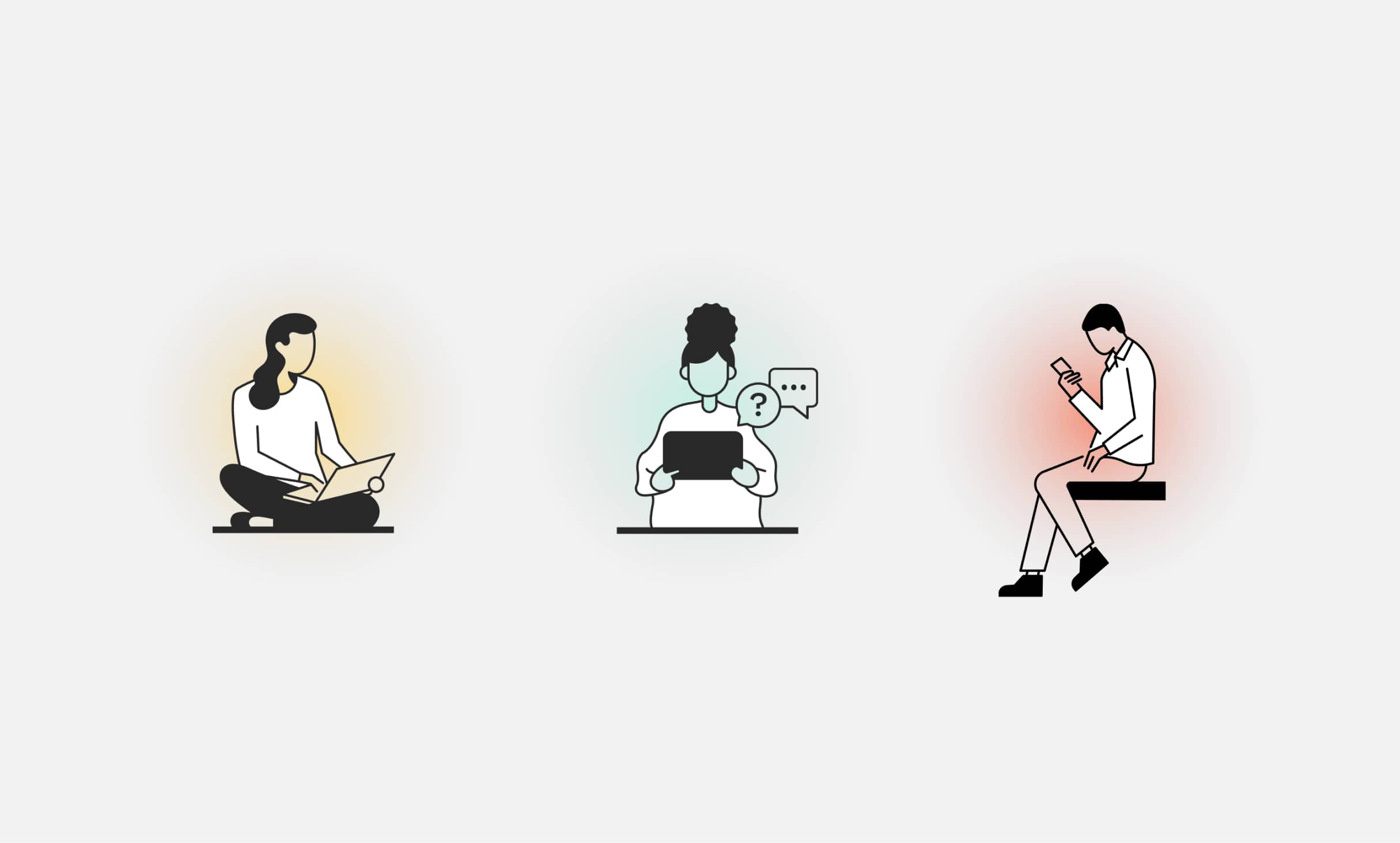
Through our survey data, we uncovered that “fear of the unknown” is the hardest part of living with a rare kidney disease diagnosis. This need for support and community formed the nucleus of our brand messaging and creative concepts.
02
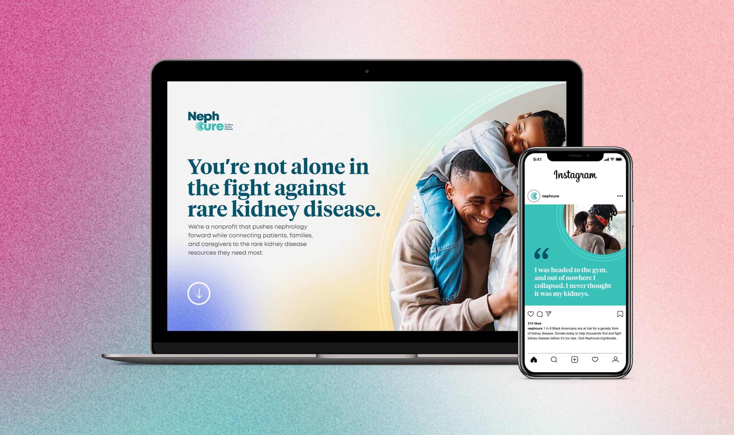
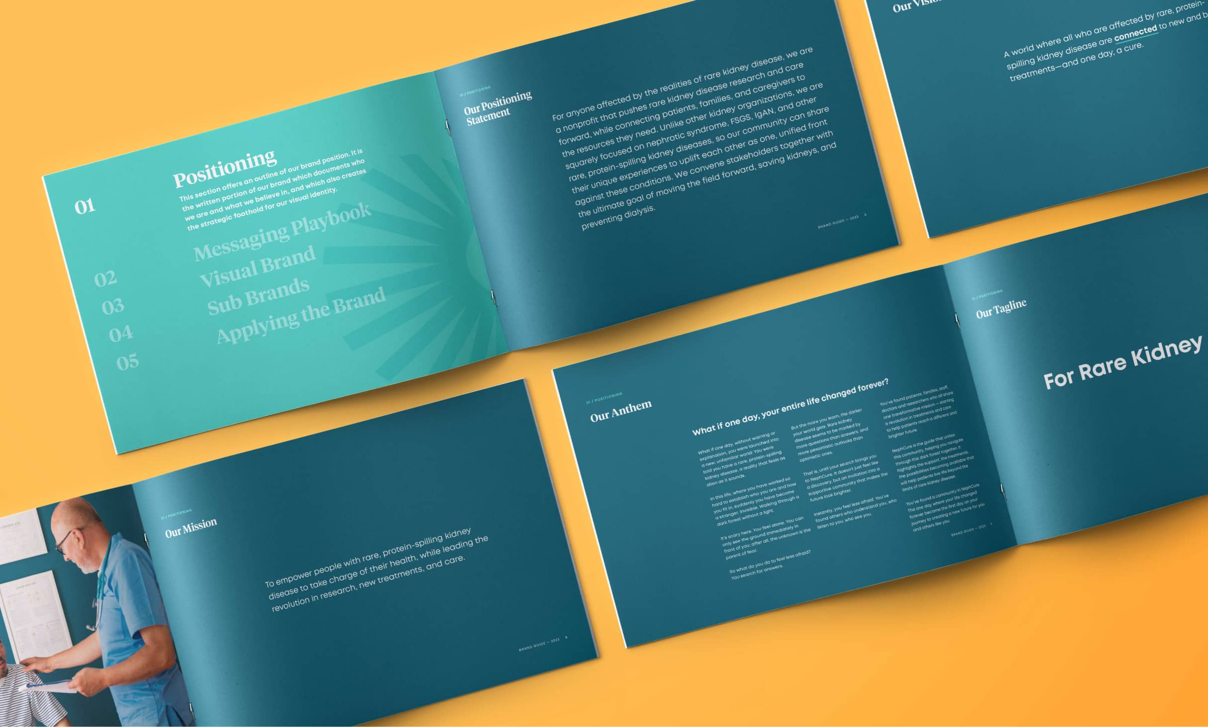
Brand Positioning & Visual Identity
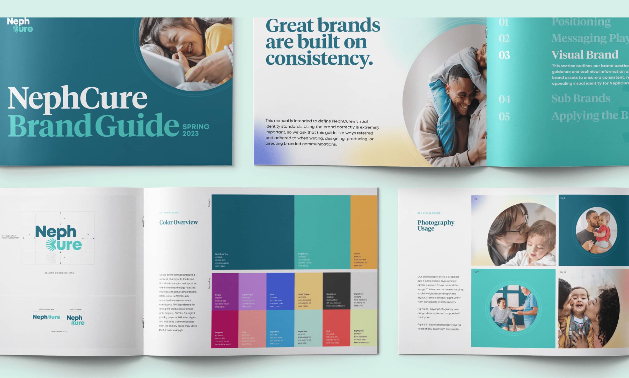
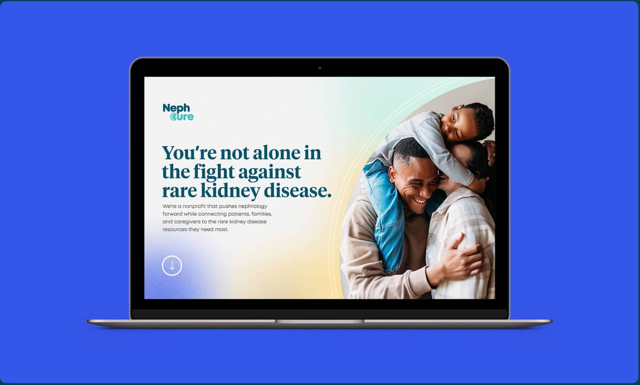
We worked alongside NephCure’s team to refine the brand’s fundamental written communication elements. We clarified the organization’s tagline and wrote mission, vision, values, and anthem statements that highlight NephCure’s role as a connector and place for support. Then, we developed a visual brand that brought those key messages to life.

Before and After
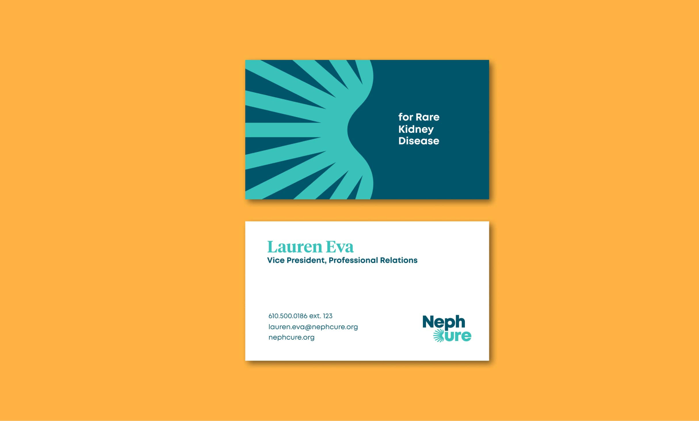
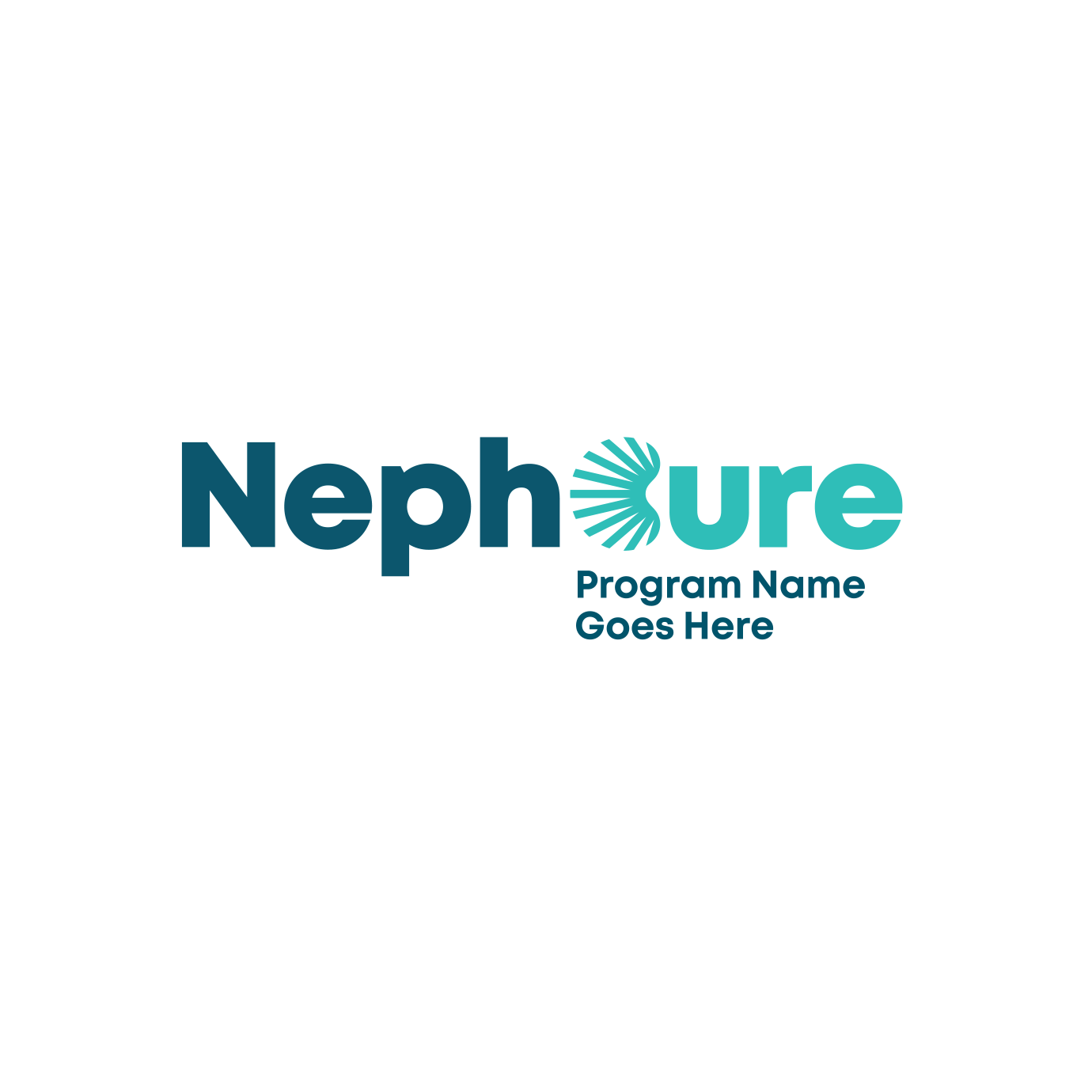
NephCure’s prior logo blended into the competitive landscape. Research also showed that the full brand name, “NephCure Kidney International” created confusion as the organization is located in the United States. Together with the client, we agreed to streamline the name and created a bold new logo that features a kidney formed by connecting lines that represent a strong supportive community and hope for the future.


03
Strategic Messaging
Patients and their families or caregivers are some of NephCure’s most important audiences. We created a Messaging Playbook to help outline key messages and supporting proof points that will resonate with these audience members throughout their journey. This guide helps NephCure maintain consistency when communicating to the people who matter most.
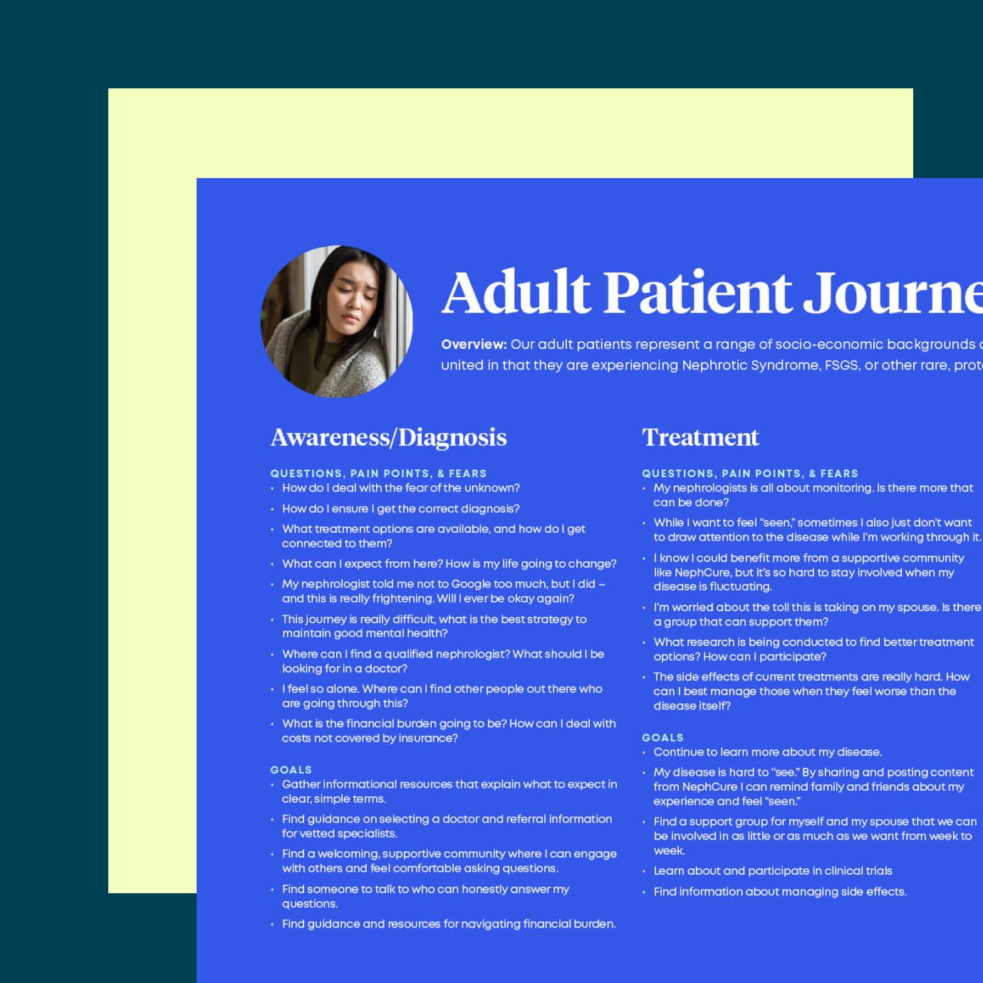
Audience Journeys
Based on our research data, we outlined the questions, pain points, and fears that patients and caregivers experience throughout their treatment journey.
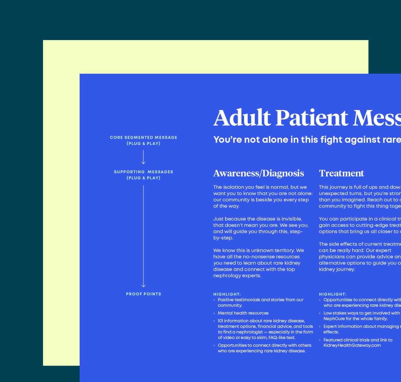
Plug & Play Messaging
With each audience’s journey in mind, we created plug-and-play messaging that helps NephCure communicate in the right way at the right time.
04
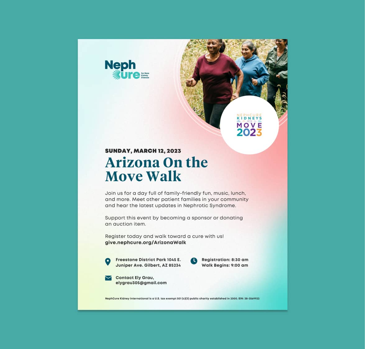
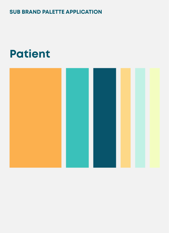
Sub Brand Architecture
As a growing modern nonprofit, NephCure has many initiatives and events. Push10 analyzed each subbrand and created a strategy for five categories of sub brands grouped by their intended audience and/or purpose.
05
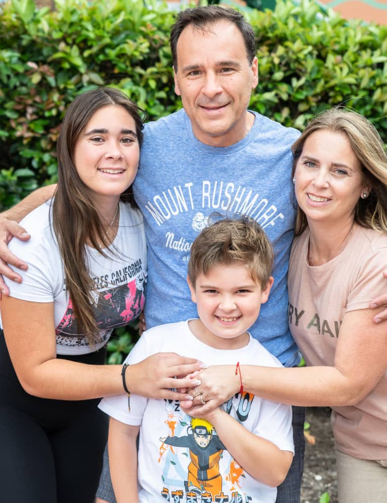
Launching the Brand
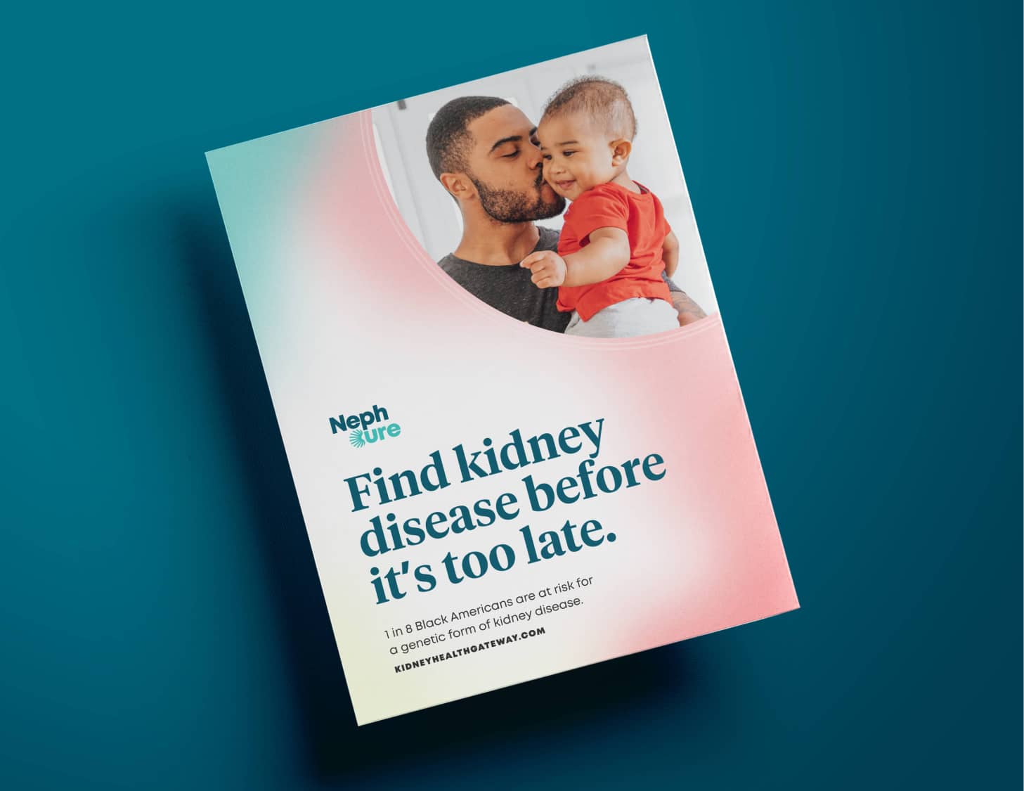
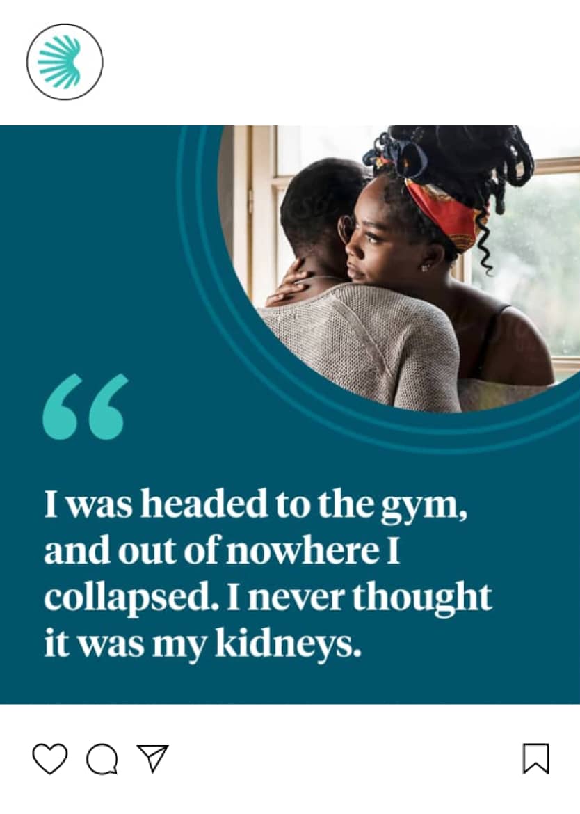
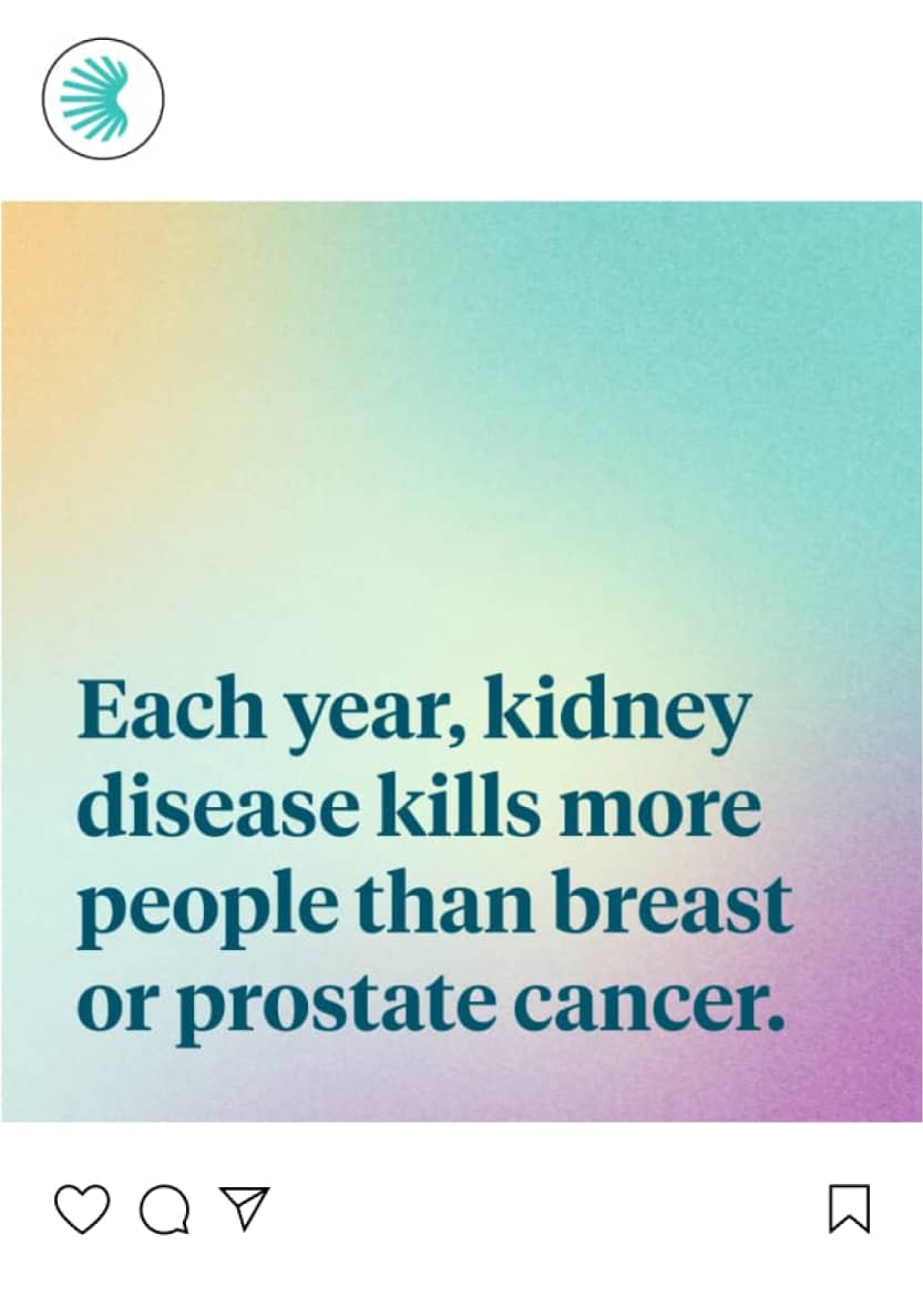
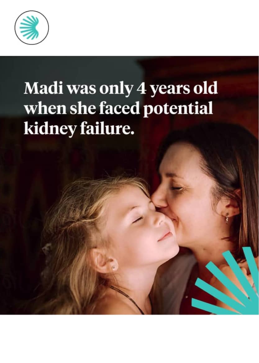
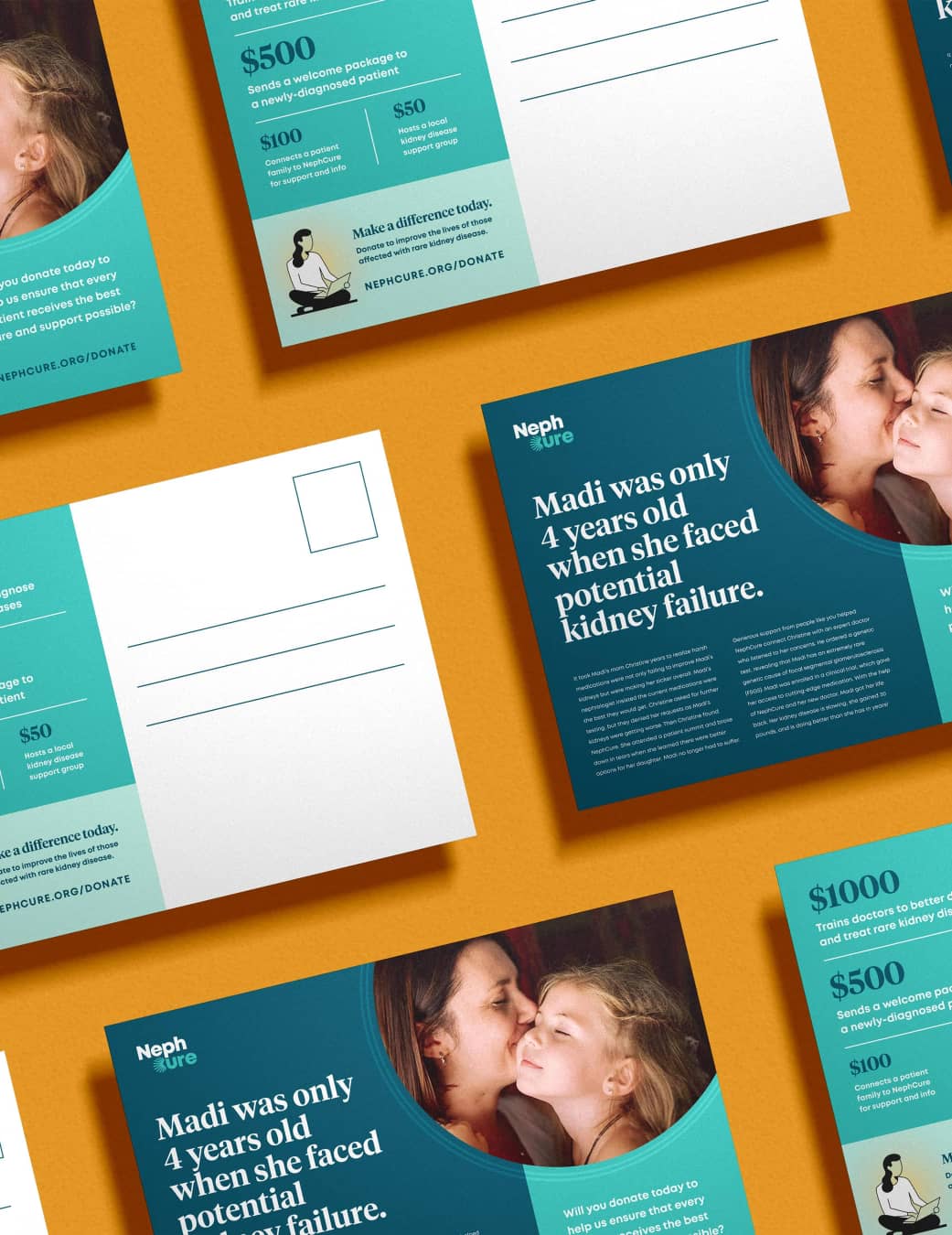
With the new brand in place, we created a launch campaign to secure funding for NephCure’s future. Our research indicated that personal stories were most likely to cut through the noise, so we worked to promote stories that highlight how NephCure’s community can save kidneys and save lives.
Teaming up with Push10 was instrumental in giving our written and visual identity a fresh boost. The comprehensive research their team conducted captured the essence of who we are to our core, resulting in a modern and revitalized look that truly represents the dynamic rare kidney disease community we serve.
Nephcure
Kylie Karley, Director, Marketing & Communications
VISIT THE WEBSITEView Related Work

HeadsUp
We designed and launched a new brand and website aimed at changing conversations, stigmas, and outcomes for those experiencing psychosis.