Insights
Chris Tremoglie
Lead Developer
The Pros and Cons of Websites Designed with Full-Screen Hero Images
June 2, 2025
5 Minute Read
Updated June 2, 2025
Over the past several years, we’ve seen a huge increase in the number of websites designed with large, full-screen banner images. Whether you call them “hero” images or the more traditional “banner” images, the design principles remain the same, and in 2025, they’re still going strong.
First things first: What is a hero image?
A website hero image typically fills the entire screen (or a large portion of it) with a visual. It’s usually a background image with type and/or design elements layered in the foreground. It’s the first thing a visitor sees, and the first chance to make an impact.
Hero images have become popular for good reason: they’re bold, visually engaging, and a powerful way to communicate your message alongside your primary headline. Research still shows that static hero images outperform outdated rotating carousels in usability and clarity:
- 5 Reasons Carousels (Sliders) Are Bad UX
- How to Boost Your Conversion Rate with the Right Hero Image
And today’s users are more comfortable scrolling vertically than ever before:
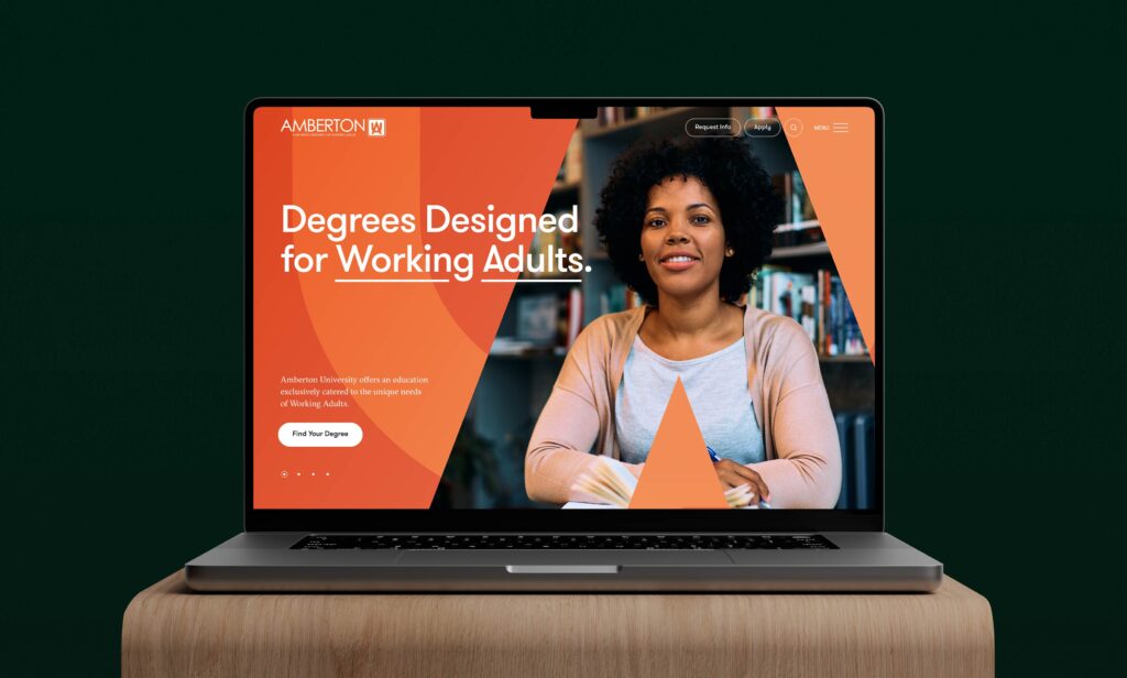
Combined with long-scroll layouts, full-screen hero banners create strong storytelling moments and clearly communicate your value proposition, something we thoughtfully strategized and designed for Amberton University, without cramming everything “above the fold.” (Thank goodness.)
Full-Screen Hero Images Look Great, So What Can Go Wrong?
While we love this design approach, clients often have questions about how images scale, crop, and behave across different devices. The short answer: there’s no one-size-fits-all solution. But here are some of the most common challenges, and our recommendations to handle them:
Image Cropping
The biggest issue we see is image cropping due to screen size variability. As screens continue to evolve (think: foldables, ultra-wide monitors, vertical browsing, etc.), your hero image must scale to fit countless aspect ratios.
Think of it like resizing a 4×6 photo to fit a 5×7 frame; you either stretch it (bad) or crop it (better, but not perfect). Depending on your layout and device, something will get cropped.
To manage this:
- Avoid tightly cropped images. Give your visuals breathing room.
- Adjust focal points. Many platforms now let you set a “focal area” so important content stays visible, even when cropped.
- Anchor from the right spot. For example, if you’re showing people, crop from the bottom to avoid chopping off heads.
- Use fixed-width images if cropping isn’t an option—just know it limits responsiveness.
 File Size
Hero images need to be sharp, but not at the expense of performance. Today’s best practices, especially with Google’s Core Web Vitals and performance benchmarks, prioritize fast load times.
While 1,200 pixels wide may still work for average users, higher-res screens require larger images (1,800–2,500px wide). That means bigger file sizes and longer load times.
- Compress images properly. Use modern formats like WebP or AVIF.
- Implement responsive images (srcset) to serve the right image for the right device.
- Check analytics to see what screen sizes your audience actually uses. There’s no need to over-design for ultra-high-res if your users are mostly mobile.
Sticky Elements
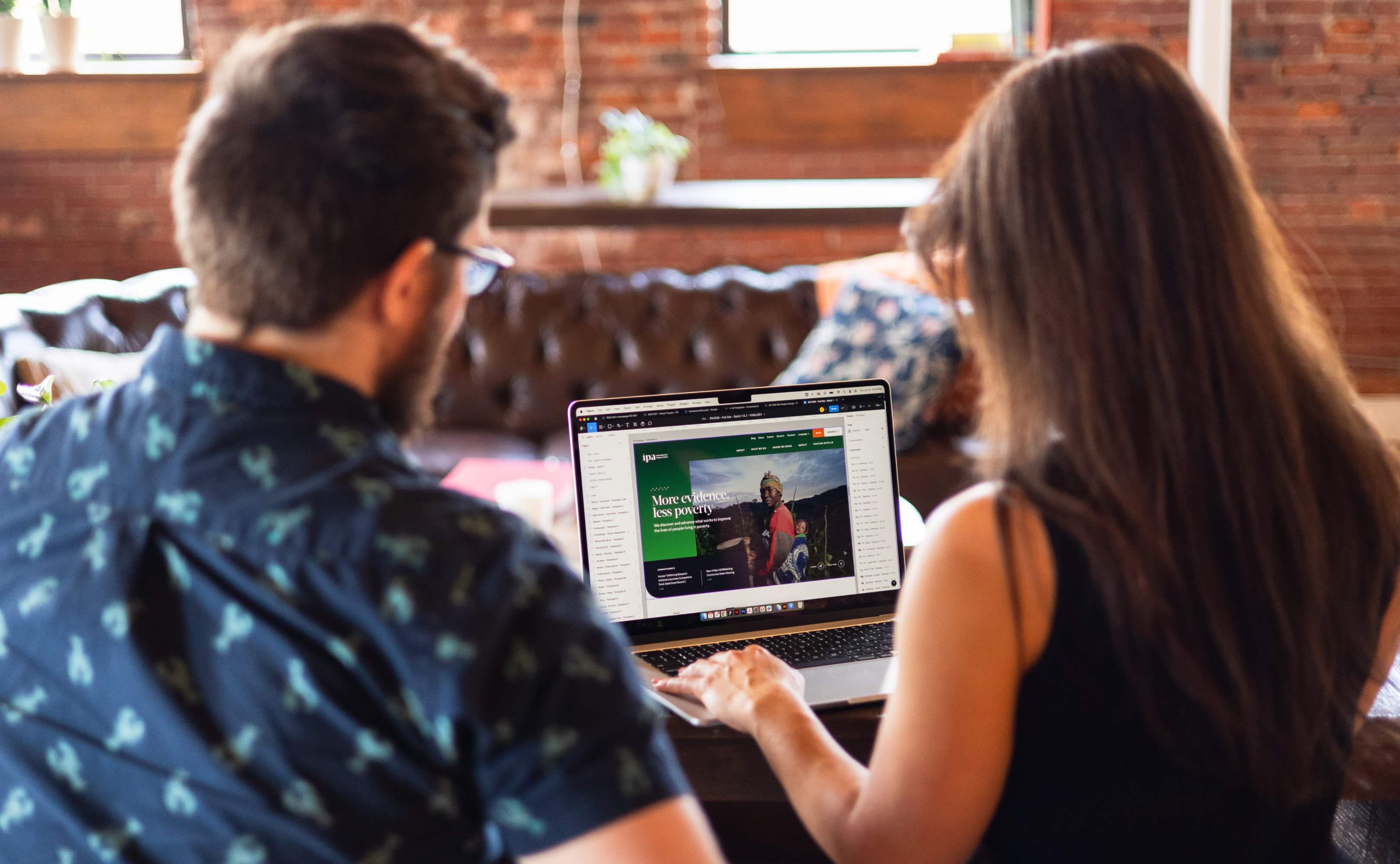
Sticky navigation is now standard across most websites. But we also use sticky elements within hero areas—like buttons, callouts, or taglines that remain visible as you scroll, as demonstrated in our work for Innovations for Poverty Action.
While this adds usability, it reduces available space in the hero area and can complicate mobile scaling.
- Use sticky content sparingly and thoughtfully.
- Test across breakpoints to ensure nothing important gets pushed out of view.

Video
Background videos continue to be a popular choice for homepage heroes in 2025. When used correctly, they add mood, movement, and visual interest.
Best practices include:
- Keep it short (15–30 seconds) and set it to loop.
- Mute the audio (required for autoplay and ADA compliance).
- Keep it subtle: avoid using videos that compete with foreground text.
- Use a static fallback image on mobile to reduce data load and prevent lag.
And remember: your hero video isn’t your brand reel. Save the interviews and voiceovers for a dedicated section.
Mobile Experience
With mobile traffic making up the majority of web visits—and foldables, tablets, and ultra-wide phones joining the mix—responsive hero design is more important than ever.
Sometimes the desktop hero image needs to be swapped out or restructured entirely for mobile. That might mean repositioning text, tightening the crop, or customizing an alternate version—approaches we implemented in our mobile-first design for Cure Epilepsy.
New mobile-first builders (like Framer, Editor X, or the latest Gutenberg updates) make it easier than ever to create hero sections that look great at any size.

Looking Ahead: WebGL & Interactive Hero Design
Some brands are already pushing beyond static images with WebGL and real-time 3D rendering. These create immersive hero sections where users can interact with animated elements, floating shapes, or dynamic transitions.
It’s cutting-edge, and with modern JavaScript libraries and CSS 3D capabilities, more accessible than ever.
But be warned:
- WebGL isn’t always accessible or compatible with all devices.
- It’s resource-intensive and can slow down load times.
- It requires thoughtful design and fallback options for older browsers.
Final Takeaway
Hero images are here to stay, but they’ve evolved. From image scaling and compression to accessibility and interactivity, a well-designed hero section requires careful thought and planning.
Start with your users, design for flexibility. Optimize for performance. And most importantly, be intentional with the story you’re telling.
Want to learn how you can improve your web design with more compelling full-screen images?
Contact UsRecent Insights
The ROI of Great Design
Great design matters. From the brands we purchase to the platforms we binge, it has a remarkable presence in our lives, with the power to influence myriad decisions. Though, despite its inherent value, defining design’s impact to stakeholders isn’t always easy.
29
Nov

29
Nov
2025 Nonprofit Marketing Trends: The Vital Role of Branding and Web Design
Before exploring this year’s marketing trends, let’s examine why your nonprofit’s brand identity and web presence must be prioritized.
8
Jan
8
Jan
The Benefits of Working with a Midsize Creative Agency
Discover the strategic advantages of partnering with a midsize agency like Push10, where personalized attention, agility, diverse talent, intentional size management, cost-effective solutions, and consistent quality converge to propel your branding and website design projects towards success.
15
Nov

15
Nov