Lehigh Office of International Affairs Website Design
This is Global Learning

After operating for a long time without a clear strategic direction, Lehigh's Office of International Affairs finally had a vision: to become the destination of choice for the brightest minds around the world while simultaneously increasing student, faculty and staff participation in international programs.
01
Elevating the Digital Strategy
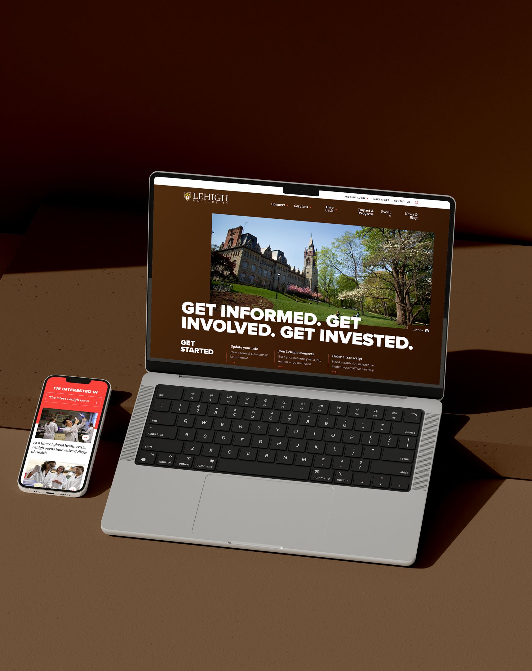
With a new institutional strategic plan in place and a convoluted existing site architecture, the outgoing web design needed to fundamentally change in order to serve its purpose as a recruiting tool for Lehigh University’s prestigious international learning program. Therefore, our digital strategy process started at the ground level and worked up toward a completely reimagined plan for Lehigh OIA’s website.

Outlining Lehigh OIA’s Goals
First, we clarified the goals. Then, we went to work: scrutinizing the existing brand identity, the industry, the competitors, and most importantly, the target audiences.

Simplicity Starts With a Sitemap
After a comprehensive digital content audit, we developed a new site architecture that simplified the user experience and made the most important content easily accessible for all users.
A Tailored Website Experience
Creating detailed user profiles became a necessary step to planning the reimagined site. These personas provided more detailed information about the target audience, what they cared most about, and how we should map and prioritize content.

02
Designed for Success
Lehigh’s Office of International Affairs is a unique program, though still sits under the umbrella of a large, distinguished institution. Our challenge was clear—we needed to reflect their individual identity while staying true to the brand standards set forth in the overall Lehigh University brand guidelines. This required a little creative thinking and a lot of time dedicated to understanding what made this department so special.


A Visual Refresh
Lehigh University had a strong existing brand identity that served as a starting point for our web design exploration. We took the existing color palette and typography and pushed them into a bold new direction, reflecting the amazing experiences Lehigh’s students encounter in this international education program.


Custom Iconography
We drew unique illustrations for the site to help elevate the user interface design while creating a functional system to quickly communicate information.

Sharing Stories From Around the Globe
Throughout our discovery, we learned of all the incredible stories from students who are part of this international program. We strategically designed space throughout the website to tell these stories—stories which bring the amazing experience of this program to life.
03
Seamless Web Development
We worked closely with Lehigh’s internal development team to ensure a smooth handoff of our front end design work. Using an interactive tool, we packaged all the necessary files, styles, animations, UI elements, and more. This collaborative process ensured the final build appeared as visually stunning as the design mockups themselves.


Everybody here is very impressed by and pleased with the new website. It makes great use of our best assets—our photos and our stories.
Lehigh OIA
Emily Groff, Director of Communications & Marketing
VISIT THE WEBSITEView Related Work
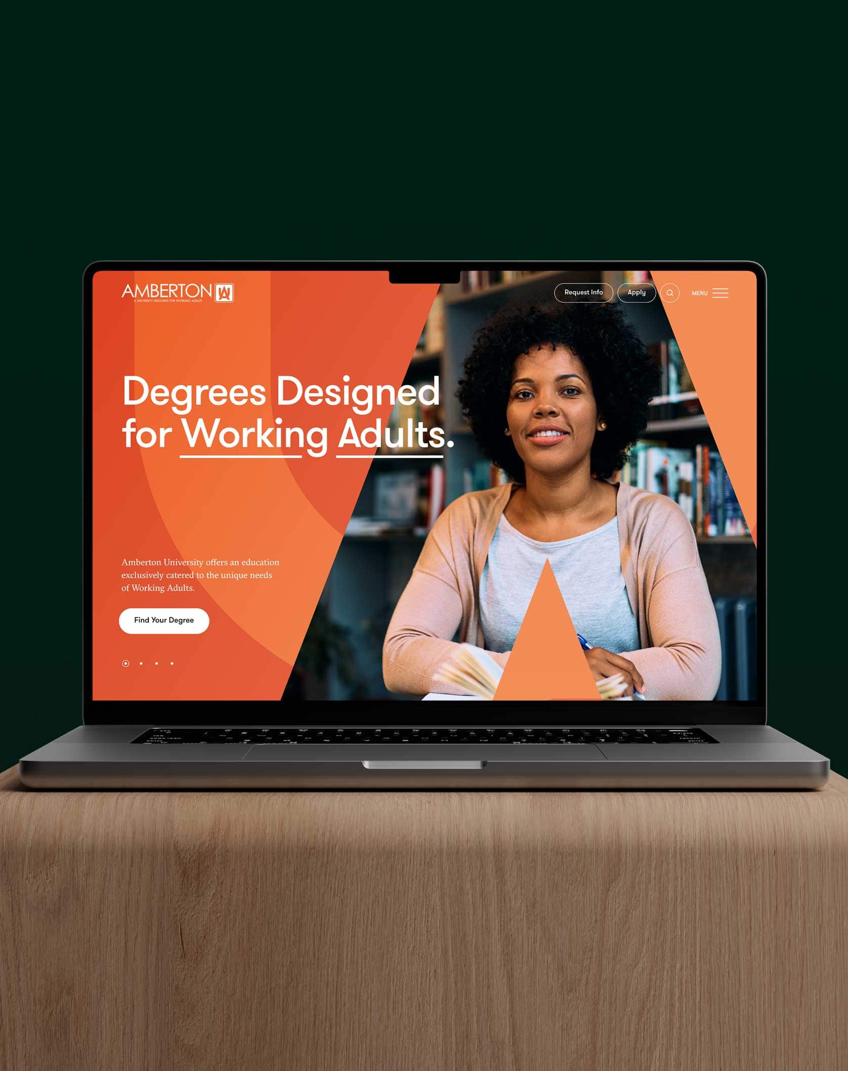
Amberton University
We worked with Amberton to refine their messaging, refresh their brand, and reimagine their website to reach more adult learners.