McPeak Wealth Management Group
Beyond the Standard
McPeak Wealth Management Group has spent over four decades building deep relationships with the families and business owners they serve. They had the expertise, the history, and the recognition to back it up. What they came to us for was a website that could tell that story in a way that would resonate with the right audience.
01
Setting the Strategy
First, we needed to establish what McPeak's prospective clients were actually looking for when they landed on the site. What would make them stay? What would give them enough confidence to reach out? Those questions shaped our entire strategic approach and gave us a clear lens for evaluating every aspect of the existing experience.

Putting the Photography to Work
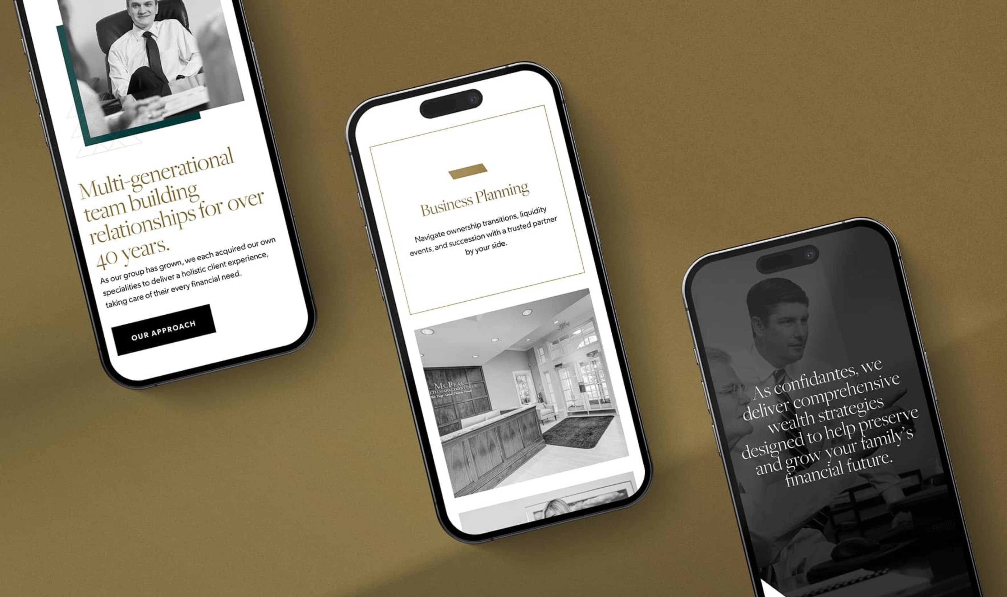
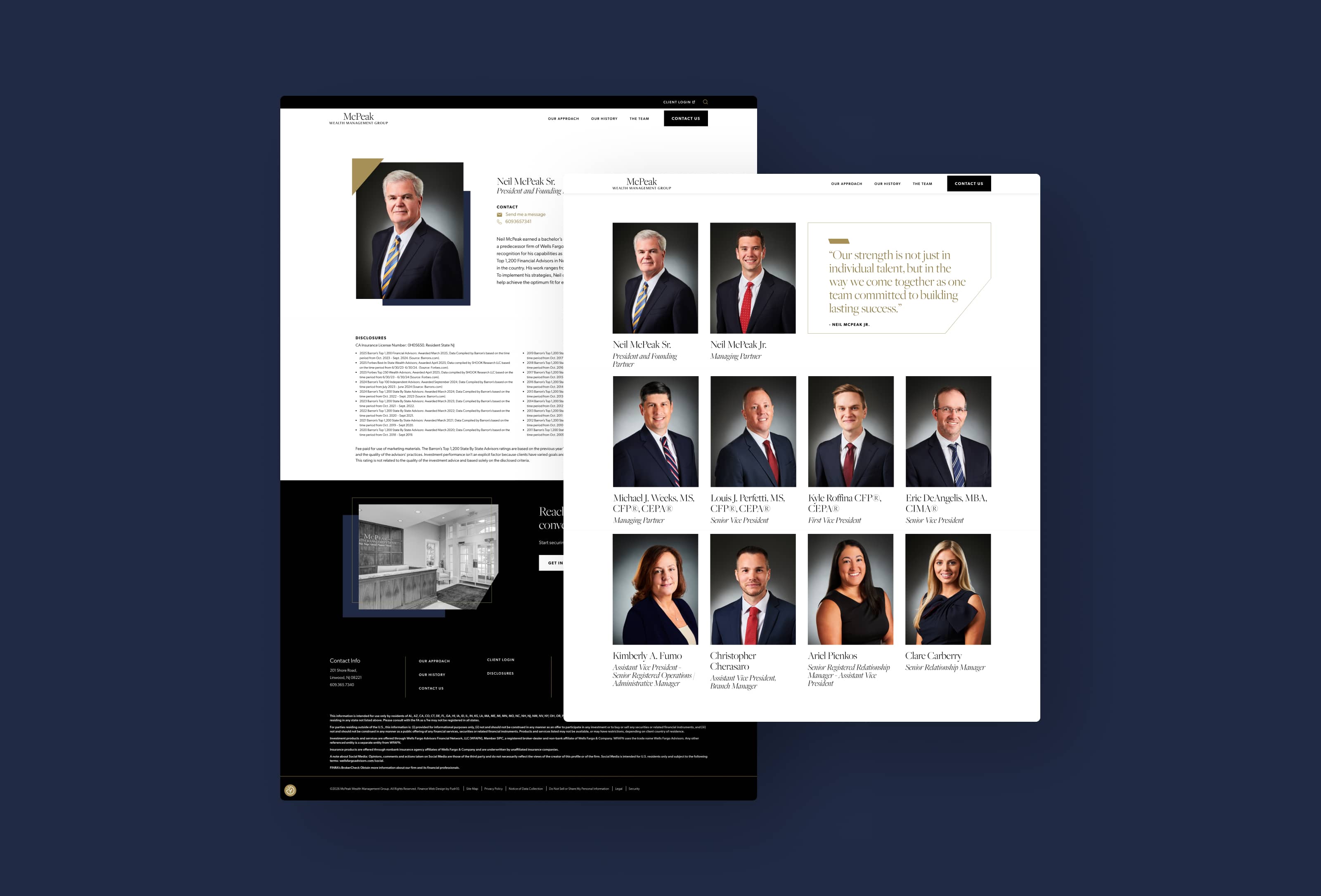
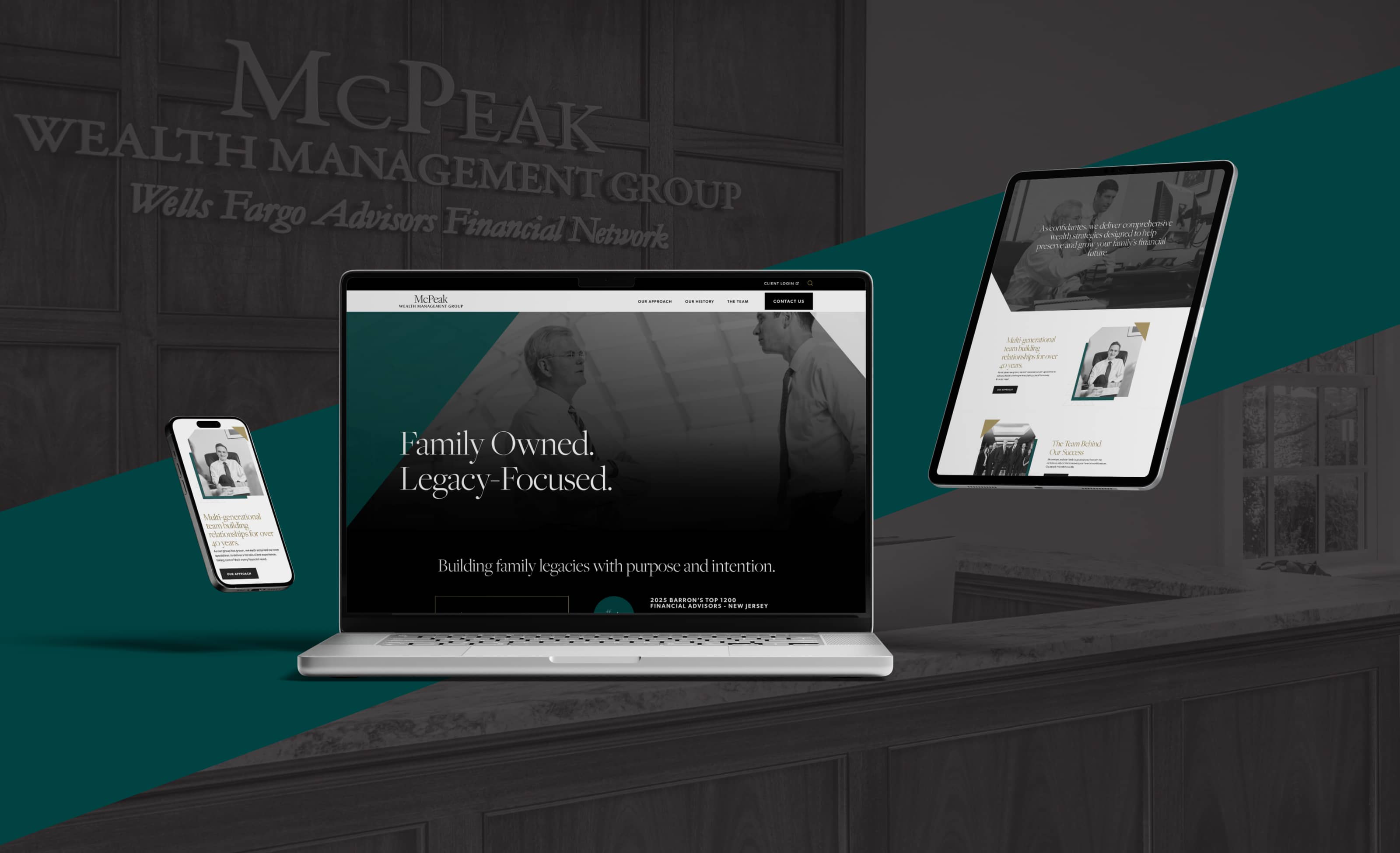
One of the clearest opportunities we identified early on was the photography. McPeak had invested in a custom photo shoot that captured the genuine character of their team, but the existing website design wasn't giving those images the space to do their job. We built the content strategy around leading with that visual strength, using it to create an immediate and human first impression that copy alone can't achieve.

Creating Confidence
Trust in the wealth management space isn’t built through bold claims. It’s built through consistency, the sense that every part of the experience has been thought through. That became the standard we held every design and content decision to as the project moved forward.
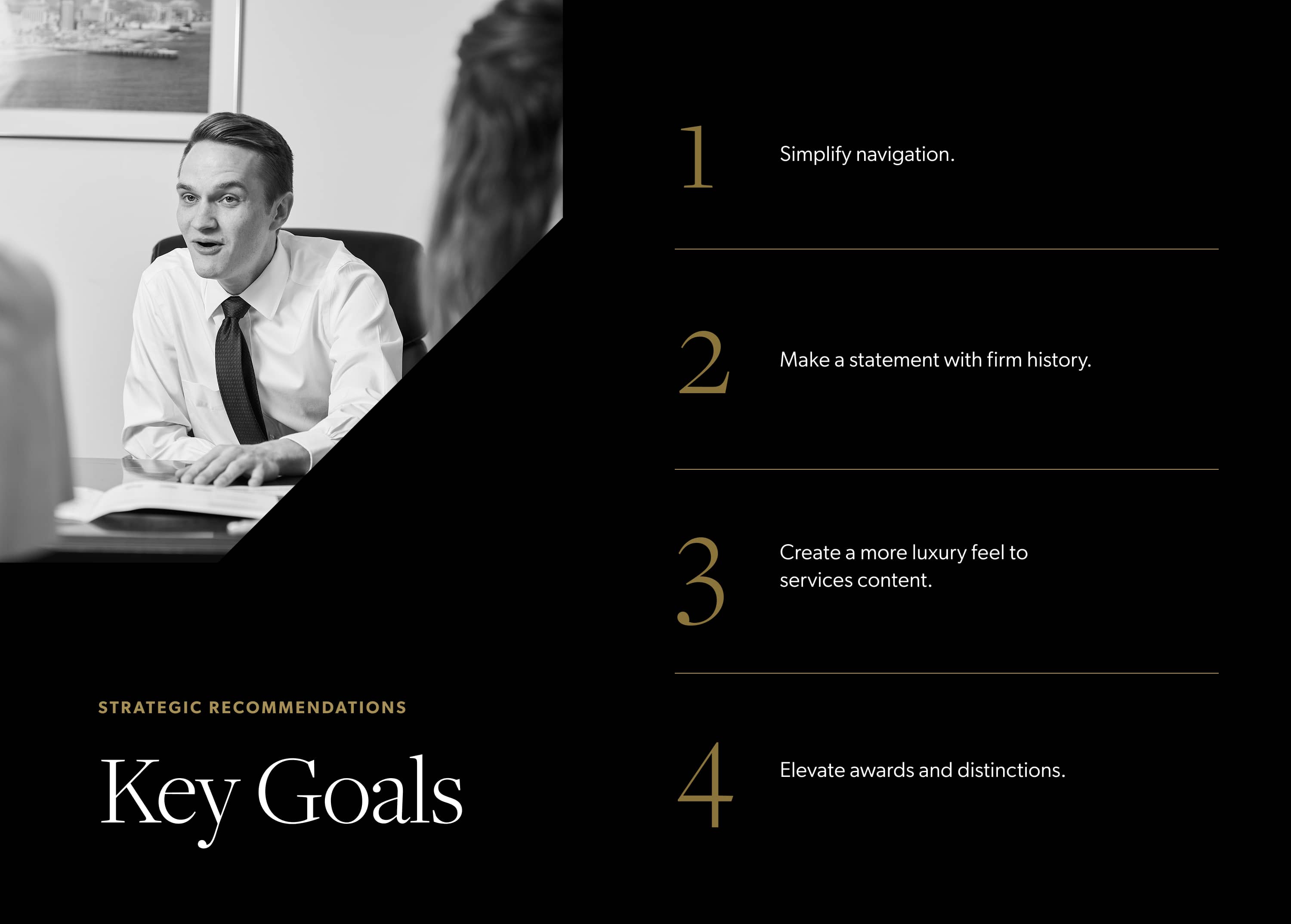
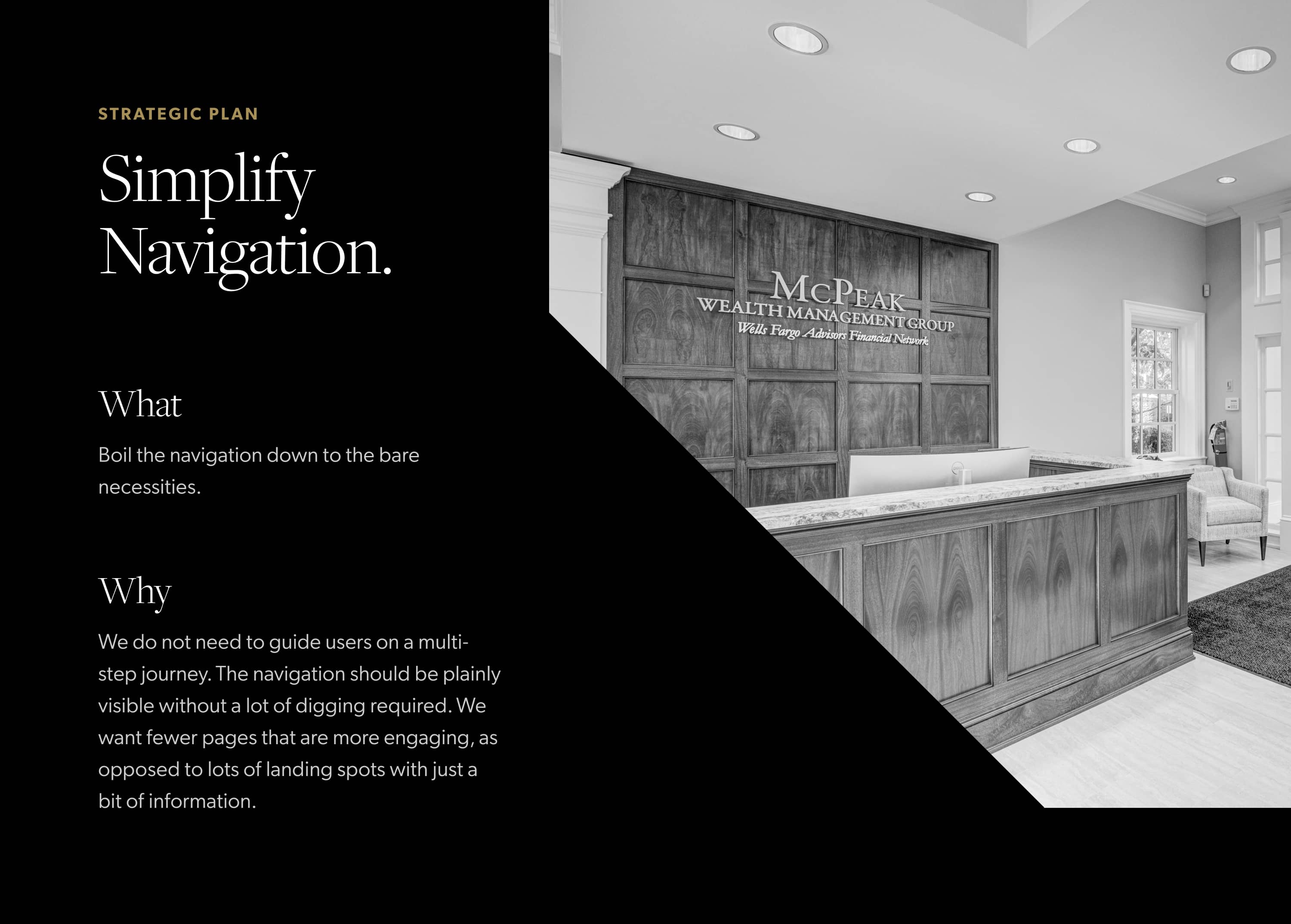
Key Goals
The starting point for any good strategy is understanding who you're designing for. We looked at the McPeak website user journey through the eyes of their audience, identified what was missing, and built a focused plan around four clear priorities that would shape everything that followed.
02
Translating Strategy into Design
With a clear plan in place, the work shifted from strategy to execution. The visual identity and web design phase was where the thinking we had done became something you could actually see and feel. Every choice in this phase was made in service of the experience we had set out to create.
Setting the Tone from the First Frame
We wanted the premium feel of the website to be apparent before a visitor ever reached the homepage. The preloader animation was an early opportunity to do exactly that. A brief, considered moment that signals the quality of what's ahead and prepares the user for the experience they're about to have. It's a small detail, but it's the kind of detail that tells an audience something important about how a firm operates.
Knowing What to Leave Out
As the website design came together, one of the most important things we kept coming back to was editing. Removing the elements that were adding noise without adding meaning. The cleaner the experience, the more the content that remained could breathe and do its job. That discipline carried through every page of the website.

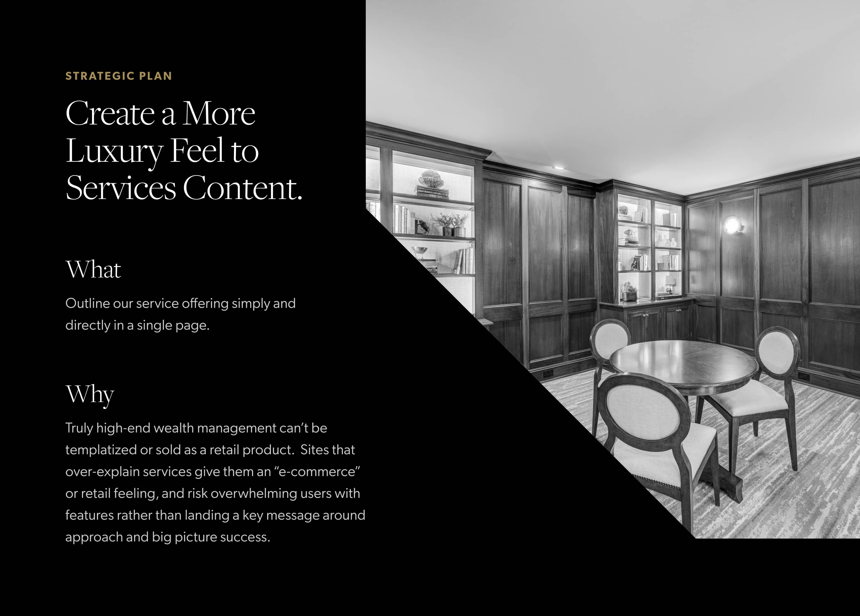
Letting the Design Carry the Message
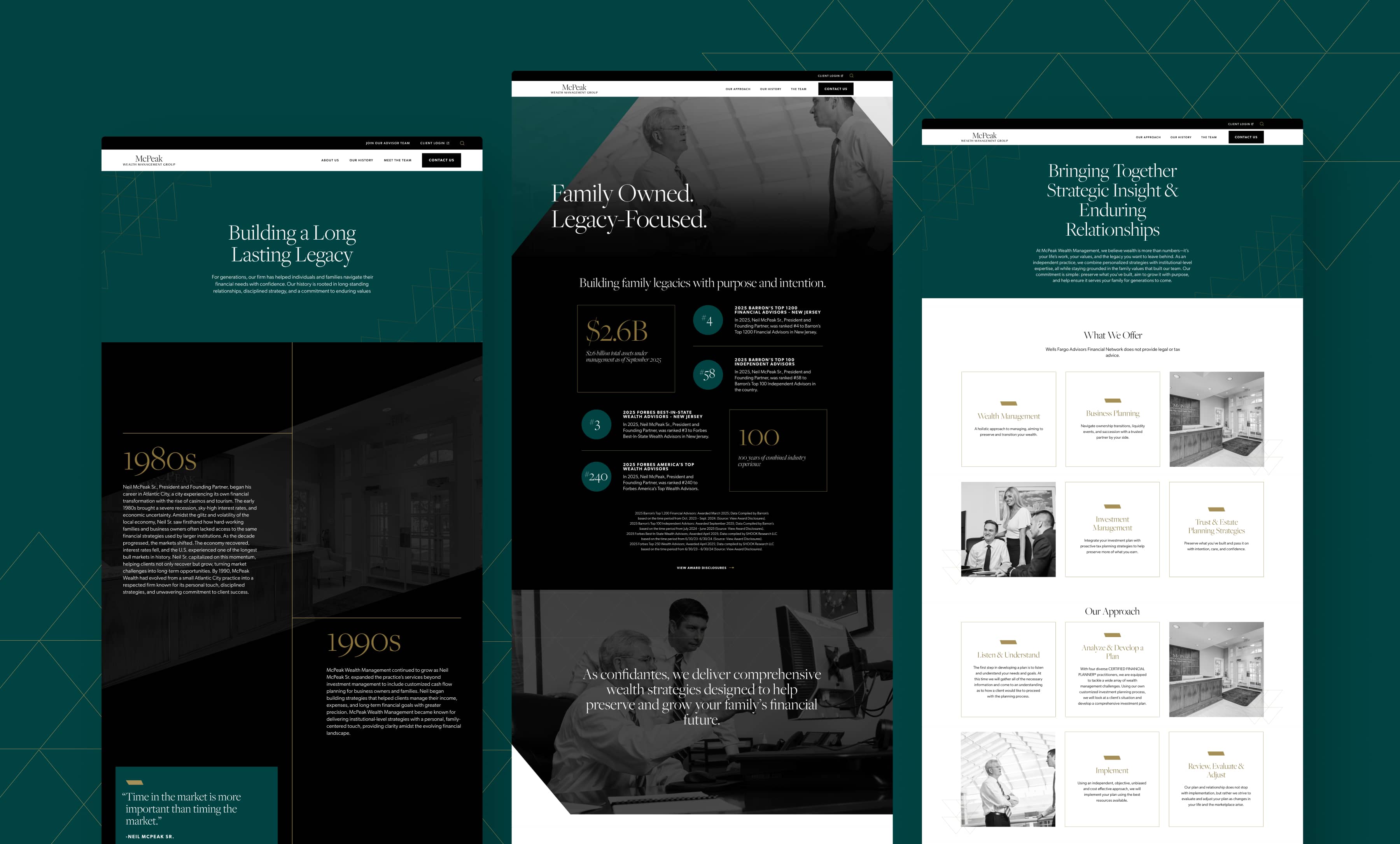
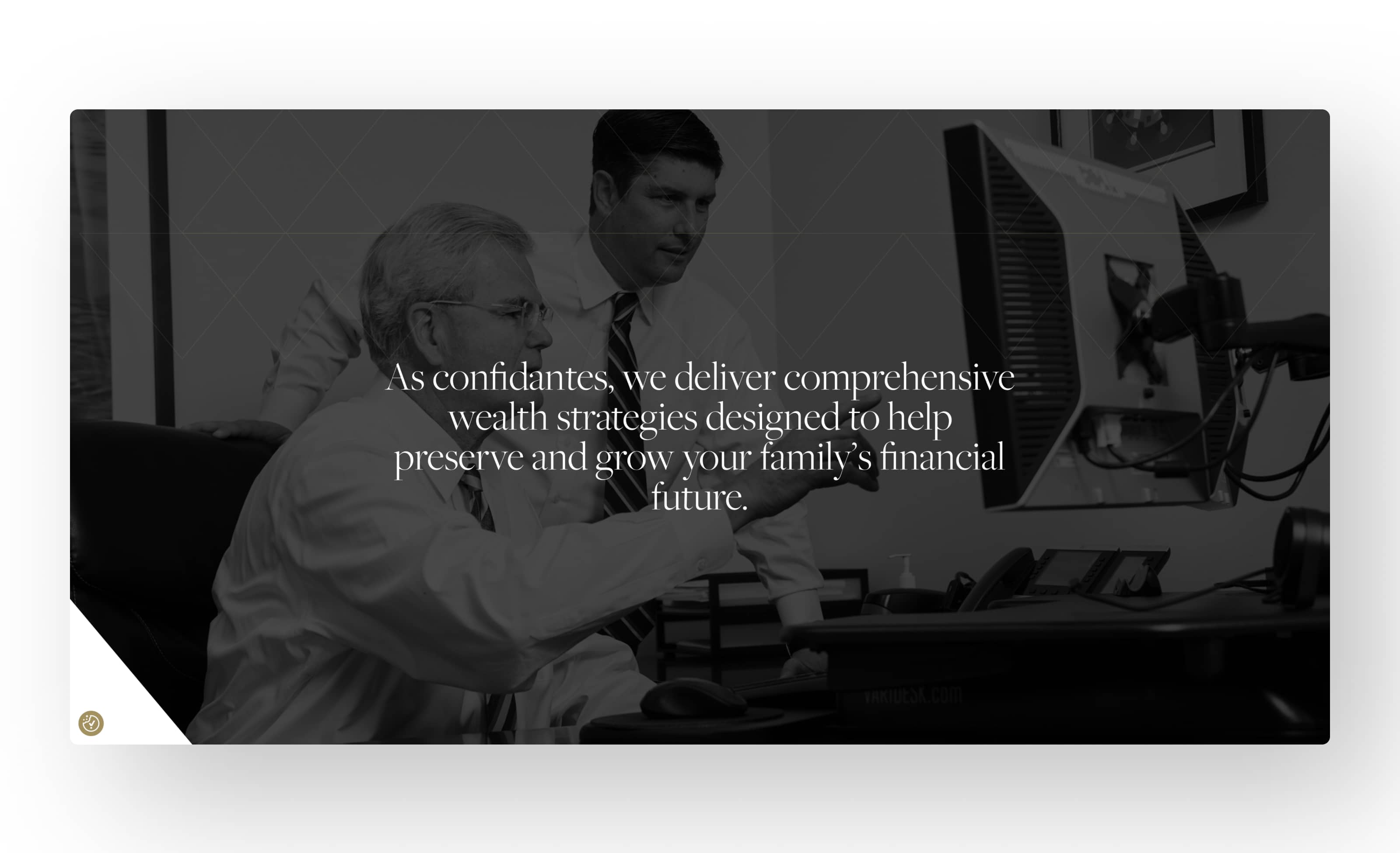
One of the clearest examples of that editing discipline in action is the services content. The messaging is direct and focused on what matters to McPeak's audience, and the website design gives it room to land. White space, considered typography, and imagery that feels purposeful rather than decorative. Together they create an experience that feels authoritative without having to try too hard.
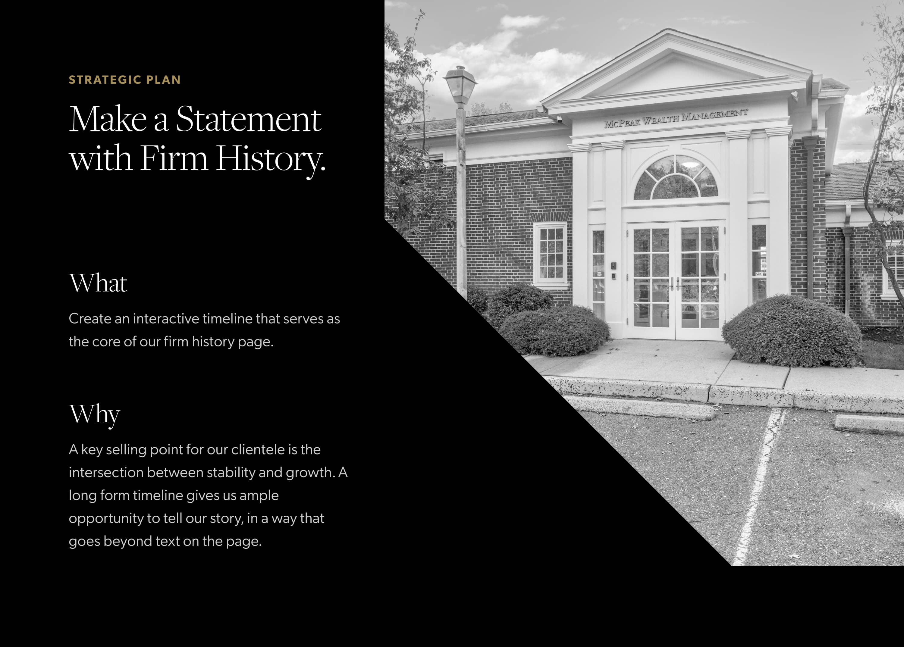
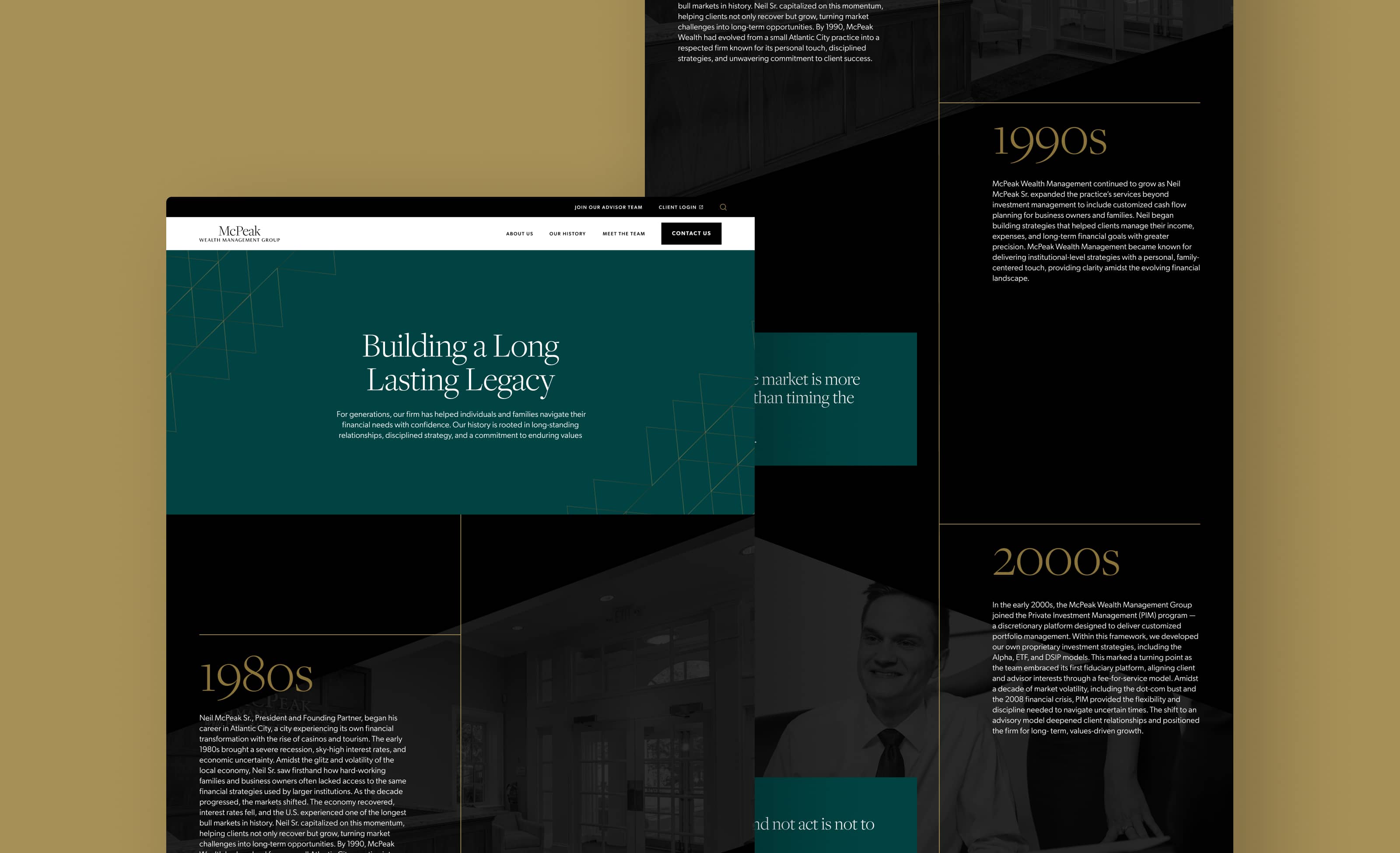
A History Worth Highlighting
McPeak's story spans decades of navigating real market cycles with real clients, and that depth deserved to be front and center. The timeline content block gave us a way to present that history in a format that feels substantial without feeling like a corporate biography. Specific milestones anchor it in fact, while the pull-quote treatment brings in the personal voice that has always been at the heart of how McPeak works.
A Clearer Picture
Seeing the before and after website design side by side is the clearest way to understand what the project achieved. The firm is the same. The story is the same. What changed is how legibly and confidently that story is told. That shift in clarity is what moves a prospective client from browsing to reaching out.
McPeak came to us knowing they had something worth showing. Our job was to figure out the best way to show it. Once we understood the audience and what they needed to feel when they landed on the site, everything else followed from there. The strategy informed the design, the design elevated the content, and the result is a site that finally reflects the firm behind it.
Push10
Chandler Roberston, Senior Strategist
VISIT THE WEBSITEView Related Work
LEARN MORE ABOUT THE WORK WE’RE DOING FOR NONPROFITS & FOUNDATIONS
Pitcairn
We dug into what makes Pitcairn unique, crafted new positioning and a new brand identity, and translated it all to a stunning new website.