Author
Chris Tremoglie
Minute
Read
Design
Development
Create animated canvas masks with set speed, masks, images and more to add a subtle layer of “wow” to your site.
By employing the canvas element as well as the JS inspired by this Codepen user leusrox, we can wrap a canvas element in a div that has all the necessary data for animating the canvas mask. Utilizing simple data attributes, we can control the type of mask, the main image, the speed, the trigger method and even add a CSS class to control subtle animations such as zoom, pan or any other CSS transition you can dream of.
To set up the necessary images, you will need two items
First, we need to choose the main image that is revealed, which we will call the main-image-path.
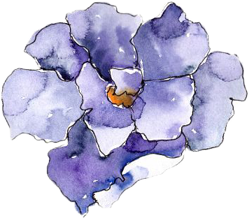
Next we will need the masked image that will transition the reveal. Let’s call this path the masked-image-path.
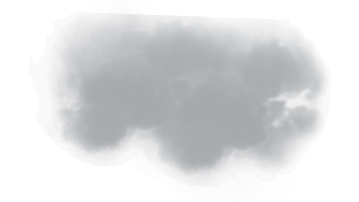
This image should have a transparent background and filled graphic that will do the actual revealing of the main image. You should feel free to experiment with different masked image styles and opacities for an infinite number of creative applications.
Utilizing a div wrap with the new attributes, we can easily control different mask effects to give this simple transition more life and functionality.
Wrap an empty canvas element with a div and set as many of the following attributes as you would like. These have been set up on the JS file to watch and trigger as necessary (check out the full JS function here):
data-img: this should be the [main-image-path] and is required.
data-mask: this should be the [masked-image-path] and is required.
data-delay: set the delay speed of the canvas mask effect to trigger in ms.
data-click: True/False to set if the trigger should be on click.
data-scroll: True/False to set if the animation should trigger when an element is in the viewport.
data-speed: the speed at which the transition plays.
data-scroll-target: the element class or id that will trigger when the animation plays. NOTE – this is required if data-scroll is set to TRUE. Use ‘.element-class’ or ‘#element-class’
<div class="canva-wrapper flower-6" data-img="[main-image-path]" data-mask="[masked-image-path]" data-speed="10" data-click="true" data-scroll="false">

<canvas class="canvas"></canvas>

</div>
The code also adds a class when the element is triggered called ‘active-mask-scale’ that allows you to utilize simple CSS transitions. Simply set the canvas wrapping div with a `transition: all 2s ease-in-out;` and you can then trigger scale, transform, opacity or any other CSS transitions when the animation triggers.
By utilizing the amazing code by user leusrox and combining it with a simple wrapping div element, we can now easily create this effect with varying speeds, images, masks, delays, trigger effects, and CSS transitions throughout a project.
Check out a few examples of Canvas Masks and the source code below.