You’ve built a strong reputation with your clients, and have earned their trust — so how do you translate that reputation to a new website, and that trust to prospective clients? You have to find smart ways to tell your story.
How to Tell Your Finance Firm’s Story On Your Website
A good partnership (or potential partnership) between a finance manager and a client is based on a lot of factors, and many of the most important ones are intangibles. It can be hard to show off your firm’s philosophy, strategy or client service chops on your website, since descriptions of them usually end up being words on a page. You’re counting on people to read the content, and the content to convince them.
Finance and investment firms are at an advantage because they deal with something people take very seriously — their financial well-being. Users looking to work with your firm are looking for answers. If you can provide those answers in the form of a compelling story, you can build trust in your firm as the right choice.
You know the ins and outs of your firm’s story. But how do you make the information feel compelling? Here are five things to keep in mind when creating a story-driven Finance website.
Keep the Focus Visual
It’s great to make sure you have strong written content across your website, so that website visitors can get the full picture of how your people, approach, and process make your firm unique. Just be careful not to let that written content dominate the page.
Make sure that any longer pieces of text are designed to support strong visuals, shorter teaser content, or bold headlines, not the other way around. This is called content hierarchy, and it makes a huge difference in how people interact with identical information. Think about how the type style of a headline changes the way you read it, and it’s easy to understand how design decisions impact how content is consumed.
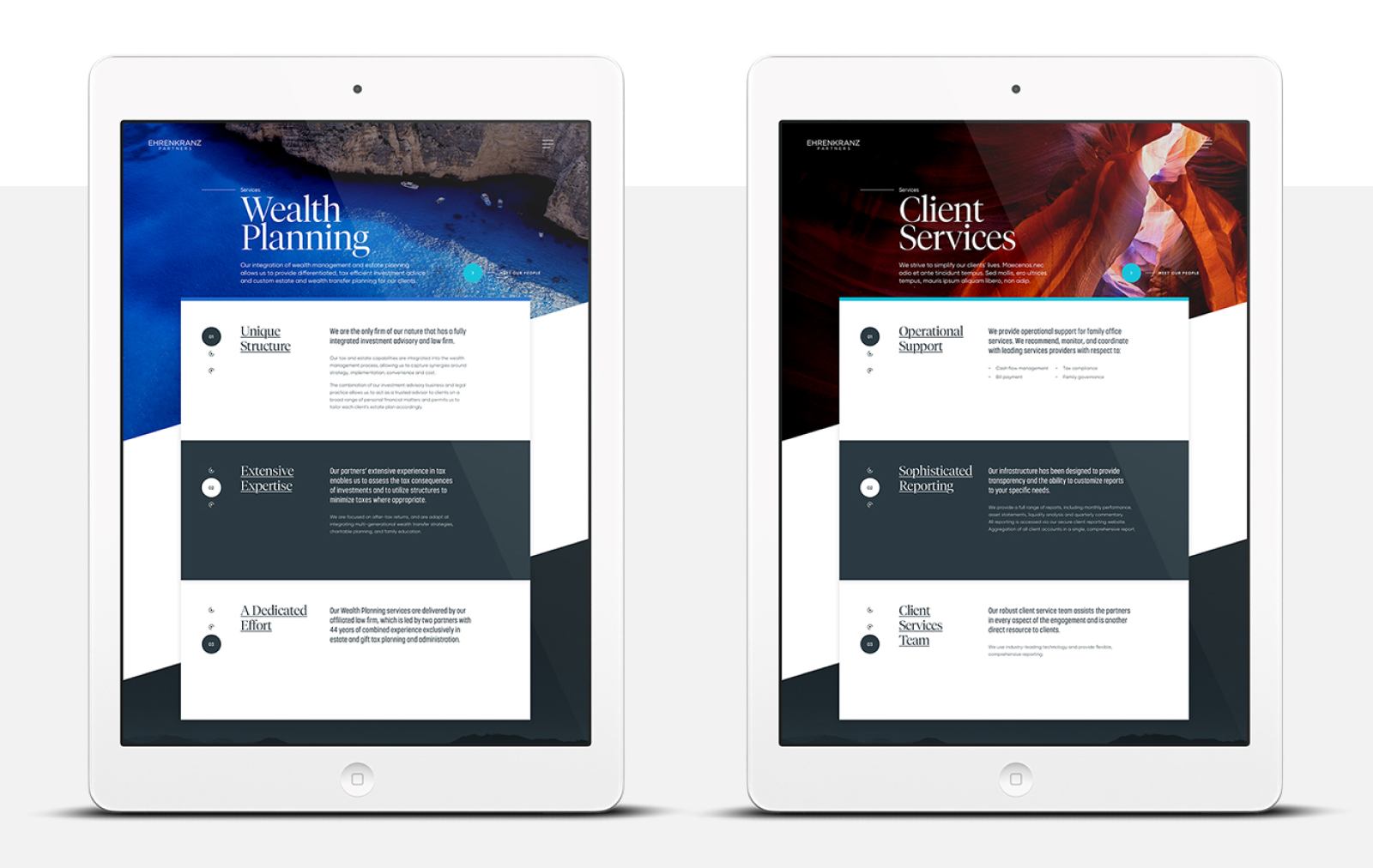
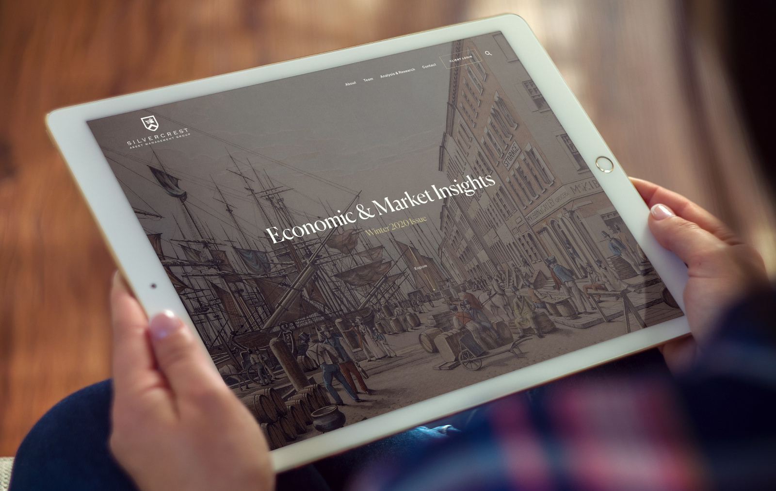
Good visuals are attention grabbing, speak for themselves, and leave even the busiest visitors with an impression. In a particularly competitive field like wealth management, having a well designed site with strong visuals helps ensure you look trustworthy to people doing online research.
Show the Work Everywhere
Don’t sequester the results of your work to a single, dedicated page. Instead, bring data, proof points and testimonials to each portion of the site to create multiple opportunities to build trust. Specific references to your results and investment strategy will have just as strong of an impact on an About page as they will within a dedicated Services or Results section. When those types of points stand alongside other content, they serve as a reminder of the quality of your work, reinforcing other messaging.
This peppering of your work across the website creates crosslinking opportunities as well. Featuring strategic thinking on a Services page gives you an easy opportunity to link to more in depth content so that potential clients can learn more about your expertise.

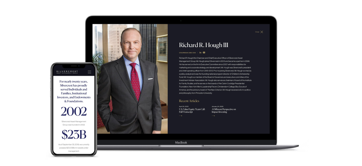
For Silvercrest, we found ways to incorporate their approach (and results) throughout the site. We called out statistics demonstrating impact, and linked from team bios to thought leadership pieces.
Use Video When You Can
As stunning as photography can be, using video on your website in high traffic areas can provide a lot of depth to your site. Hubspot research shows that 54% of users want to see video content from brands. Video was also the type of content that users wanted to see most, beating out emails, social content and everything else. Strategically placing video content on your site gives users an easy way to consume your message.
Try a mix of informative video with strong storytelling, and accent video that adds a dynamic element to your website.
Long-Scroll Pages Are Built for Cohesive Stories
When it comes to telling cohesive stories, we advocate for creating content that users can scroll through. Using these longer scrolling pages rather than short pages with lots of clicks required to see more content creates a more fluid user experience. When executed well, long-scroll pages merge design and narrative to make content engaging.
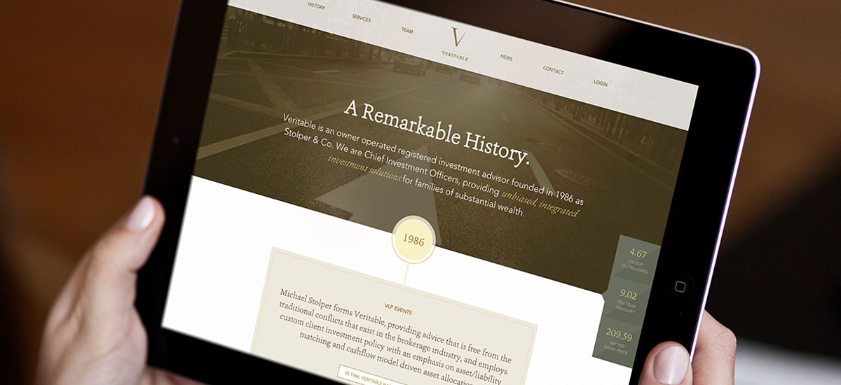
Of course, there are important components to consider when implementing long-scroll. For instance, sticky navigation (keeping your nav bar in view while content scrolls below) assures that users can control the page and their own pace without getting lost. Implementing scroll-triggered animation – like these that we used for Veritable’s vertical timeline – adds a touch of fun to the page to further engage the user. You also want to break up content to ensure users don’t just have a block to read through. Create changing backgrounds to emulate the appearance of multiple pages to help guide users.

For Veritable’s new website, we wanted to share their history in a way that felt like a continuous narrative. We used the long-scrolling timeline with light animation to keep the page visually captivating.
Make Sure There Are Opportunities to Take the Next Step
Building a website with plenty of opportunities to tell your story only has an impact if web visitors know what to do next. Clear and well defined user paths are central to an effective website.
Add clear calls to action to pages so that readers can reach out to you, learn more about your firm, or just keep exploring your website. You never want a page that you’ve invested time into to be a dead end on your website.
For a finance firm, the most important thing your website can offer is a strong story about where you came from and where you’re headed. Paired with a clear user experience, that strong storytelling is sure to yield an impactful website.
Time to reconsider your web design?


